

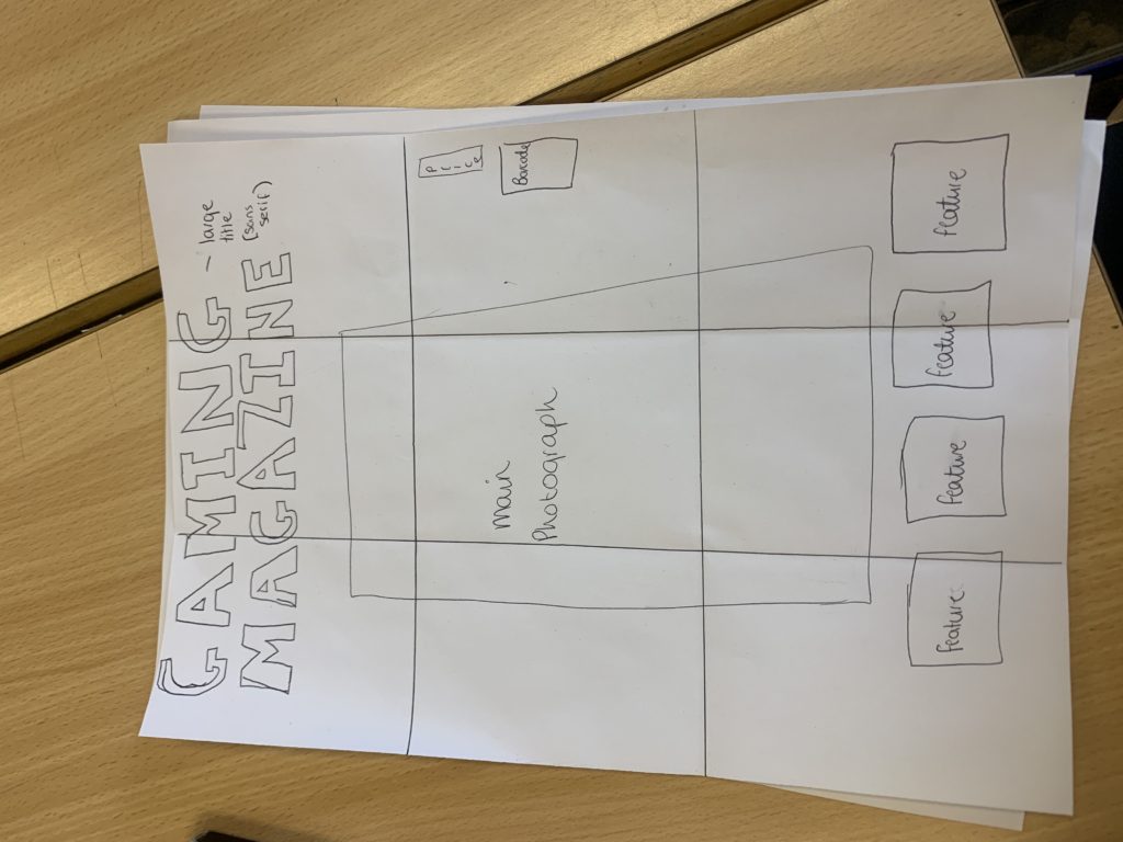

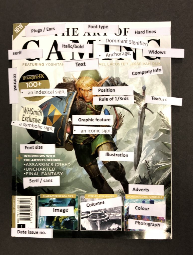
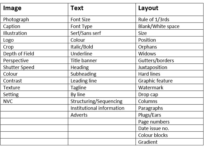


I have decided to include the cover image of my magazine as Marion, the main character of the new game my magazine is based on, Marion Racers. When I create the magazine cover, I will edit it so that it looks like the kart is moving towards the consumer (face on) so it looks as if Marion is establishing a relationship with the reader through non verbal communication
For the caption of the cover image, I have used the font and colours (rainbow) of the title of the Marion Racers title. Due to the many colours that the magazine will involve, my magazine cover will be aimed at Teenagers (ages 10-16), hence why I have used a funky font that would appeal to youths more than adults.
I have also included 3 plugs at the bottom, with what the consumers will expect in the magazine, so that they are enticed to buy the magazine and read the magazine. These plugs include a competition you can enter within the magazine, an interview with a profession gamer called SpewPieDie and an article that introduces BotBoy, the new character you can play as in Marion Racers.
Missing from my magazine is the price, which I will put in a bubble on the left hand side to Marion in her racing car.
My Ideal consumer will be Teenagers (Ages 10-16), so I will use bright colours to attract their attention. My magazine will also be quite cheap so they can afford the magazine with their own pocket money. My ideal consumer will be based at females who can game, especially as my cover image will be a female games character. The ideal consumer will have long blonde hair, wear the fashionable trainers and wear ripped jeans (the typical teenager you will find everywhere). As my ideal consumer are girls, I will include feminine colours, (Red, Pink, Purple) and as I’m aiming the magazine at teenagers, I will include trends that teenagers use, such as
#GIRLPOWER, so the consumers instantly know this magazine is based at girls, as also shown by the multiple use of girl game characters as the cover image on my magazine.
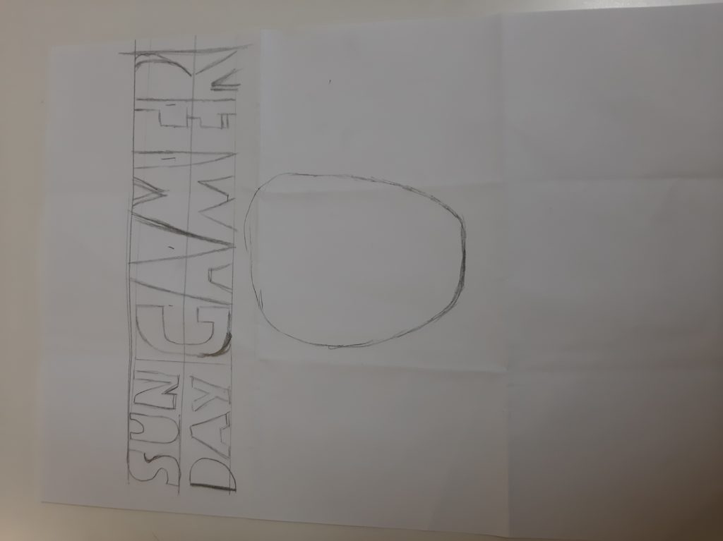
This is my new title/logo to the Sunday Gamer and it also has a head that I started drawing as a character will go there but I ran out of time to finish it.
My ideal consumer is a 15 year old boy that has no life and spends all day inside. He wears black jeans and a hoodie with trainers. He is about 5 foot 4 inches with long hair and acne. Came on a moped with headphones in and has an Android phone.
The first idea i have came up with for my magazine was to add two images of 2 people dressed up, 1 person will be dressed up in a football kit representing the video game fifa and the other person will be dressed up in a basket ball kit to represent NBA.
My ideal consumer will be 15 years old, this is because it is a certain age whee they can appreciate every game they see and know the differences from a good day to bad. It can be any gender but the magazine mostly influences males, he has short black hair he was wearing baggy Nike waterproof joggers with air max 97’s as shoes. He was wearing a Y-3 jumper by his cloths you can tell he is living comfortably as he has enough money to wear a few bits of cloths that are generally expensive. The title of the magazine was FUTURE GAMER!
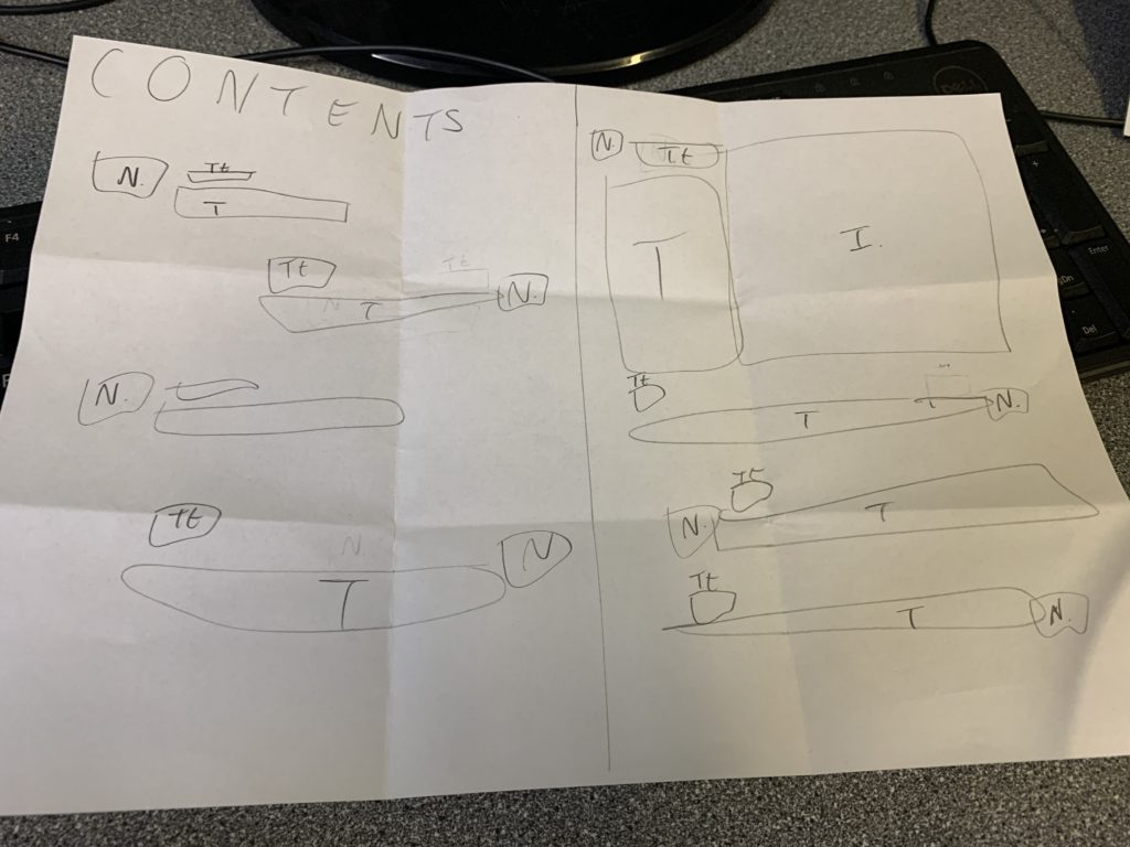
Large title top left with alternating lines of text with page number, subheading and brief explanation on what is on that page. On the other page a major image with page number subheading and more text then the others with the alternating lines again.
Tall, longer than average hair, hipster/ basic clothes, sneakers/ skate shoes, basic/pastel colors, 17 +, credit card, came in bus/car/moped, headphones in, ignoring everyone,
