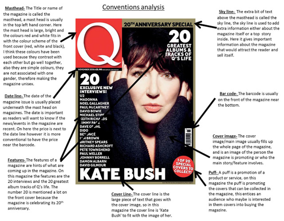
Choose a magazine cover and label the key features (signifiers). Go on to identify the producers intended messages through the selection (paradigm) and combination (syntagm) of these visual elements (connotations/signified meaning). Place your diagram on the blog.

Images on magazine covers/feature articles need to be of “pin sharp” quality. The top third of a magazine cover needs to be visually striking. A magazine title needs its own specific branding to make it stand out. Covers should not use too many fonts or colours – font colour and images should be unified where possible. Coverlines should be visible from at least two meters away. The key function of the front cover is to sell the product.
MAGAZINE COVER LAYOUT KEY TERMS:
Masthead Puff Coverline Dateline Skyline Cover Image/ Cover Star (dominant signifier) Features
