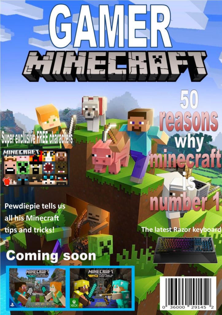
For my gaming magazine I have decided to use a currently popular game for the main image because it is relevant and will interest lots if people since a lot of people are currently playing that game therefore they will be interested to find out what the magazine is about and they will be more likely to buy it.
I then decided to make a really big and bold colorful title to catch the attention of the gamers, the big bright title will catch their eye and if the title is interesting then the buyers are more likely to notice this specific magazine and that makes them more prone to reading the title and becoming more interested in actually purchasing the magazine. I also decided to use complementary colours because that makes the writing and the writing stand out even more.
I also decided to use words like ‘you’ and ‘we’ to make the reader feel like this specific magazine was directed towards them and make them feel included in what this magazine is talking about and like they belong which I believe will make them want to buy the magazine more.
I then added a few different smaller images of different games around to add more of a variety because the reader may not be specifically interested in the main game I have put on the front; however they may be interested in one of the other games and this broadens the variety of readers and creates a bigger possibility of a reader finding something they are interested in and in general increases potential number of magazines sold.
I also made sure that the secondary pictures were in different sizes as I have made the currently more relevant games larger and the less relevant games smaller. I decided to do this because the larger the image the higher the potential of someone noticing it and if the game is more popular then theres a higher chance of the reader being interested.
I have also put words like ‘free’ and ‘super exclusive’ because these words catch the readers eye and help sell the product because it makes them believe that they are gaining something more from buying this magazine and everyone loves free gifts and this may make their parents more likely to buy it because they’re getting a lot from this magazine. Also the word ‘exclusive’ makes them feel special and like they’re being let in on a very important and unknown new piece of information.
I have added a few smaller subtitles with a few intriguing headings so that once the reader does hopefully pick up the magazine they have other things that they can look at and hopefully become interested in enough to actually buy the magazine. Also these subheadings give sneak peeks of whats in the magazine so they can determine wether they want to buy it.
I also put some advertisement on the magazine because if they buy the magazine and they see this they will know what to expect in future magazines and make them want to buy more and get excited for new things coming out.
- Iconic signs– looks like its object (e.g : camera work, sets and props)
- sonic is the actual character
- the yellow character
- Indexical– a sign that links to its object (e.g : sounds, props)
- ‘Boom’ is onomatopoeia and sounds like explosion
- ‘new’ sticker
- Symbolic– a sign that has a random link to its object (e.g : numbers, letters and colors)
- the writing
- the letters
- the colors
- the ‘£’
- green eyes show he’s a good person
- gold ring shapes= money
