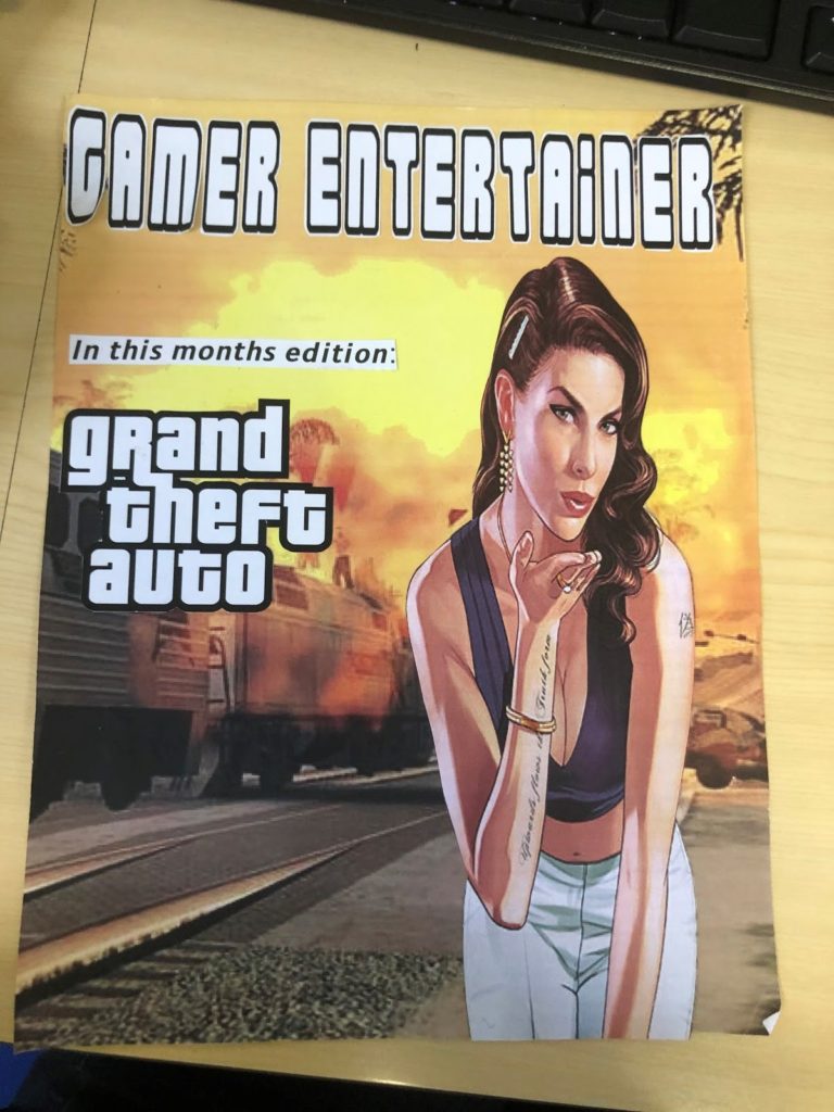
On the front cover that I designed for a new gaming magazine I decided to go down the route of ‘less is more’. I gave the title of the magazine ‘Gamer Entertainer’ pride of place and used a simple font that is easy to read and can be read at a quick first glance. I wanted to stick with a simple black and white colour scheme for the font because the contrast of the black and white over a bright yellow background really makes the title stand out. I found this style of text on a font generating website and thought the bold letters would catch the eyes of the consumer. Creating the actual title itself was a much quicker process; having just a two word title keeps it short and sweet which prevents the audience from feeling uninterested before they’ve even read the whole thing. The use of rhyme increases the fluency of the statement which makes it more memorable – making the title more memorable will allow advertising through word of mouth. Aswell, the title gives a clear insight into the content of the magazine so people that are interested in gaming will be instantly attracted. The image of the girl on the cover is a character from GTA, I included this picture because the main focus of this edition is Grand Theft Auto. I edited her silhouette out of a photo onto a new background, which is also taken from the GTA game. I used the background picture in particular because the bright and vibrant colours will catch the public’s eye more than a duller backdrop. I included the photo of the girl on the cover because the warm tone of the picture went well with the colours on the background, also because there is a higher percentage of gamers that are male so using a female figure will draw attention towards it. I kept the amount of writing on the cover as minimal as possible, my intentions were to not be too specific about the material inside but still conveying the gist – this broadens the target market.
