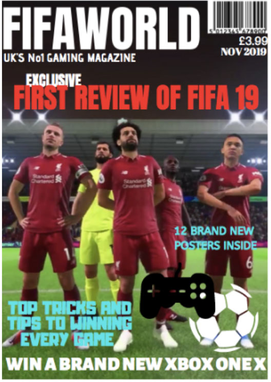
I based my gaming magazine around the digital football game called FIFA. One of my intentions for the magazine was to make sure it stands out on the shelf and that it was clearly about the game Fifa. The target audience is young men and boys who have an interest in football and the game FIFA. I named my magazine FIFAWORLD which clearly represents the idea and concept of the magazine. I made the masthead stand out by using a bold font called Anton and using the colour white on a dark background. The title is clearly in the top left corner covering most of the width of the page. The idea was to make sure that the title was easily recognizable and stand out on the page. I also wanted to make sure the date, barcode, and the price was clearly visible as well. I also placed my tagline “UK’s No1 gaming magazine” under the title. This is to show the gaming image of the magazine and will show the concept of the magazine. Using the terminally “No1” is effective as it connotes that the magazine is good and worth buying.
Another key intention of my magazine was to make it appeal to the target audience by using competition to win an Xbox. As the target market is gamers this will appeal to them. I placed this across the bottom of the cover in bold, white capitals to make it eyecatching and stand out. Another technique to make it stand out to the target market was my main cover line. “Exclusive first review of FIFA 19.” Again using bold font and the colour red. Using the word exclusive connotes that the article is only in this magazine and is, therefore a must-have. The background of the magazine is a picture of the game with some of the players from the game. There is also a football and a game controller just to create the imagery around the game. My colour scheme was white, red and blue which are quite bold and bright colours. The other overlines I used about the posters inside and the top tips on playing the game are again to make the magazine more appealing and give some information about what’s inside and what type of articles there are. I used a different font and a bright blue colour to make these cover lines stand out from the title and the background image.
Overall the main ideas and concepts of the magazine were to make sure that it was clearly representing the game Fifa and appealed to the right target market. I think using the colour scheme I used and the bring images made it look eye-catching and standout on the shelf. I think it also clearly represents the game as I have used an image from the game and added the image of the game controller. This also adds to the overall image of the magazine along with the fonts and the colors.

- An iconic sign – which has a direct connection to its’ object (ie it looks or sounds like the object)
- An indexical sign – which has an indirect link to its’ object (think smells)
- A symbolic sign – which has a random or arbitary link based on a shared knowledge or an agreement, for example, a shared culture or language (think letters, words, writing, shapes, squiggles, colours, sound effects, facial expressions, hand gestures, clothing, hair styles, etc)
Iconic signs
- The backround image of the players
- The football clipart
- The game contoller clipart
Indexical signs
- The football stadium is an indexical link to football
Symbolic signs
- The title FIFAWORLD links to the game Fifa
- The colour red symbolises fire and passion for the game.
- The colour white symbolises the kits and the field
- The colour blue symbolises masculineity.
