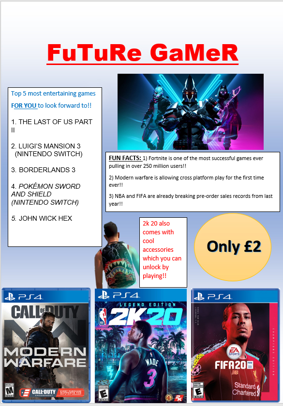
My intentions with my front cover magazine for gamers was to give my audience an insight on what upcoming games to look forward to playing in the future. The ideas I came up with was to add some of the most promising games to come out later in the year, by doing this I added in a few images of the games that are most likely to be most popular to play I also added in some already released games such as Fortnite which I believe will still be popular. My target audience ranges from ages three to eighteen and older, this is because it relates to the age policies certain games have for example games such as FIFA twenty is aged at the age of three years old and older, whereas games like Modern Warfare are aged at the ages of eighteen and older. I also added in a top five list on my front cover in this list I covered the top ten most entertaining games to look forward to in the future. The reason why I decided to make a front cover magazine on future games instead of games which are already out is because, I myself play games however I have stopped recently as I have become bored of the games that are out at the moment. I am waiting for new games to be released so I can start playing again this is how I came up with the idea of future games. Some of the games that are featured by having their own images are personal favourites of mine that I am looking forward to play and a few other of the games that are mentioned I researched on google and found some top twenty lists and got some games of those lists to put on my front cover, I chose carefully with these games as I didn’t want all the games on my list to be similar I wanted to keep it unique so it has various choice for my audience. Another idea I came up with was to add in some more text about some fun facts of the games that are featured on the magazine front cover, by doing this it could increase the knowledge of the games to my audience and it will also give them more of a reason to purchase one of these games that have been featured. In conclusion, I believe my intentions on portraying a front cover magazine for games to look forward to in the future was a good idea as it is accessible to all ages so that they can be intrigued and willing to read more. I also believe, I balanced the amount of text I used out with the images I used. By doing this it doesn’t make it to boring for the younger audience but it also includes reasonable facts for the older audience this means that the magazine balances out for my target audience not just heavily influenced on one.
- Icon:
- Looks like a footballer
- Looks like a man with a backpack
- Looks like a neon light
- Looks like a man
- Indexical:
- Clothes
- Red color font
- Symbolic:
- Game headlines
- Nba Logo
