Definitions

Barthes – One of the leading theorists of semiotics. Denotation and Connotation

C S Pierce – A scientist and philosopher best known as the earliest supporter of pragmatism (an approach that evaluates theories or beliefs in terms of the success of their practical application). Iconic, Indexical and symbolic signs.

Ferdinand De Saussure – A Swiss linguist and semiotician. Signifier and Signified

Semiotics – The study of signs and symbols as well as, their use or meaning.

Sign – An object or event relating to what is happening or going to happen.

Signifier – A sign’s physical form (such as a sound, printed word or image).

Signified – The meaning or idea presented by a sign.

Iconic Sign – Physically resembles what ‘it stands for’ (Looks like)

Indexical Sign – (Using sensory features) signs where the signifier is caused by the signified, e.g., smoke signifies fire

Symbol – A mark or character used as a representation of an object, function, or process/ A shape or sign used to represent something such as an organization. (Random)

Code – A system of words, letters, figures, or symbols used to represent others, especially for the purposes of secrecy/ A phrase or concept used to represent another in an indirect way.

Dominant Signifier – The most important sign on the page e.g a key/ main image.

Anchorage – When a piece of media uses another piece of media to reduce the amount of connotations in the first piece – so it can have a fixed meaning.

Ideology – An ideology is a set of beliefs and values that a person may have.

Paradigm – A typical example or pattern of something; a pattern or model. A set of linguistic items that form mutually exclusive choices in particular syntactic roles.

Syntagm – A unit where signs occur in sequence or parallel and go together to create meaning.

Signification – The representation or conveying of meaning/ importance.

Denotation – The literal or primary meaning of a word, in contrast to the feelings or ideas that the word suggests (Connotation).

Connotation – An idea or feeling which a word invokes for a person in addition to its literal or primary meaning.

Myth – A widely held but false belief or idea/ misinterpretation of the truth.

Dominant Ideology – Attitudes, beliefs, values shared by the majority of people in a society.

A Radical Text – Texts which challenge the dominant ideology

A reactionary Text – Texts which support the dominant ideology

C S Pierce

  • Iconic signs grass, gun, people
  • symbolic signs: colours – orange, purple, letters, pound sign (they are all arbitrary, random, shared and agreed.
  • indexical – (linked to something) woman looks confident, strong, independent, because she is holding a gun, body language, facial expressions. Also, they all look like they are linked to war or conflict.

summer task


On the front cover that I designed for a new gaming magazine I decided to go down the route of ‘less is more’. I gave the title of the magazine ‘Gamer Entertainer’ pride of place and used a simple font that is easy to read and can be read at a quick first glance. I  wanted to stick with a simple black and white colour scheme for the font because the contrast of the black and white over a bright yellow background really makes the title stand out. I found this style of text on a font generating website and thought the bold letters would catch the eyes of the consumer. Creating the actual title itself was a much quicker process; having just a two word title keeps it short and sweet which prevents the audience from feeling uninterested before they’ve even read the whole thing. The use of rhyme increases the fluency of the statement which makes it more memorable – making the title more memorable will allow advertising through word of mouth. Aswell, the title gives a clear insight into the content of the magazine so people that are interested in gaming will be instantly attracted. The image of the girl on the cover is a character from GTA, I included this picture because the main focus of this edition is Grand Theft Auto. I edited her silhouette out of a photo onto a new background, which is also taken from the GTA game. I used the background picture in particular because the bright and vibrant colours will catch the public’s eye more than a duller backdrop. I included the photo of the girl on the cover because the warm tone of the picture went well with the colours on the background, also because there is a higher percentage of gamers that are male so using a female figure will draw attention towards it. I kept the amount of writing on the cover as minimal as possible, my intentions were to not be too specific about the material inside but still conveying the gist – this broadens the target market. 

Media Summer Task

Media Summer Task

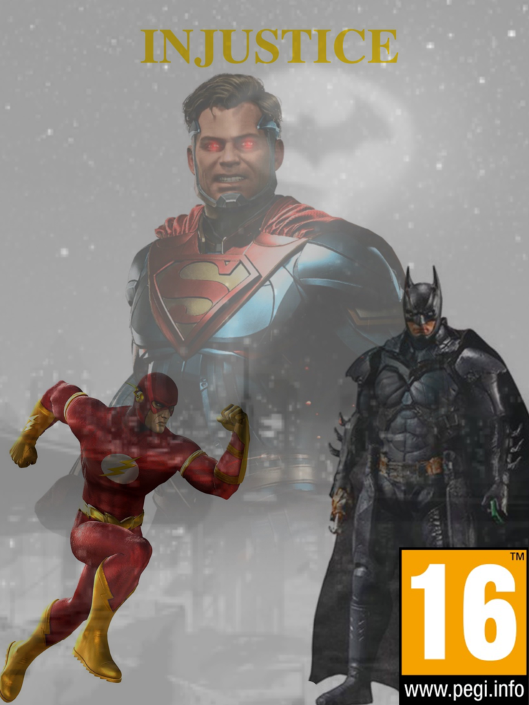
For my magazine cover I first off had to choose a game, I had decided on the Injustice universe games. The first game’s title is “Injustice: God’s among us” and the sequels title is “Injustice 2”. Both games go off of the storyline of the Superhero ‘Superman’ becoming evil and being the main antagonist in the first game as well as the second game.

 Because of this I decided to put him in the center of my magazine cover with red glowing eyes, ready to shoot heat vision. To get the image I went onto Google images and picked an image that I thought would capture his evil essence. However, because I did this with all my images I don’t know if they have any copyright claims that any owners could potentially use against me and therefore sue me.

Because there is an antagonist on the cover there must also be the protagonist, in this case it is Batman. Batman also feels as if he is partly to blame for why Superman has become evil. Because of this I wanted to get an image of Batman not looking happy or sad, however I did get an image of him looking very determined and serious. I decided to put Batman’s layer over Superman’s layer because it generally went well with the aesthetic and overall looks better if it were the other way around. Batman is wearing his second game costume as it represents he is a new man from who he was before.

The last and final superhero character that is on the front cover is ‘The Flash’. I chose ‘The Flash’ because in the first game he is an Antagonist somewhat against his will. Yet, in the second game he has been given a redemption and is on his way to becoming a Superhero once again. I decided to choose a picture of him of him running for two main reasons:

  1. Reason number one is because it’s simply his ‘superpower’ and it makes sense of him to be using his abilities like Superman and Batman with his utility belt.
  2. Reason number two is because it can be representative of him on his ‘run to redemption’ and once again becoming one of the good guys.

For the background I decided to pick an image of ‘Gotham city’ with the Bat torch being shone into the sky. I chose this because it shows the Batman is being in need of service to help save the day. It also shows that Batman is needing to protect his home city where he grew up and protect the ones he loves.

I chose to include a Pan European Game Information (PEGI) rating of 16. PEGI is to help European consumers make decisions when buying items like video games. This rating specifically is to alert the audience that there may be some strong violence and is an action game. This means that young children are recommended not to play it. It also means that if you are under the age of 16 you won’t be able to buy the game in stores.   

Iconic signs:

  • PEGI 16 Logo. This links to who should be playing the game.
  • Batman Logo (in the Background). This links to heroism.
  • Flash Logo (on the Flash suit). The symbol looks like lightning.
  • Superman Logo (On the superman logo). This links to heroism.

Indexical signs:

  • Batman holding his grappling hook. This links to violence.
  • Superman and his eye lasers. This links to violence.
  • PEGI 16 Logo. This shows that it’s specific to a certain target audience due to the violence and sensitive issues in the game.

Symbolic signs:

Definitions

  • Barthes – one of the leading theorists of semiotics.
  • Pierce – an American philosopher, logician, mathematician, and scientist who came up with the three signs in media.
  • Saussure – one of the founders of semiotics.
  • Semiotics – the study of signs
  • Sign – a gesture or action used to convey information or an instruction.
  • Signifier – a sign’s physical form.
  • Signified – the meaning or idea expressed by a sign.
  • Icon -a sign that looks like its object.
  • Index – a sign or measure of something.
  • Symbol – a mark or character used as a conventional representation of an object, function, or process.
  • Code – a system of words, letters, figures, or symbols used to represent others.
  • Dominant Signifier – the most important sign on a product.
  • Anchorage – changing the meaning of an image to fit your viewpoint.
  • Ideology – when multiple people have the same viewpoint.
  • Paradigm – a group of signs
  • Syntagm – a series of signs that if one drops out it doesn’t make sense.
  • Signification – an exact meaning.
  • Denotation – the literal meaning of something.
  • Connotation – a feeling or meaning a word invokes.
  • Myth – a widely held but not necessarily true belief or idea.
  • Radical Text – a text that challenges the dominant ideology.
  • Reactionary Text – a text that supports the dominant ideology.

What is media?

Media is the main means of mass communication that can be used to deliver information, data and news and includes, broadcasting, publishing and the internet.

Why is media important?

Media is important to society as it is one of the fastest and most efficient ways of receiving information of various subjects.

What would you like to learn?

I would like to learn more about journalism and the impacts that media can have on society.