
- iconic signs;
- city background
- suits
- jackets
- hair
- light in heading of Detroit
- Sony logo
- RP logo
- red bar
- white underline
- blurred crowd background
- Indexical signs;
- blurred crowd background(bottom right corner)
- “heavy rain”
- “two souls”
- “night in the woods
- “dawn”
- “o” in Detroit- LED light
- “human”
- “worried facial expression”-(Kara Left Middle)
- round LED Light on the side on the peoples heads-not human or super human
- the text style for the heading-futuristic
- blue clouds/mists-imply futuristic
- symbolic sign:
- determined facial expression(Markus right side)
- “worried facial expression”-(Kara Left Middle)
- headings
- subheadings
- small text
- orange text
- red bar
- the dominant blue colours in the magazine
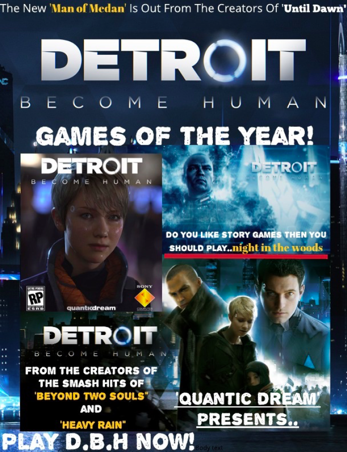
For this summer project of designing a video game magazine cover I started off listing my top favourite games I’ve either played or watched playthroughs of. My list contained; “Detroit Becomes Human”, which is my most favourite game I’ve ever played that is filled with diversity,amazing graphics, great story lines and more. “Night In The Woods” is a story line game with cute graphics and lovable characters. “Little Nightmares” a horror adventure game that explores this odd world filled with suspense and mystery. And the final game on my list was “Man Of Medan’ it’s a sequel to the classic horror decision game “Until Dawn”.
So after listing my favourite games I started to look at different professional video game magazine covers, and I noted the similar things the covers had in common. Most would showcase one game as the main interest of the cover, and put smaller titles for other games. To catch the interest of the audience, if the first game wasn’t as appealing.
When creating my magazine cover I used a gaming cover about the ‘Last Of Us’ as a reference. I did this because it could help me create a more realistic and professional gaming cover, almost like a template.
To follow the plan of having one main game to present I decided to go with “Detroit Becomes Human’ because It firstly was my number one game on my top 5, and It had the most usable material for a gaming cover.I started the process of making this cover by finding a collaging software, were I could add text, and photos together to create my cover.
I ended up finding this software called, lucid press which was free, and easy to use. When I loaded up lucid press I started playing around with the order and arrangement of screenshots to see what would look the best, whilst leaving room for subheadings.
After I chose the correct order of the pictures I looked back at my reference to see how its subheadings where placed and with what colours,language, and font they used to intrigue their audience. With the cover I was referencing from they would put their subheadings in bold, to make the audience enticed to read it. They also changed the fonts; size, colours or shape to make the names of the games stand out more.
To make the cover stand out more, they chose a dramatic photos. Which would intrigue the audience to want to know more about what the game is about. Also when choosing a photo for a magazine cover usually they place the main character for the big heading since more people will recognise it and want to read it. I took this into account and put the main 3 characters of the game on the magazine cover.
With designing a magazine cover, colours matter a lot. The colour palette of a magazine cover, can contribute to if the magazine gets sold or not. So it’s very important to not over power the colours or leave them to bland.
When creating my cover I tried to make it look dramatic whilst not over filling the page with titles. I think it turned out well, and im really pleased with the outcome. I think my magazine cover is more aimed at the audience of ages late teens to early twenties.