Gaming Magazine – Media Induction Task – 2019
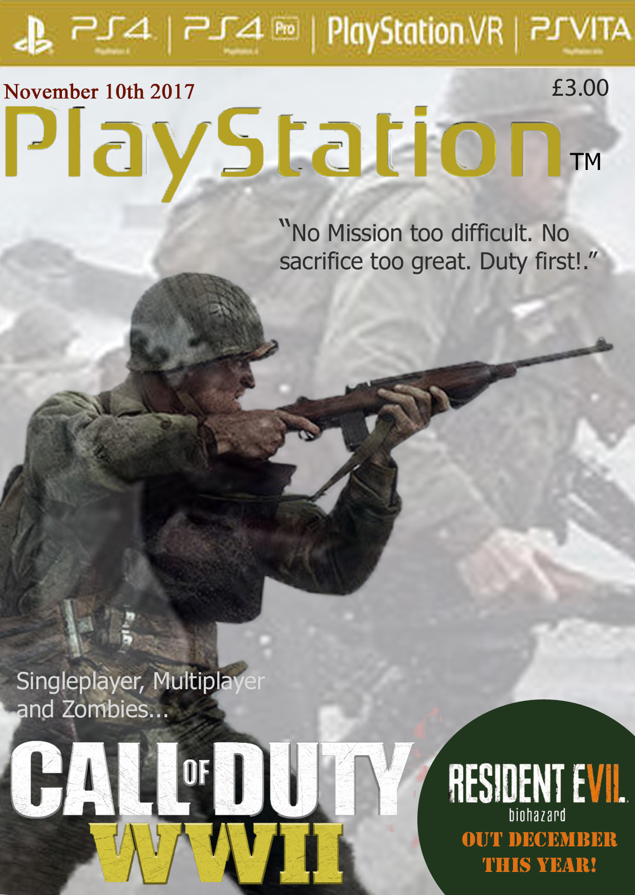
For my magazine idea I decided to use the game Call Of Duty WW2 as I had just recently finished playing the game. I decided for the main part of the cover to be the soldier as it conveys multiple emotions to the viewer such as worry but also respect. In addition, I reduced the opacity of the backup image (covering the whole page) as not only does it give a slight insight of what the game is like to the viewer, but it can also be viewed as a flashback or memory of the main solider.
As well as this, by using scary/ dramatic images to represent the game can also be used in order to attract some players who like action, horror or historic based games. The phrase “No mission too difficult. No sacrifice too great. Duty first!” Is also used widely throughout the game in order to display each characters loyalty to the army and their country; not only does this phrase also attract and interest the a new audience to the game but also attracts people who may have already played the game as they have an emotional connection with he phrase.
This magazine was mainly directed at PlayStation [4] users, as it is a very popular console. I also tried to maintain a compact/ similar colour patter which matched the colour scheme of the ‘Call Of Duty WWII’ logo; therefore, using quite dull colours as well as white and grey. This game was released on November 3rd, 2017. Which is why I decided to add a date around the same time as the game would have been in high demand. In addition to this, I also decided to advertise a game with a similar thriller/action/horror theme also released only a month later. Too highlight the advertisement and add a bit more colour to the page, I inserted a green circle (in order to emphasise the advertisement as well as to add colour) I then used the quick selection tool to cut out the name of the game – ‘Resident Evil(7) Biohazard.
The two main pictures covering the page, however, only represents the theme of the game and the campaign (story) mode which may not be as appealing to someone who enjoys online games. I therefore attempted to advertise more than just the story mode by mentioning the multiplayer and zombie game modes which the game also offers. As this is a magazine supporting and advertising PlayStation games, I also inserted a banner along the top which highlights other consoles/ add on such as VR that the company has also created to enhance gaming experiences.
Iconic Signs –
The soldier
The weapons
The soldiers outfit
Idexical Signs –
‘PlayStation’
The characters outfit
The fonts used in the top banner
The characters facial expression
Symbolic Signs –
The ‘Resident Evil’ advert
The yellow PlayStation sign links to the Yellow ‘WWII’
The ‘Call of Duty’ font
The ‘Resident Evil 7’ advert changes the colour of VII in order to emphasize 7
