Media means mass communication, which can include broadcasting, publishing and the internet. Communication channels consist of news, advertising/ promotional messages or even education. Media is used to inform and influence people in larger groups. Media studies is a course in which you learn how to inform and influence large amounts of people effectively. It can be useful for many careers including marketing/advertising positions where messages need to be sent out to masses of people. I’m taking this course as I’m hoping to take fashion design and marketing at university, I want to study media a level to prepare me for the marketing side of the degree. I think it will help having background knowledge before I go down that career path so I know what to expect when I start university.
(Most) Newspapers, Magazines and Books are physical and word
based, whereas Media Forms such as, Radio, Television, Cinema, Video Games and
online aren’t physical and are audio based Mediums.
In addition, Newspapers, Non-fiction books and Adverts tend
to be more formal, informative and serious; focusing on events occurring
world-wide. However, mediums such as Video Games, Movies, Magazines and
Television are more informal and used in order to entertain the audience.
The main intention behind my magazine cover was to present an idea of evil and good. I did this by using green to represent good and red to represent evil. Another way I showed this was when I created the header with both the green and red colours. I found the red monster from a movie poster, I thought it would be appealing to a gamer as it shows their target/the ‘bad guy’ in a game. The background colours are red and green ombré which reflect the theme of the magazine.
I used text to appeal to gamers too. I used side headings saying things like ‘top tips’ and ‘how to’. I’d hope that these phrases would attract a gamer audience because they would want to learn about the game to become a better player. I also used a collage of words to do with gaming that could attract gamers to the magazine. Some of these words are ‘Nintendo’, ‘hero, ‘retro’ and ‘Xbox’.
In the bottom left and right corner I found a logo for the magazine because it says ‘good vs evil’ and I also found another logo that could be another gaming company that sponsors the magazine. This makes it look more professional. At the top of the cover I used a strip of writing about new laptops. I think this would interest gamers because it shows the magazine isn’t just about the actual game but also the technology side.
To create the final cover of the magazine I used mostly found material. I cropped and edited headings from movie posters and also used text from other magazines. Then I used a digital website to create the ‘evil’ heading.
Iconic signs
The red monster
The logo
The sponsor logo
The ‘Evil’ title
Catching headers
Indexical
The labels beside the monster that describe how to defeat him.
‘The rise and fall of ion storm’
‘World of Warcraft’
face of the monster represents the villain in a game
Symbolic
‘new laptops’ sign links to technology/gaming
Catching headers ‘exclusives’
red background to symbolize the monster
Green background to symbolize ‘good’
red background can also link with ‘evil’ and danger
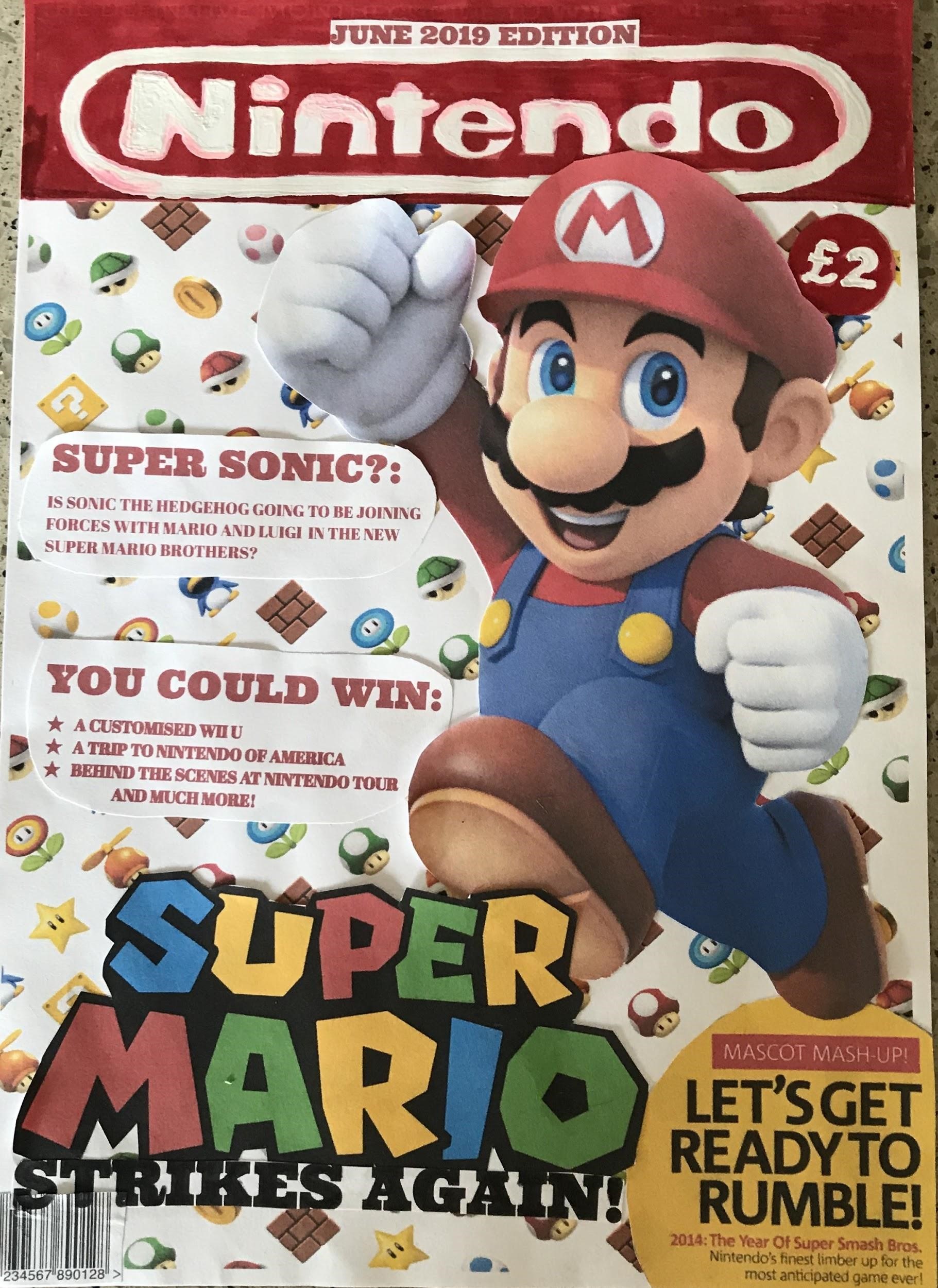
Prior to designing this magazine cover, I looked at the
covers of many Gaming magazines. After many attempts of creating magazine
covers, this one I decided was my favourite. I decided to design the magazine
cover for the Nintendo Magazine. This cover is aimed at Older Children and Teenager
(between the ages of 10-24). I have designed the logo free-handed, with all
other features of this magazine being printed off. I have gone with a red and
white theme as they are the main colours of the Nintendo branding. Red and
white also I find looks quite appealing together because the red is quite dark,
and the white colouring used for the title makes it stand out from a distance.
I have included a date line, which is written in red to fit in with the colour
scheme of the magazine and I have also included it on top of the masthead
because I feel with its placement there, people will take notice of it.
The masthead is the name of the magazine. I have used it
against a predominantly white background so that it stands out. The masthead
also matches the colours on the main image. I have used red and white for the
masthead as they are quite bright colours and will stand out from a distance, thus
attracting the consumer’s attention. The Masthead is the Nintendo logo to
inform the consumer that the magazine is associated with the Nintendo branding
and franchise. It also is large to stand out and used on every magazine issue
so the consumers instantly know this is the Nintendo magazine. I have used
Mario as the central image on my magazine because Mario is the most famous Nintendo
Character and I find his red overalls make him stand out over my predominantly
white Mario themed background. I also used symbols associated with Mario (ie
coins and the power-up items) as my background behind the large image of Mario,
so the consumer instantly knows that this magazine edition is all about the
Super Mario franchise.
As my magazine is based on the Super Mario Bros Franchise, I
have used the Super Mario logo as my central image’s caption. This is so that everyone knows the magazine
is all about Super Mario Brothers. I have even included a yellow bubble with an
article that will appear in the magazine. I have chosen yellow because it
stands out as it is bright, it also quite closely opposite to red on the colour
wheel and yellow is a colour used within the Super Mario Franchise (Wario’s hat
and shirt). I also included the caption “Mascot Madness” as I find it is quite
catchy and the alliteration helps people to remember it, thus allowing them to
keep my magazine cover in their minds, making them more likely to buy it and
future issues.
Finally, I have included headings of articles. I have
written them in red to fit in with the Super Mario colours. I played with words
and came up with the heading “Super Sonic” by
combining the “Super” of “Super Mario” with the “Sonic” of “Sonic the
Hedgehog”. I have also included snippets of competition prizes available throughout
the magazine. I used the prizes that are more of a once in a life-time
experience in order to entice customers to buy the magazine to try and win
amazing prizes in future competitions held in future issues.
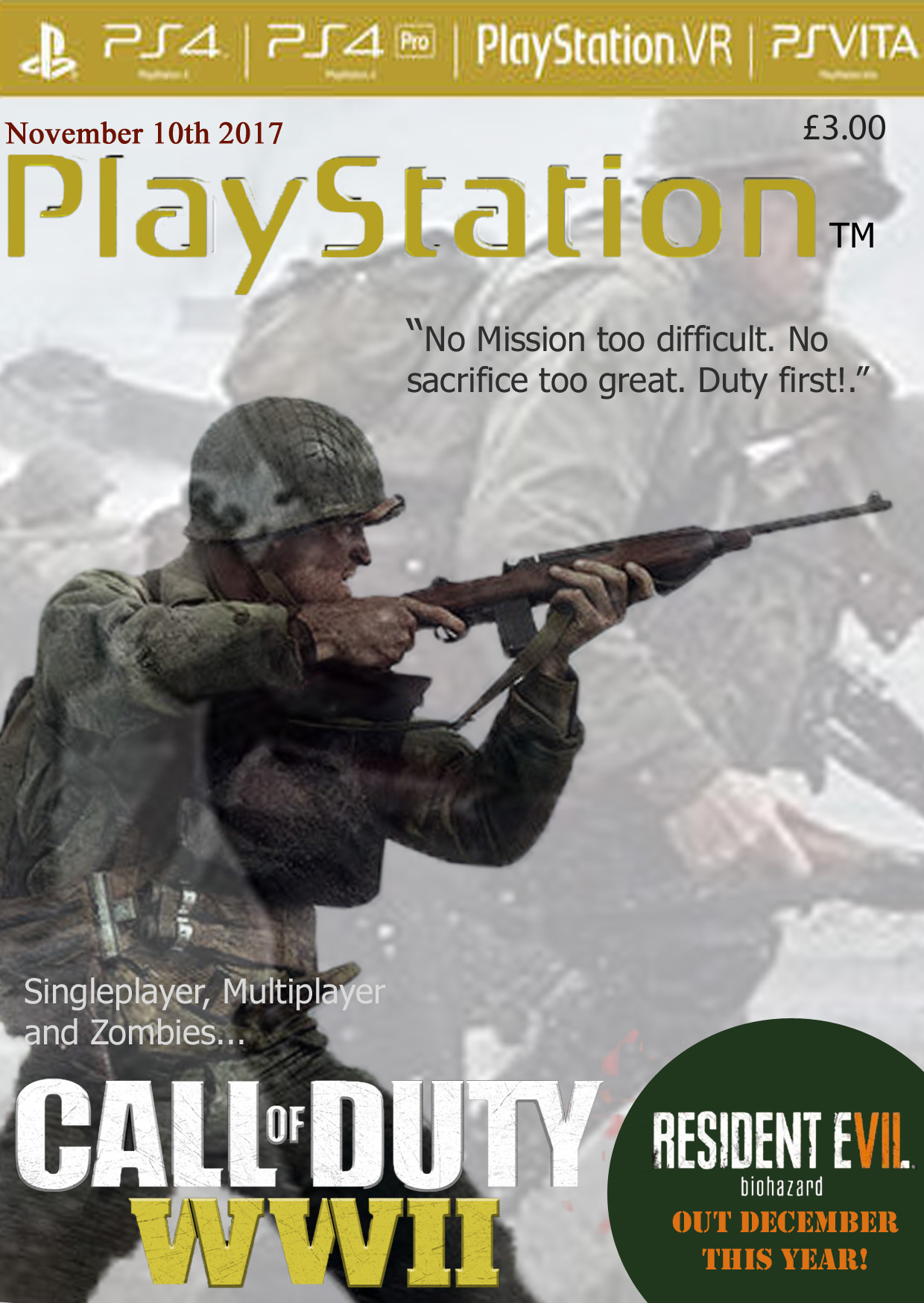
For my magazine idea I decided to
use the game Call Of Duty WW2 as I had just recently finished playing the game.
I decided for the main part of the cover to be the soldier as it conveys
multiple emotions to the viewer such as worry but also respect. In addition, I
reduced the opacity of the backup image (covering the whole page) as not only
does it give a slight insight of what the game is like to the viewer, but it
can also be viewed as a flashback or memory of the main solider.
As well as this, by using scary/
dramatic images to represent the game can also be used in order to attract some players who
like action, horror or historic based games. The phrase “No mission too
difficult. No sacrifice too great. Duty first!” Is also used widely throughout
the game in order to display each characters loyalty to the army and their
country; not only does this phrase also attract and interest the a new audience
to the game but also attracts people who may have already played the game as
they have an emotional connection with he phrase.
This magazine was mainly directed
at PlayStation [4] users, as it is a very popular console. I also tried to
maintain a compact/ similar colour patter which matched the colour scheme of
the ‘Call Of Duty WWII’ logo; therefore, using quite dull colours as well as
white and grey. This game was released on November 3rd, 2017. Which
is why I decided to add a date around the same time as the game would have been
in high demand. In addition to this, I also decided to advertise a game with a
similar thriller/action/horror theme also released only a month later. Too
highlight the advertisement and add a bit more colour to the page, I inserted a
green circle (in order to emphasise the advertisement as well as to add colour)
I then used the quick selection tool to cut out the name of the game –
‘Resident Evil(7) Biohazard.
The two main pictures covering the page, however, only represents the theme of the game and the campaign (story) mode which may not be as appealing to someone who enjoys online games. I therefore attempted to advertise more than just the story mode by mentioning the multiplayer and zombie game modes which the game also offers. As this is a magazine supporting and advertising PlayStation games, I also inserted a banner along the top which highlights other consoles/ add on such as VR that the company has also created to enhance gaming experiences.
Iconic Signs –
The soldier
The weapons
The soldiers outfit
Idexical Signs –
‘PlayStation’
The characters outfit
The fonts used in the top banner
The characters facial expression
Symbolic Signs –
The ‘Resident Evil’ advert
The yellow PlayStation sign links to the Yellow ‘WWII’
The ‘Call of Duty’ font
The ‘Resident Evil 7’ advert changes the colour of VII in order to emphasize 7