Summer task

Iconic signs:

  • People
  • Guns
  • Hand
  • War
  • Keyboard

Indexical signs:

  • All logos
  • PC gamer (shows that they’re pc games)
  • Guns

Symbolic signs:

  • Colours – Orange, green , black, white, red
  • Zombie (hand)
  • Words
  • Letters

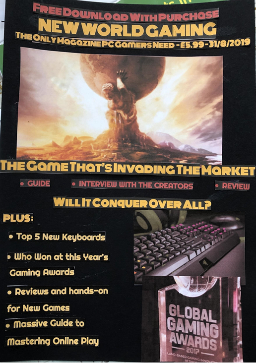
After receiving this task, the first thing I considered was which platform (PC or console), I would make my magazine cover for, I decided to go for a PC magazine. To convey this idea, I found an image saying, ‘PC GAMER’ and an image of the, ‘WASD’ keys, these two things make it obvious to the people looking at this magazine exactly what they’re looking at so they can decide if it’s right for them. The next thing I decided to do was to come up with a slogan to try to draw in the buyer’s attention and really capture the theme for the magazine, this slogan was ‘Get your game on’, I chose this because I believe that It can help to encourage people and motivate them to pick up gaming or re-connect with it if they have lost touch with it. 

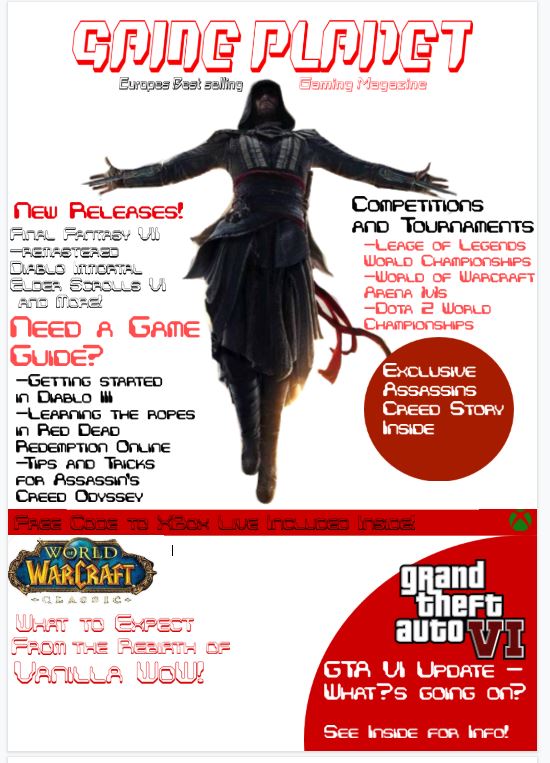
The next thing I did was think about the layout for the magazine cover, I decided that putting lighter colours such as white and orange over a darker base (black/grey). I chose this because I thought it would make the colours on the magazine pop and help to catch the buyer’s eye. After deciding on the initial layout and colour scheme, I then decided which games to show on the front cover of the magazine, to do this I thought about whether I wanted the magazine to be about a specific type of game, or whether I wanted it to showcase a variety of different games and different genres of games, I decided to include a variety of different genre of games in the magazine cover because I wanted to be inclusive and try to catch as many people’s interests as possible, the genres in the magazine are, shooting games (COD,battlefield, CSGO), battle royale (PUBG), and horror (Left 4 dead 2, Dead by daylight). 

When composing the magazine cover, I wanted to show a character shooting across the page, however this wasn’t possible to convey the way I wanted to, so instead I then decided to put the logos of the games. I didn’t want the magazine cover to look too digital (rows of pictures), because people want to see originality, and I wanted to be more artistic and less boring, so I decided that making some of the pictures/logos overlap with each other was a good idea to show this.  

To summarise, I made a list of different things I could include in this magazine cover to see what things I could come up with, in order to get inspiration for this I went online and looked at other gaming magazine’s to see what they did and I tried to make it look as professional as I could without making it look like I just copied someone else’s work. I tried my best to make an eye catching magazine cover that wasn’t boring and turn it into something that someone would actually buy and look at if they were interested in gaming. 

Induction Task

I decided to select FIFA as the theme of my magazine as it’s a very popular game worldwide and I’m extremely familiar with it. It’s a game involving 11 players on each opposing side and the objective is to score as many goals as you can within the duration of the 90 minutes. The intention players have who play the game have is, to keep possession throughout the game, try not to gain a booking from the referee and produce ridiculous skills to perform against the opponent to confuse them.

Firstly, in my magazine cover, my title is FIFA Global which is an eye-catching title. Why? Well, it addresses this magazine worldwide to grab the attention of more people to gain a greater audience. Therefore, the more people buying the product, then the more sales made. Due to FIFA being known extremely well worldwide, people will want to buy this specific magazine as the content contained inside will be relevant to players. For instance, new skills you can learn and practice to perform at a more advanced level. This will enable them to get better and become more experienced at the game.  

Next, the font. The fonts used in my magazine cover are, contrail one and bebas nue. Contrail one for the title and subheading and bebas nue for the rest. I decided to select these two fonts because an element of them stood out to me. They consist of all the characters being capital letters so, this will immediately draw the customer in as the title will be very easily noticeable. The font size all around the magazine is quite big because I want people to detect that it will be beneficial to helping gamers become better at the game.  

The three colours that consist within this cover are red, white and blue. These colours were selected because it makes the magazine look more interesting, stands out and makes it look exotic in the way the colours are presented. If all the cover was the same colour then it wouldn’t be attractive and not as many sales would be made. The product itself would not be very successful. The colours add initial flare to the magazine allowing more attraction. Bold colour is one of the simplest and most effective ways to grab a reader’s attention. It’s a fantastic element that needs to be included because it really emphasises the point you are trying to get across and lures the reader into examining the product.  

Finally, the background cover will fulfill the entire page which is very key. So, a good photo needs to be there otherwise no attention will be brought to it and no sales will be made. In my magazine cover, my background cover is a photo of Neymar Jr in game in FIFA. He’s a world class footballer so easily recognisable within the picture. The Paris stadium is featured behind Neymar to give the reader an idea of what the game looks like if they are wanting to learn or haven’t played it before. The background consists of Neymar performing a skill which can be done in game also giving the reader a feel for how the skill will look once performed.   

Media Summer Task

Gaming Front Cover and Statement of intent

ICONIC SIGNS: 

– Image of gaming character 

-image of game logo 

INDEXICAL SINGS: 

-Magazine title 

-World of Warcraft logo 

-GTA VI logo 

-Xbox logo 

SYMBOLIC SIGNS: 

-Titles  

-Subheadings 

-Puffs 

-Cover Line 

– Buzz words  

– Colour 

Media Studies Summer Task – gaming front cover 

The gaming magazine will be called ‘’Game Planet’’ as I am trying to make the magazine come off as well known and retro styled. For the masthead I intend to use 3D fonts that will look similar old school arcade game titles.For my front cover for a gaming magazine I plan to target the role playing games community as it is a broad audience which would perfectly suit a gaming magazine.To target the role playing games community, I have decided to use an image from the game ‘’Assassins Creed’’ as my main image in the front cover.The image will show a main protagonist from one of the many games that have been released by Ubisoft in a ‘’Leap of Faith’’ position.I am using this image because the exclusive story will be about the ‘’Assassins Creed’’ series and  its new and upcoming games .This will allow me to include other conventions around the image as it wont take up much space on the cover. I intend to make the front cover predominantly red and white as it will compliment the character shown in the main image as he is wearing darker clothing. In the bottom corners of the front cover I plan to include multiple puffs and teasers in order to affect a broader audience, for example I will include a second image with a game title saying ‘’World of Warcraft Classic’’ and a buzz word underneath it saying ‘’What to expect from the rebirth of Vanilla WoW’’.This will interest many people from the role playing games community as the re-release of the 2004 ‘’World of Warcraft’’ is a highly anticipated event happening this year in summer 2019.In the other bottom corner of the magazine cover I intend to use  a buzz word saying ‘GTA VI Update, What’s going on?’. This will interest a large amount of people as GTA has an enormous community Rockstars 2013s ‘GTA V’ has been expecting a sequel for a long time. I also intend to include a banner mentioning other gift codes for games, goodies and contests.The banner will say something along the lines of ‘free code to xbox live included inside!’’ . Along the sides of the front cover I plan to include conventions such as cover lines to feature what is inside the magazine. The cover lines will mention other new game releases such as ‘’Final Fantasy VII remastered,Diablo Immortal,Elder Scrolls VI etc’’, gaming competition and tournament stories such as ‘’Leage of Legends World Championships,World of Warcraft Arena 1v1,Dota 2 world championships’’ and guides to games like ‘’Getting started in Diablo III, Learning the ropes in Red Dead Redemption Online, Tips and Tricks for Assassin’s Creed – Odyssey’’ 

Media Summer Task

I have studied a variety of magazines already in the market place and have analysed and used the effective elements in my design, however adapting these conventions to enable mine to be unique having it’s own brand identity.   

I decided to use a house style or brand guideline of three consistently used colours to make my magazine stand out amongst the competition. I chose to stick to three main colours of red, black and yellow, which is my house style to make my brand recognisable and to give the magazine a uniform and organised look. As the audience is generally male I have steered away from traditional female colours such as pink. I chose contrasting colours for the background and text to make the text easier to see and to also make the magazine attract the interest of the buyer. 

In my research I found that gaming magazines are generally purchased by the 14-30 year old demographic, mainly male. I have therefore chosen colour schemes, text, images and enticing offers to appeal to this demographic. Therefore I aimed to advertise to a teen and young adult audience (14-30) and to attract this audience I used bright, contrasting colours and large, impactful fonts to catch attention to my magazine. I used large images to provide a visual representation of what the text I wrote was about (I used an image of a gaming keyboard next to the line on the cover about a list of the top 5 new keyboards. I also used an image of a gaming award next to the line about gaming award winners). I advertised a free download of a demo at the top of the magazine cover. These elements are present in many real magazines I analysed and they make the magazine more eye-catching to customers especially the free offer as it promises a bonus to buying the magazine that can sway a shopper slightly unwilling to buy.  

The requirements outlined a cover image and two other small images, which I have provided on the cover of the magazine and have also wrote lines about the contents of the magazine, conveyed by the images. The 5 cover lines, one main hook line and 4 minor lines link to the articles inside the magazine. I chose a unique and eye-grabbing title/masthead, “New World Gaming” with connotations of discovery and exploration which fits well as the magazine informs the buyer about new games and their quality. 

 With the main cover image I created a hook to the double-page spread that referenced the game and the genre of the game (e.g. “Will it Conquer Over All?” and “Invading the Market” are references about how the game is about war and conquest).  

My tagline is “The only magazine PC gamers need” which pinpoints how the magazine is about PC gaming and targets an audience of PC gamers. Standard industry practice is to include the price of the magazine and date of publishing near the masthead so I have analysed prices of gaming magazines and decided to set the price based on the prices of these magazines I researched. I believe that choosing this standard price will balance the cost of making the magazine and the revenue gained from selling it. 

Iconic signs: 

  • Image of Keyboard  
  • Image of Award 
  • Image of Game 
  • Image of Game characters 

Indexical signs: 

  • Image of Game 
  • Image of characters in the game 
  • Colours of text 
  • Colours of Background/images 
  • Magazine Title 

Symbolic Signs: 

  • Titles 
  • Text 
  • Colours 
  • Date 
  • Price 
  • Tagline 

Timeline

NEWSPAPERS: The first ever newspaper was printed in England, 1665.

MAGAZINES: Published in London in 1731, the first ever magazine was called “The Gentleman’s Magazine.”

RADIO: An Italian inventor invented the radio in 1895 as the first radio signal was sent and received.

CINEMA: First created by the Lumiere brothers in December 1895 in Paris.

ADVERTISING: Tobacco advertising was the first form of advertising in the 1920s.

TV: The television was first ever invented by an American inventor in 1927.

VIDEO GAMES: The first video game known to exist was created by a Physicist in 1958.

MUSIC VIDEOS: MTV was the first music company to air music videos, it was established in 1981.

INTERNET: First invented in 1983 by two computer scientists.