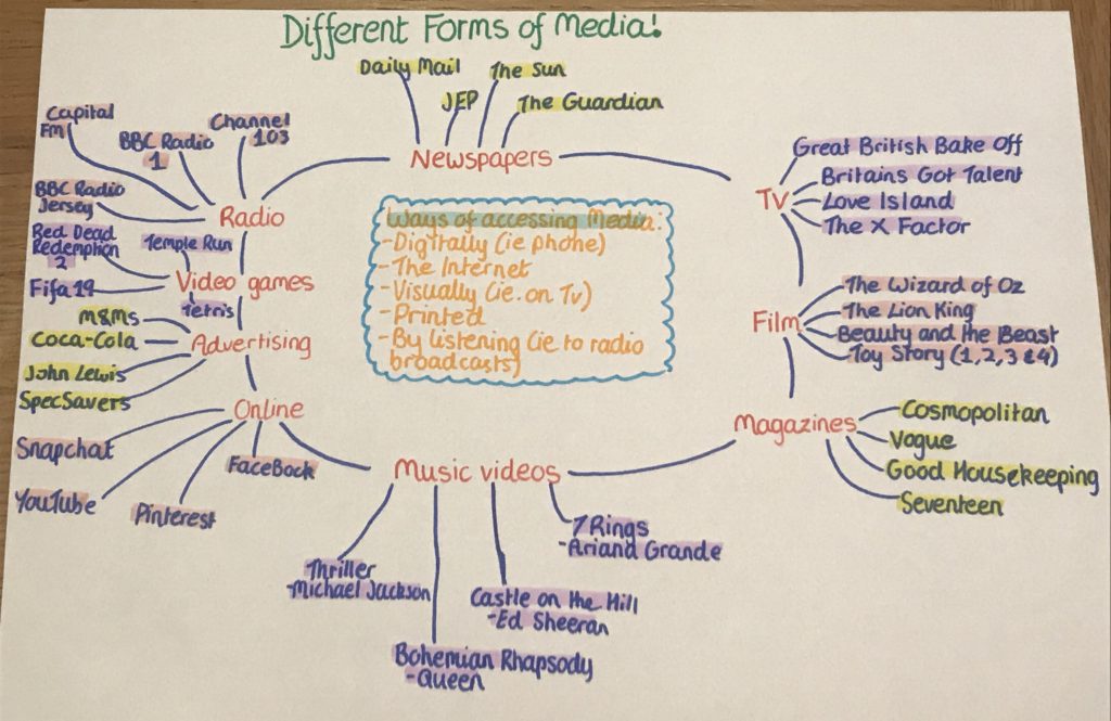
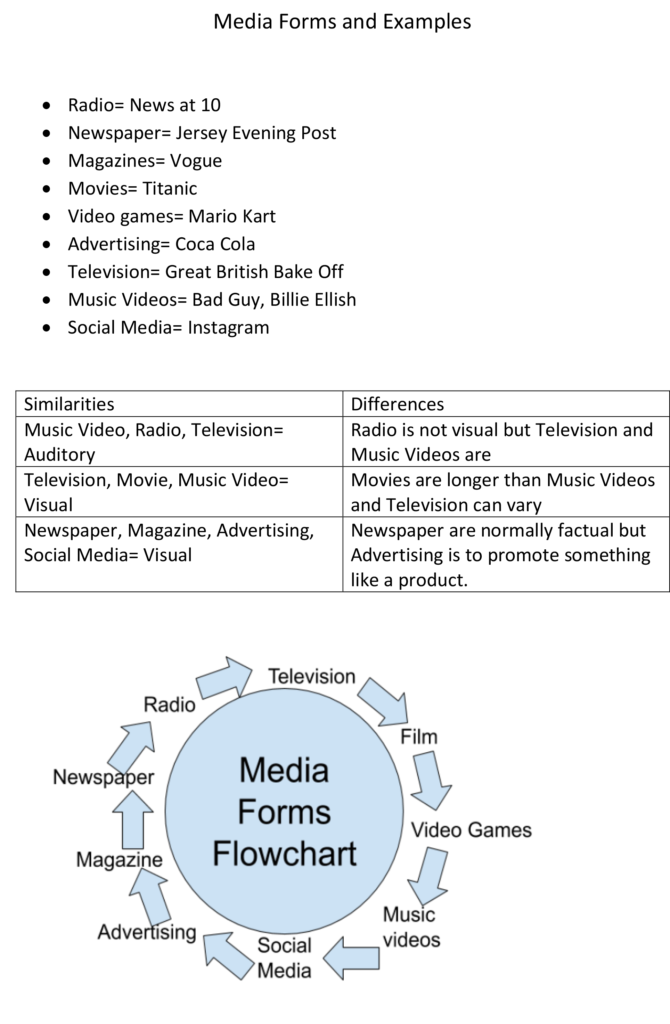
Different Forms of Media: Flowchart
Signs
Iconic Signs
Indexical Signs
Symbolic signs
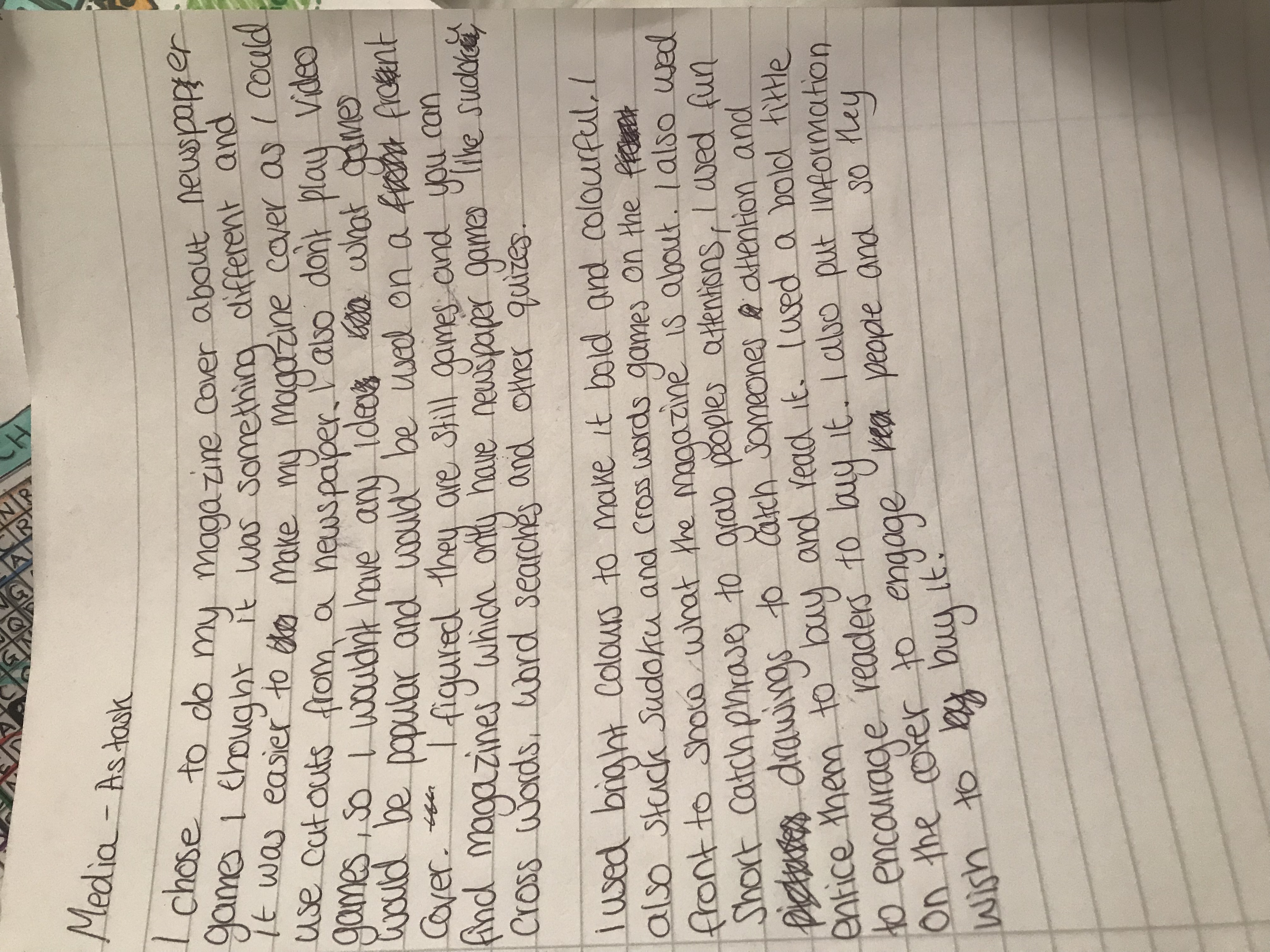
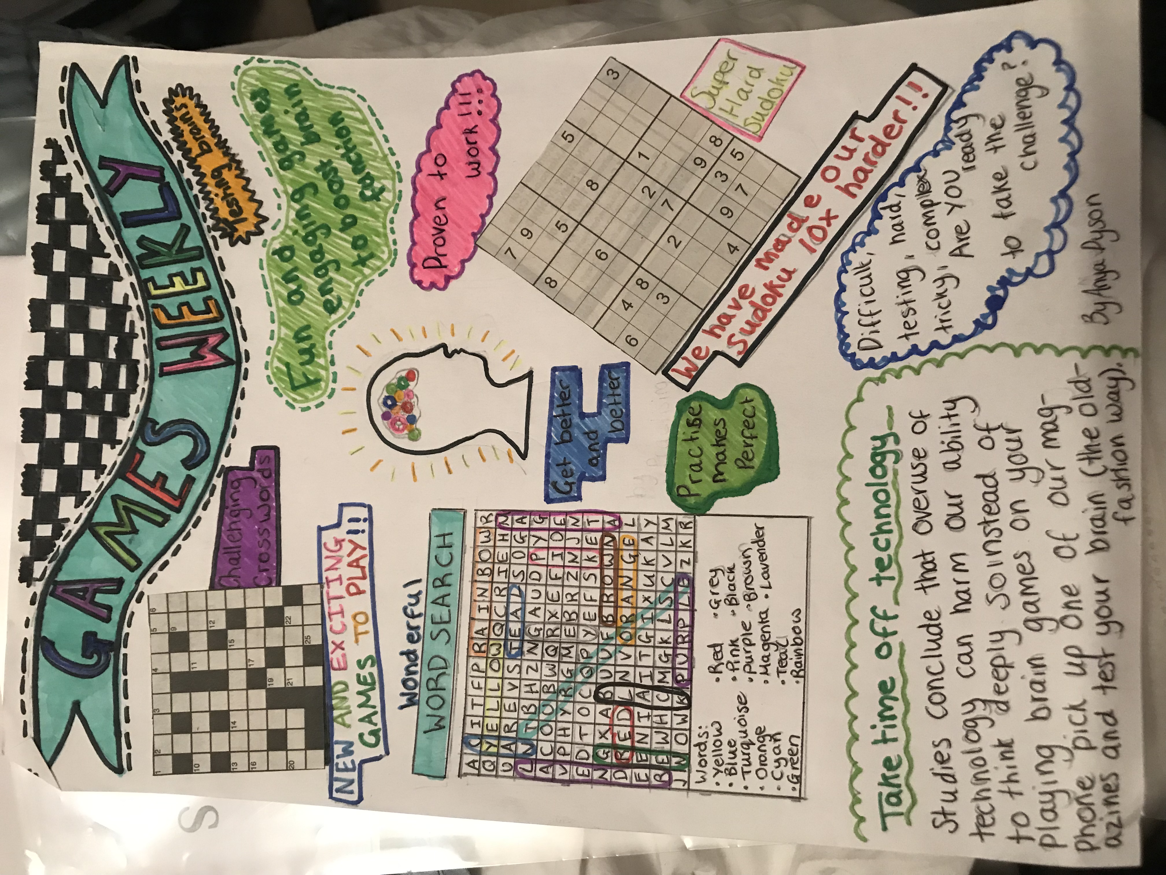
Summer Tasks – Communication of Ideas and Intentions
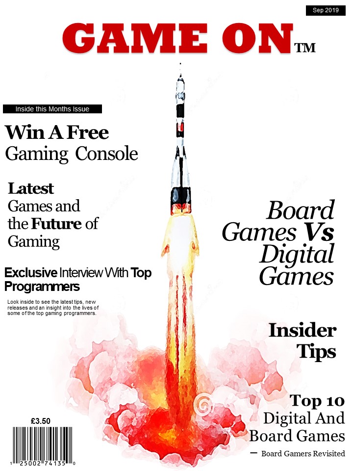
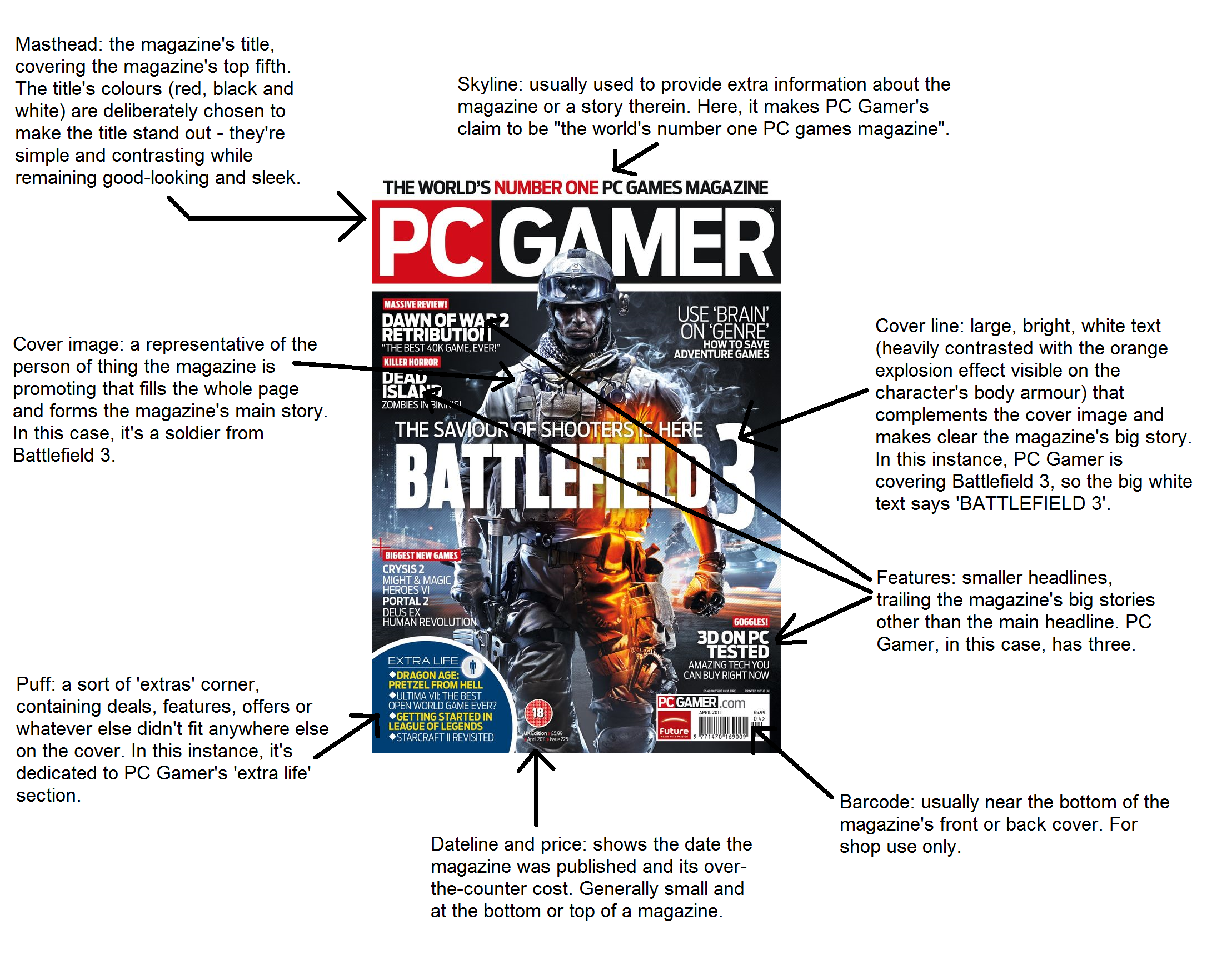
The title of my new magazine for gamers is ‘Game On’. I have named it this because it has alternative interpretations, for example the Gamer colloquium for the game has started as well as the continuation and future of gaming. I have made the title much larger and in a different font to the rest of the text with the intention of it standing out from a distance to try and capture attentions. It is bold and the colour red as red is a colour associated with fire, energy, danger, hate, strength/power, as well as passion/desire, and love, typical themes associated with modern digital gaming. It is located in the centre and the top of the cover with little other text around it so that it draw more attention to the title itself.
I have included a price of £3.50 and date on the cover as this magazine is intended to be monthly and issued on the 1st week of each month.
I have included many subheadings of article and information contained within that particular issue on the front cover. The items inside this issue are varied including a mixture of board gaming articles and digital gaming articles with constant comparisons of the benefits between the two. It includes tips and advice that might appeal to serious or armature gamers. Interviews with programmers which gamers or those with an interest in that particular field or career may find appealing. Competitions to actively involve buyers of this magazine, and luxury prizes to encourage more people to purchase the magazine. I have included this particular selection of articles on the front cover with the aims of appealing to a varied audience and trying to broaden the market of this magazine to encourage different interests and buyers of the magazine.
For all text, excluding the title, on the front cover, I have used the same font and colour. However, have varied the size and positioning of the text and put certain words in bold with the aims of drawing focus to the key words and inciting intrigue however, there is no particular order on structure to the size of text, only the explicit aims to make it varied and entertaining, such as gaming itself. I have used all black text on the cover to stand out from the background and title, it is a universal colour that is not heavily associated with either board or digital games as this magazine addition is equally focuses on both.
The background colour of the front cover is plain white, white is often associated with things that are brand new, (digital games,) however, can also be associated with tradition, (traditional games/board games). As it is plain it can represent the start of a game e.g. an empty board or new level etc.
The background image is a simple design of a rocket taking off an object off which could be associated with the start of a game or an object within a game. It is a simple, plain image so that its contents and headings are more focused on as that is the main function of the magazine.
Iconic signs – The head/brain – The check board at the top – Word search
Indexical signs – Sudoku is indexical to fun – Colours
Symbolic sign – Text – Colours
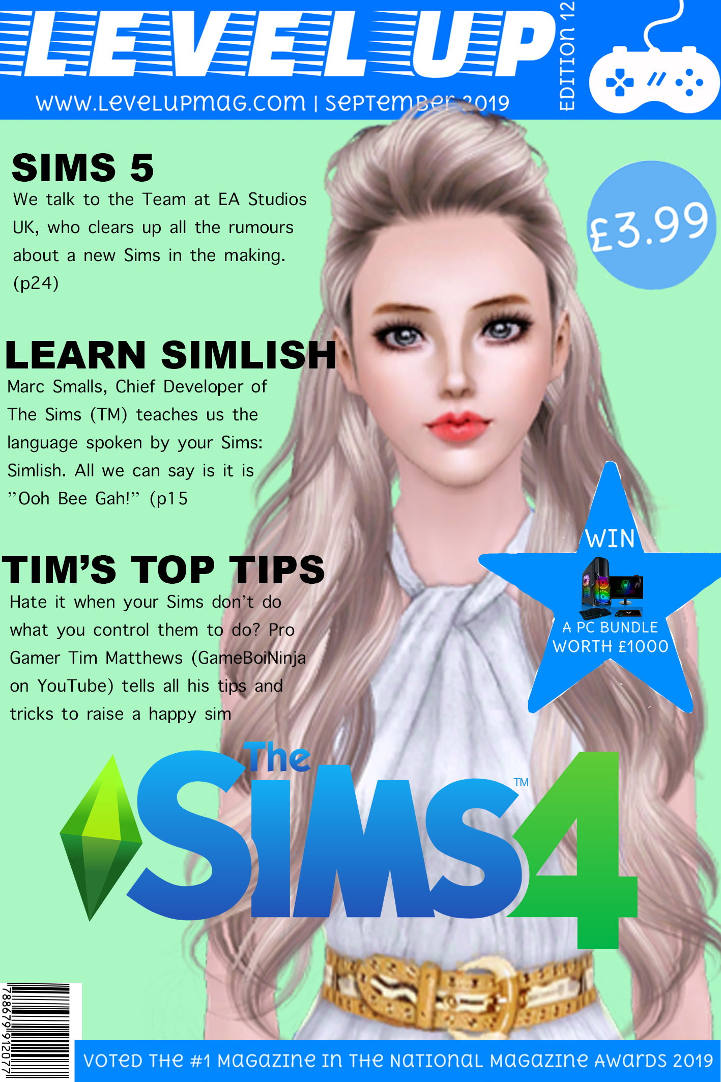
Sims Magazine Cover
This is my second attempt at creating a magazine cover for a gaming magazine. Before I started, I had a look at what I included in my previous magazine cover attempt and identified what I was missing and how I can improve. This magazine cover is based around “The Sims”. I have chosen to base mine on “The Sims” because it is one of the most popular games and it is also very famous, meaning people with instantly recognise the logo, hence why I have added it onto my magazine. I created my magazine cover in Photoshop and cut out bits of other magazines to use in my magazine. My magazine is based for Older Children and Teenagers (10-18years).
At the top is my Masthead, I have used the colours of the Sims branding (Blue and Green) as these colours look quite nice together and the bright blue stands out against my pale green background. On my masthead, I have also included the edition number and the date so people know when my magazine issue hits the shelves. I have also included the price, at (£3.99), which I think is quite reasonable as it entices children to buy it with what could be their own pocket money. I have decided to include a close up of a Sim as my main image, so from a distance people automatically realise this edition is based on “The Sims”. The Sim used as the central image is looking directly at the consumer as if they are trying to communicate with the customer. I feel the direct address makes the consumer feel included and more likely to buy the magazine as its as if they and the Sim are establishing a relationship.
I have chosen my cover articles carefully. I have chosen “Learn Simlish” (the language the Sims speak) as a bit of humour and to entice the reader to read on as I included a phrase of “Simlish” so they would want to find out the meaning. I also used alliteration with “Tim’s Top Tips” because at the age bracket my magazine is aimed at, kids want to succeed at a game, so I feel this article is suitable to out on my magazine cover. Lastly, I think the article about the Sims 5 is appropriate for the cover as it is an exclusive article. I also feel by mentioning the possibility of a new game, consumers are enticed to buy my magazine and to discover whether it is true or not. The “Sims 5” is a selling line of my magazine because if a new game is talked about, people are bound to buy the magazine to learn more about it. I have kept my cover lines quite vague to entice readers to buy the magazine and read on. Finally, I have a huge star shape with the word “Win”. I have made this quite large because I feel that promoting competitions with a prize worth loads of money will also entice consumers to buy the magazine.

To help you look at this post from my blog:
http://mymediacreative.com/blog/2019/04/18/semiotics/
When you study any form of communication (Art, Music, English, Maths, French etc) you need to recognise that there is a LANGUAGE that is full of signs, codes and conventions, organised around a grammar (a set of organising principles).
TASK 1: To investigate Language, let’s try to create one of our own! In one big group create a new sign that represents a new meaning – in other words, a single element of a possibly new complex language. Then in small groups develop 3 more signs (EACH PERSON IN THE GROUP) so that you then have about 15 new signs that form the basis of your new language. Make sure some of your signs are command signs (signs that get people to do things – sit, stand, greet, wave, nod etc)
TASK 2: Once you have developed some basic units of your new language, you will need to teach this new language to another group. Then let’s test the acquisition of this new language as a demonstration – ie communicating to each other in this new language (that is way command signs may be a good basis as we can see students responding based on the use of this new Language).
When we have created a new language through these practical activities we can then start to think about some of the theoretical ideas that underpin our knowledge of LANGUAGE.
My new gaming magazine is aimed at all ages and genders. I did this so everyoneis included and it is not stereotypically pointed at a certain age or gender. I didthis by making it gender neutral colours, like the colours white, black and a bit ofred. My intention of this magazine was to give it a clean, strong look so it is eyecatching for everyone. I decided to use Mario as the main focus of this magazinebecause this character is one of the most popular for all ages and also all thegames are a classic to play with family, allowing all ages to be included. As wellas Mario i included other well known characters on the front,this is so people canrelate to some of the most popular characters in gaming and may even be theirfavourites. By having someone’s favourite character on the front of the magazineit will make them want to buy it more.I made the text of this magazine in bold and all black to make it stand out topeople. I especially made the most important information bigger so people canread it a lot more easily. Such as the key intention of the magazine in this casemine was the top 10 games of the month and the official date of future games. Iput this information on the front because i thought it will make the audienceintrigued and make them want to buy it and find out more. I also included asection on the front about a competition, by doing this if gives the audiencesomething to get involved in and have the chance to win something. I made thename of the magazine “High Score” in bold and the biggest size so people canremember the title so they can buy the next issue. I named my magazine thisbecause it gives the message that this magazine will allow you to achieve a highscore and even the best score when gaming. By naming this it makes peoplewant to buy it and want to know how to achieve this by the tips included as I saidon the front cover. The title of my magazine explains exactly what people’sintentions are for gaming. Also I input a section about what the magazineinvolves on the cover so people know what they may be interested in or may notbe. In that section I included about that there will be tips for beginner andadvanced in the magazine which is important as it shows it that it doesn’t matterhow skilled you are there are tips for everyone who likes to game.In conclusion my intentions for this magazine is for it to be for everyone nomatter the age or gender, also for it to be bold and eye catching so people cannotice it. I wanted to have big bold statements on the front showing what isincluded so readers can know what is included and get involved withcompetitions and other interactions.
What is media ?
Media is a form of mass communication and is used to inform and influence people’s actions. Forms of media include : songs, videos, photos, magazines, newspapers, these could be used for persuasion.
What is media studies?
Media studies is the study of different types of media. It also shows you how to use editing software, such as photoshop or video editing software.
What is the point of media studies?
The point of media studies is to teach students how to use editing software. Media also teaches students to appreciate the work and effort put into media, such as advertising and music videos.
What am I interested in?
During my time of study media, I am interested in learning how to use editing software properly such as photoshop. I am also interested in learning more about how music videos are produced. During this course I also want to learn how media affects businesses and how they can persuade people to but their products.