My Magazine
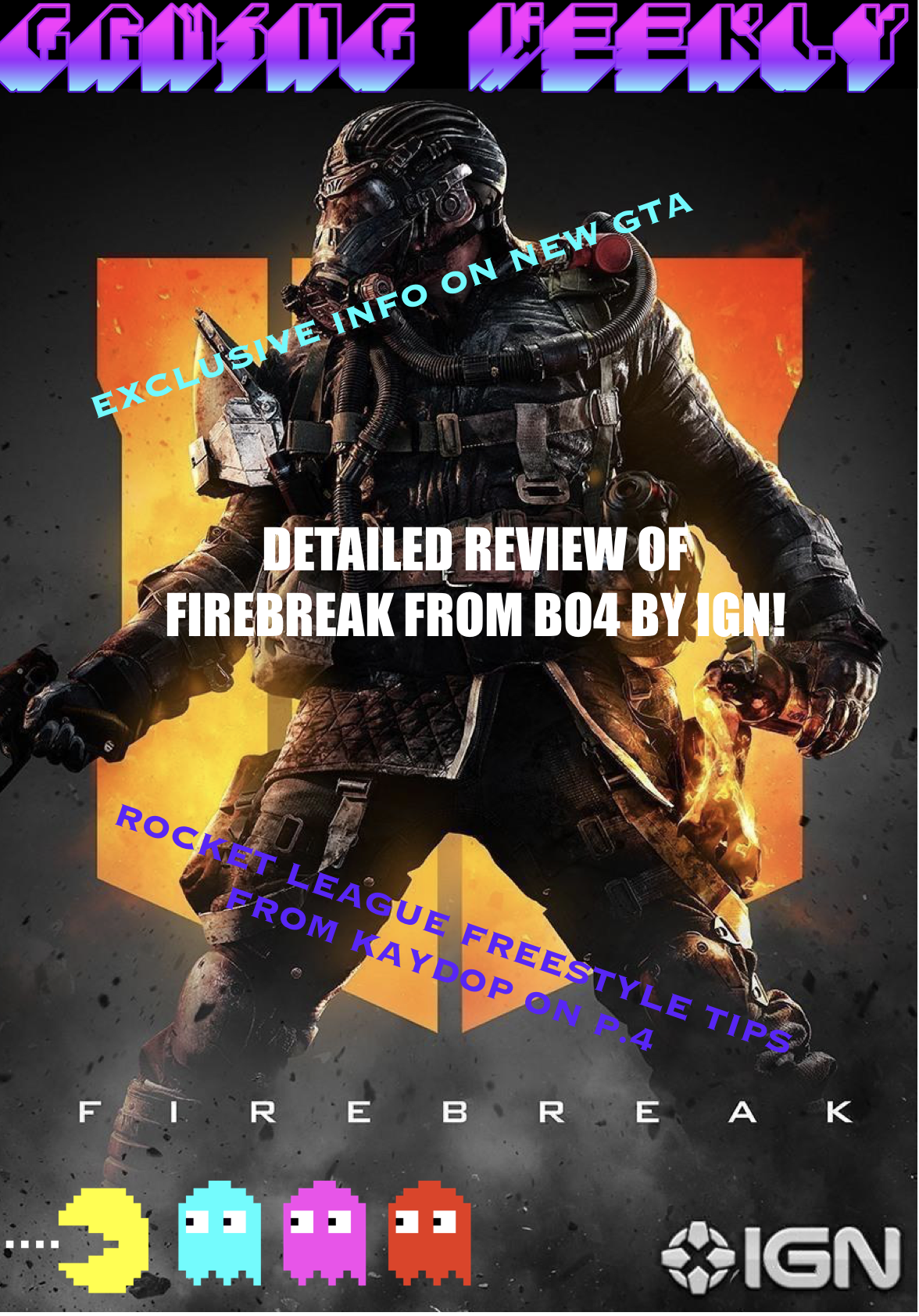
For my magazine I have decided the main focus was going to be around a new character for a game, so I decided to have the back ground as the call off duty black Ops 4 Logo with a picture of Firebreak on the front. To go with this image I have attached a small amount of writing saying ‘Detailed review of firebreak from BO4 by IGN’ so the customer buying my magazine will know what is written inside the magazine as it was my main focus I have centred it in the middle of the page and I have made the font size bigger than the other ones I also made the font white as I thought it would stand out more. Most magazine have titles and logos so for my magazine I decided to make a Pac man logo on 8bitart and put it in the left bottom hand corner of the page. For my title I went with something very simple and to the point ‘gaming weekly’ this allows everyone looking at it to know it’s a gaming magazine that comes out once a week and gives you information on the previous week’s games. I wanted the title to be bright and colourful to catch people’s attention as well as the logo.