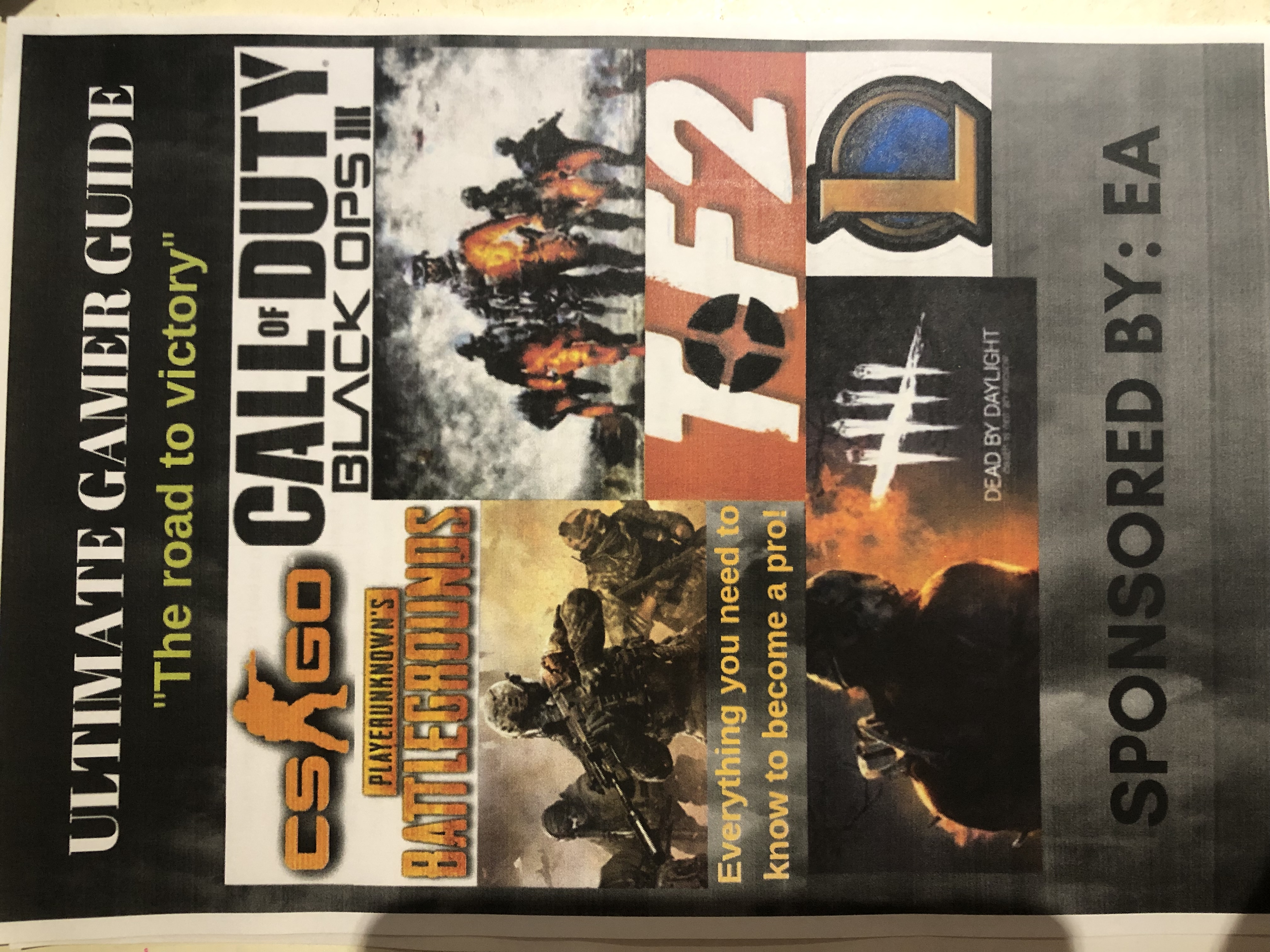
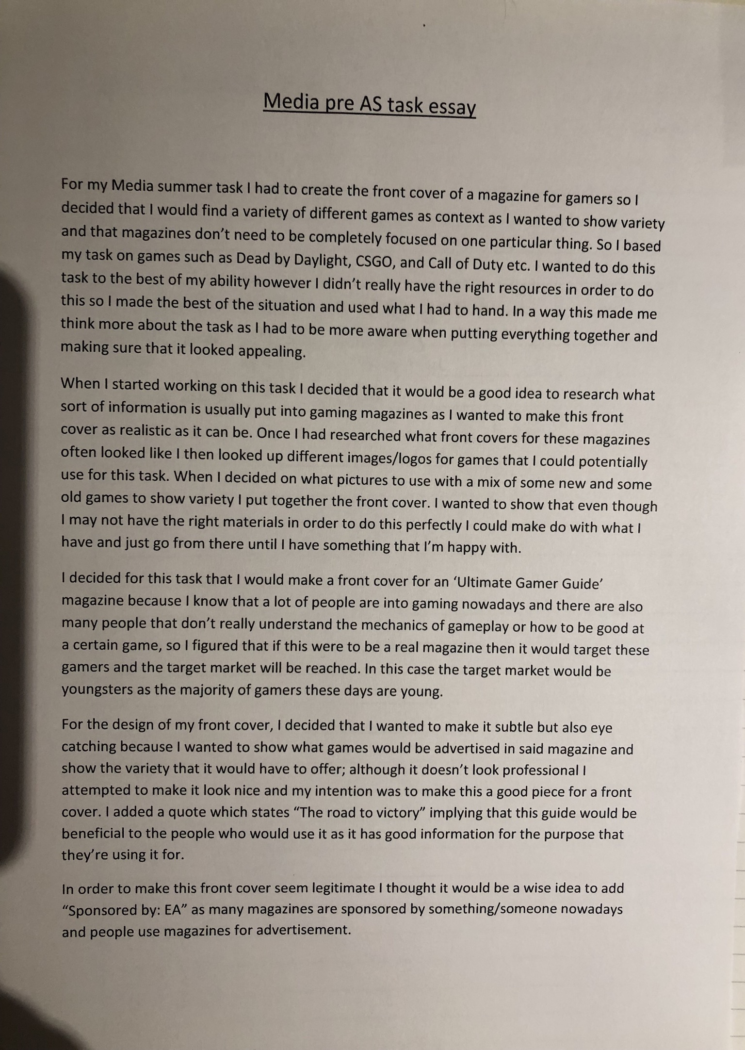
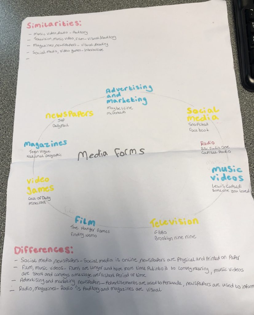
For my gaming magazine front cover, I have chosen to do it with a black background with a yellow stripe and a white triangle with white yellow and black writing as the theme as it seems to really stick out. The reason I chose black to be the background for my gaming front cover is because when I was researching online the magazine cover with a dark background and big bold writing stuck out to me so I thought I would do my magazine with dark background as well so when I do the core colours like white and yellow they will really stick out and hopefully this will mean my magazine cover will stick out from others because if it was really my magazine will have to be noticeable as magazines are a competitive market so you want your magazine to stick out so people will want to buy and read it.
For my text, I overlapped on some of the images when I was researching I found out that the majority of the gaming magazine front covers would have some sentences overlapping the images like for example I mainly saw them overlapping the name of a newly released big game in bold. The text colour of yellow in particular works well as personally I get reminded of games in a way, for example, the classic gold coin from Mario and with the black background it really helps the yellow stand out especially with the white.
For my images, I got a png of the few video game characters that came to my head at the moment of creating my magazine front cover and would seem to suit and stand out from the dark background. I did the Minecraft steve the picture in the bottom right the largest image as he is an iconic character and also Minecraft, as a game seems, is on the rise again and many more people have started to play it again like popular YouTuber “pewdiepie”. The image of the Mario gold coin also fits well into the magazine as I called the magazine “gamer deluxe” when you think of deluxe you think of top-grade quality expensive things like gold also the gold coin from Mario is also such an iconic game item as well.
The name of my magazine isn’t the most creative of names but it creates the idea that the magazine is high end as I mentioned in the previous paragraph you think of quality items when you hear deluxe and as if it was a real gaming magazine front cover you want it to be attractive to customers and you want it to have a nice ring to it rather it be something that sound technological or simply simple like I have done so when potential customers read it I want them to think its good quality and want to read it.

Iconic sign: wolfenstein, Doom slayer, Mario coin
Indexical sign: Minecraft title, box/ps4 symbol, doom slayers amour, wolfenstein military garb
Symbolic sign: bar code


