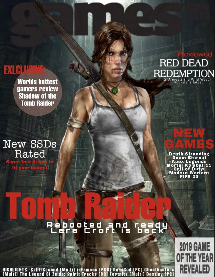
For my gaming magazine cover I firstly researched and found lots of other popular magazines so I could get a feel for what the style is like. I decided to use one gaming character as the image focus for the center, as many others had used characters, and decided on the female protagonist of Tomb Raider – Lara Croft. This is good for a magazine cover, as it attracts the customers attention, and anyone who is a fan of the tomb raiders will immediately be interested. The background I chose is also a scene from one of the Tomb Raider games, which further shows that Tomb Raider would be a focus in the magazine and is much more attractive than a blank background. I chose a dark colour for the magazines title ’Gaming TM’ as I wanted the focus to be the contents of the magazine, as that is what the customer is interested in reading. I thought it was effective to have the character cover some of the title, as it helps the cover to have a smooth finish, that it all blends together; however, I made sure it was still visible. I didn’t want the cover to be too busy so that it was able to be read clearly but tried to include multiple articles that would be inside, including a highlights list of games mentioned at the bottom, so it was still informative. I chose a basic colour scheme of black, red and white. I thought red would be a good choice for a magazine cover, as it is bold and bright, and therefore catches the readers eye. I mostly used it for the titles or headings so that they would be seen first and give a quick brief understanding of what was being advertised. As the background is darker, the white was much clearer to use and enables it to be read easily, I only used darker colours for the texts if they had a lighter background area. I also used different shapes as backgrounds for the two of the texts, a translucent red circle and white square. This adds more graphics to the cover, making it more interesting and covering more space. I also used all capital letters, which further makes those sets of texts stand out. If I were to continue my cover I would of made space and added a bar code to make it look realistic and ready for mass production and sale. I could also include another smaller image on a side piece to add some more graphics than only the center character, but I didn’t want this cover to look overcrowded, as I think a simpler cover with specific bold texts is more attention grabbing towards a customer.
Iconic sign = Lara Croft, Tomb, Square, Circle, Bow, Bandage
Indexical sign= Dirt (adventure) Weapons (fighting) Bandage + Blood (injury/pain) Water in background (rain/wet)
Symbolic sign= Red, Game titles, Numbers, Letters, Green, Vest top