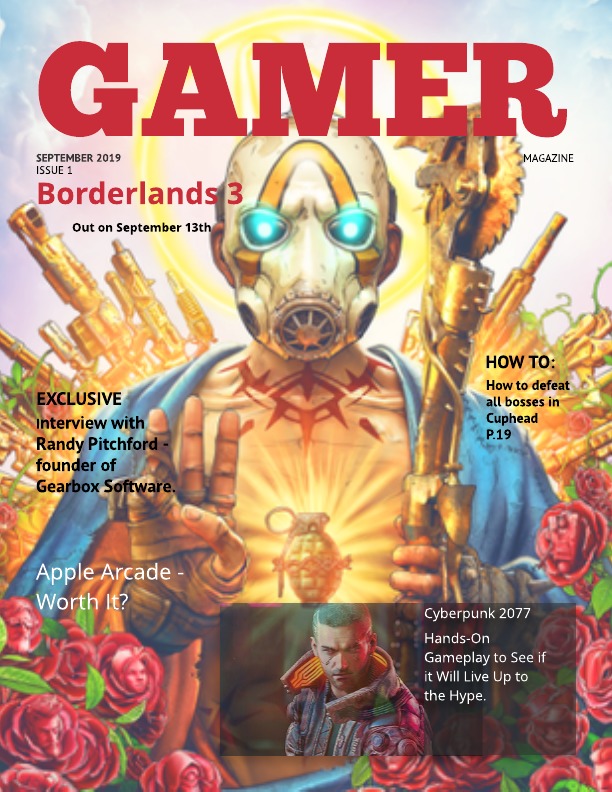
I chose my Borderlands 3 background because it is a game being released soon and a game in a series that I love. Also, I think that the striking character on the cover may draw in readers as they are staring directly forward with glowing blue eyes. My subheadings have different topics which convey other parts of the gaming industry with the newest ideas in the game industry, such as Apple’s new gaming ‘Arcade’ or smaller news on tips of completing harder games. I included this variety so that there are different things that attract different readers with different tastes. The cover includes another big game release news as gamers don’t all just play one game so only placing one game would mean that many are turned away by it so two well-known games mean more people are intrigued. The large bold font for GAMER (as a title) and BORDERLANDS 3 which means they stand out from the background, which is mostly yellow and blue, as red which draws new readers to the magazine as a strong warm colour. The red also matches the roses at the bottom of the colour which makes the poster more ascetically pleasing. I think the cover tells enough to lure a reader but not enough where they don’t have to buy it.
