Stanley Kubrick, as both a director and a photographer, has a very unique style to the way he directs. This is what is considered an ‘auteur’ style, as his own artistic flourish on the screen, along with the cinematographer’s work, of course.
ONE POINT PERSPECTIVE

Kubrick has a way of directing the eye to the most important thing on screen, through creating a single converging point in the center of the shot. This one specifically has an effective composition because the four characters which the eye is drawn to, along with the benches by their legs, create a horizon which draws together the vanishing point.
Alex’s face, despite being fairly plain, and half covered, is the main point of the screen our eye is drawn to, because every element of the shot points toward the centre of frame, even literally in some cases, such as the mannequins’ nipples. He uses this as a constant thru-line in all of his work, most notably in 2001 and The Shining, where corridors appear constantly through the film’s runtime.
SYMMETRICAL COMPOSITION

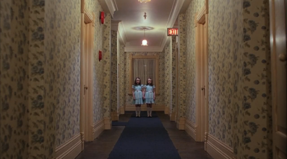
Directly related to Kubrick’s aptitude for one point perspective, is his love for symmetrical shot compositions; where the same image or images are replicated on both halves of a shot. This is often combined with the vanishing point, letting the converging elements frame the subject or subjects with a gaze which is drawn into the horizon through identical parts of the production design.
Making parts of a frame symmetrical in this way not only draws your eye into the centre frame, but allows for instances of uncanny, repeated subjects at the focal point of the shot composition; The Shining’s infamous twins, even the duo of Jack Torrance and Delbert Grady, or A Clockwork Orange’s uniform droogs, and many more. In all of these cases, the symmetry of a shot calls into attention not only the similarity between the subjects of a shot, but also the difference.
DEEP FOCUS

A holdover from Kubrick’s time as a photographer is his relationship with focus. Unlike more character-oriented directors like Fincher, Kubrick uses an extremely deep focus ‘wide-angle lens’ which keeps every element of the shot as clear and crisp as possible, which comes from his time in photography. Kubrick was heavily inspired by deep focus photographs from early wartime journalism, lending to his current style.
This feeds directly into the other parts of his auteur style, as he must use symmetry, lighting and perspective to highlight the important parts of the shot, as he can’t rely on simply sharpening and blurring points of the image.
LONG TAKES & STEADICAM

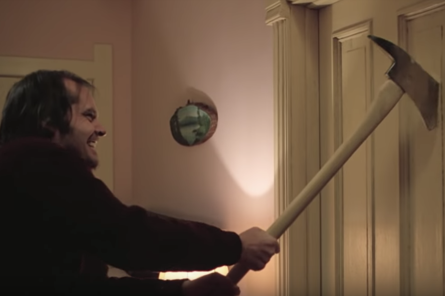
Another photographer-esque holdover that worms its way into Kubrick’s auteur director style is the use of a steadied, or tracking camera, often combined with the use of long, uninterrupted takes. His aptitude with both the still, framed and-painter-like shot and its moving, tracking counterpart both lend themselves to the lingering and voyeuristic presence of the camera inside his work – especially in films like The Shining where the watchful eye of the viewer goes an additional step to instill dread in the scenes.
The example above is perfect for this; as the camera swings back and forth, parallel to Jack’s ax as he breaks in the bathroom door to try and kill his wife and son. The motion in the long-take of the camera, coupled with Nicholson’s actual experience in ax-swinging from being a former firefighter, really immerses the viewer in the danger of Kubrick’s world, and lets us feel the ‘Shining’ that the hotel is manifesting against its residents.
CONCLUSIONS?

To capture Kubrick’s auteur style, or ‘Kubrickia’, as lovingly coined by film journalists the world over, would be to try and observe a pure and unadulterated experience. Kubrick’s style is at once a painting, panoramic and glorious, but also a stalking voyeur who follows the backs of real men and women. Kubrick’s camera is at once a phantom, and a living, breathing creature.
Kubrick’s style can be defined by turning the camera into a character in its film, giving the camera its own unique personality, way of moving, a more human way of seeing the world than most cameras are given – he lets the user fully enter the worlds he creates. The camera no longer simply views, but participates.
