Bladerunner – Effective use of Mise-En-Scene

My chosen scene from Bladerunner (1982, Ridley Scott)is very near the end. It is the scene where the replicant “Pris” is killed by Bladerunner “Deckard” In this scene many elements of Mise-En-Scene are used to create a very fitting effect for the scene. These elements include:

Light, sound, set design, character position and costume/makeup.


For example, in this scene there is a high contrast between light and dark, it is currently night-time and so it is very dark inside the building however there are random spotlights floating around. This contrast of light represents the contrast between good and evil. Pris and the other replicants being the ever-present darkness and Deckard being the light. This sets a mood for the audience and lets them who has power in each scene. At the start of the attack Pris seems to be in control, she has Deckard in a head lock and is inflicting a lot of pain. At this moment in time it is very dark constantly. However, soon after, Deckard shoots Pris. Now it can be seen that Deckard is in control and therefore there is a lot of flashing lights, the more he shoots her, the more the light flashes and the faster it flashes implying light overcoming darkness and Pris Dying.


Additionally sound is used to affect the audience. At the beginning of the fight there is quiet eerie music playing, This is signifying danger, later on in the scene when Pris is somersaulting over to Deckard she lets out a war cry-like shout. This then implies to the audience that there is more danger and this is proved correct when she manages to put him in a headlock and hit him. Finally, towards the end of the scene when Pris is being shot the is a huge amount of ambient noise as well as her screaming which then stops stops when she dies indicating that there is no more danger.


Not only that, but set design is a factor in Mise-En-Scene. This final scene uses an abandoned dusty building, This creates an effect of unpredictability on the audience as it is out of the ordinary and so anything could happen. Additionally the mannequins used at the start of the scene also create an extremely eerie effect on the audience as if there are many different people there and many possible enemies. Additionally the large amount of mannequins gives the audience something to look at and focus on since nothing much is happening, however later on in the scene the background is very plain and dark and we only get to see a few bits of detail on the all and floor. This is used to focus the audience’s attention on the fight going on and not the background.


Furthermore, we have character placement. Throughout the whole scene the actor; Ford, is the centre of attention however the character; Deckard is actually continuously being consumed by the darkness. This creates a sense of confinement and makes the audience feel uncomfortable as the actors actual position and the characters emotional superiority/ inferiority do not match up. For example while the actor is in main focus in each scene the character is constantly being beaten by the physically inferior character because of the emotional superiority she has over him. This also links to there being more darkness than light as mentioned before and how the Deckard must use his character’s emotional inferiority along with his actor’s physical superiority to overcome the ever present darkness. Only when Deckard shoots Pris do we suddenly see her in main focus, this also creates sense of discomfort because, although she is finally in main focus she has lost the superiority she had over Deckard and now has lost.


Finally the element of costume design really helps to create an effective scene because it accentuates the characters feelings and intentions. For example: Pris has very pale white skin with black and white makeup and a skin coloured costume. First of all this accentuates her black and white feelings. She is a replicant who is supposed to not have feelings, she is only supposed to have two feelings, life and death – light and dark. On the contrary Deckard’s suit is composed of many warm colours and his skin is full of red, this exaggerates his human nature and the complications and accumulation of colourful feelings he has. Secondly, the pale skin could represent the fact that Pris is going to die soon and therefore she does not have a healthy body or skin tone/texture. This juxtaposes with Deckard’s skin tone which as i said before is much more colourful and full of life representing the fact that as he is not a replicant with a short lifespan, he still has a long time to live theoretically and therefore looks healthier. In short Deckard is has a complicated and colourful costume where Pris doesn’t and this is because of Deckard’s healthy body and human nature (having all these feelings).

Blade Runner mise en scene review


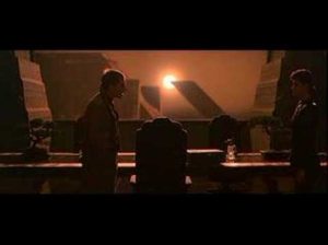
The lighting in this scene is high – key but it does not convey a positive mood to the audience because the lighting is really harsh and this tells the audience that the film is set in a harsh world and there is harsh light as a result. From a narrative standpoint , the lighting  shows how badly this world is polluted as the light from the sun seems to be unnaturally bright and distorted and this may make the audience feel  unsettled. Furthermore , the Lighting tells a story on it’s  own and it saves the characters from having to explain what had happened to the environment to the audience as they would be able to work out what had happened from the fact that the sky had turned black and from the context of the film and this helps to add to the story in an innovative manner


The costumes in this scene are reminiscent of the clothes that were worn in the 1940’s and this pays homage to the classic noir thrillers and Blade runner is part of the Neo – noir movement that was prevalent in the mid 1970s and early 1980s. Rachel’s hairstyle and makeup is also an homage to the old noir thrillers of the 1940s and she resembles a typical femme fatale that was a common archetype from films in that era and this may make the audience feel nostalgia due to all of the homages that are paid to the film noir style in the film and this helps to establish the as part of the Neo – noir movement , which was a movement that was inspired by the classic noir thrillers but it updates them for a more contemporary audience.

In this scene , the set design is very simple and it is quite understated and this may be because the costumes and the lighting are meant to draw the viewer’s attention and the sets are designed to add extra dimension to the scene by making the sets seem more realistic and this will help convince the viewers that what they are watching could be real. In addition, there are few props in this scene and this helps to bring attention to the characters and their motivations and it helps the audience to become emotionally  invested in the characters and what happens to them in the rest of the story and this is a pivotal scene where the relationship dynamics between the characters are being established so the minimalist set design helps to draw attention towards the characters. Furthermore , the set and prop design resembles decor that was popular during the 1940s  and this is in keeping with the noir style which Blade Runner pays homage to.

In this particular scene , Deckard and Rachel are placed at opposing ends of the frame ant this may indicate to the audience that  they might become enemies and this may also serve as a subtle hint to the fact that Rachel is a replicant  because Deckard is a Blade Runner and Blade Runners and replicants are sworn enemies and it is  unknown at this point in the film if Rachel and Deckard will become enemies because of Rachel’s status as a replicant . Rachel is supposed to look like the traditional femme fatal  and this scene helps to add to the ambiguity of her character , as ambiguity was a common facet of the femme fatal archetype  and the scene composition also makes her relationship with Deckard ambiguous until they enter into a romantic relationship and then the ambiguity fades.

https://www.youtube.com/watch?v=yWPyRSURYFQ


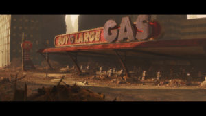
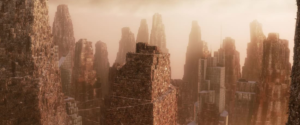
Example of good set design

I have chosen shots of the designs of a future earth from Wall-E.

Although this may not be a physically shot and acted out film, the design of the area or set is good as it adds to the effect of the narrative and suits the film perfectly, while serving as hyperbolic warning to humanity to keep our planet cared for.

What Makes A Film Good

This is my induction task essay where i describe how the accumulation of micro and macro elements can help to create a “Good Film”

Film’s can be deconstructed into macro and micro elements; Macro elements include genre, message and value, representation, narrative, style, authorship and theme. Micro elements include editing, cinematography, mise-en-scene and sound. In order for a film to be successful, these key elements must be well thought out.


For example with micro elements cinematography plays a large part, this includes camera angles and lighting and how scenes are captured to portray  the narrative as well as possible. Additionally, sound is very important, in general it is the sound in the movie that makes it seem real, whether it is a bone breaking or a wave crashing, if the sound is believable it will be more successful; with an audience.

Not only that but editing is also an important micro element. Whether it is the combination of scenes using transitions, the colour correction of a sunset or the c.g.i, editing is very important in turning a raw, unprocessed recording into a film.

Finally mise-en-scene, mise-en-scene is the arrangement of everything in a scene. For example, the setting of a scene can tell what kind of an experience one will have in it or how it can affect someone / something. If the scene is in the desert, you will expect it to be hot etc. Another part of mise-en-scene is costume, whether or not someone fits into the scene will reveal how they impact the community and how they may feel. A fancy person in a poor town will stand out and cause a sense of discomfort. There are many other attributes and elements of mise-en-scene but in general it is the amalgamation of elements in the scene that will help convey the narrative.


Next is macro elements, there are many macro elements so i will explain them briefly.


Firstly: Genre

The genre of a film is a way of categorising the film so that it can be advertised to different audiences. Different people prefer different genres and therefore it is all personal preference.

Secondly: message and value.

Many great films are great because of the messages that are portrayed and the values the characters are seen to have. This way the audience can relate to the characters but they may also learn a thing or two from the implicit or explicit messages in the film. These messages can be used to improve the community or to convey certain ideals.

Thirdly: representation

Representation is important because they are specific decisions directors make to create a unique story and directors can choose whether to represent stereotypes normally or abnormally so that their film may differ from other films.


Additionally narrative is important

Narrative is the story or plot of a film, it can be fictional or non-fictional. Good narratives have a beginning, middle, and end and show development to create differentiation.

Conjointly, style must be acknowledged.

Style is the way the film is presented to express ideas with a  different or interesting approach

Furthermore,

Authorship is an interesting macro element that helps make a film good.

Authorship is the state of writing, creating or causing. Ideally a good authorship would have a clear explanation to events in the film so that viewers may understand and yet also help the audience recognise the author by their style.

Finally: Theme

Theme in a film is all about having a basic idea that the plot and narrative runs off, different ideas can be conveyed in different genres by having separate themes. For example horror genre can have happy themes or scary themes. Themes can be more complicated than simple feelings and can relate to current world affairs. And in general are a way for producers to talk about similar ideas in an  alternate way. Therefore it is also similar to style. There is no such thing as a good theme and in fact, what makes a film good is how a producer or character conjoins a theme to a plot or idea so it may be portrayed in a desired way.


Spike Lee

Spike lee believes that only a person who has experienced events or has relation to the events can direct a film based on these events.

For example Django Unchained (Quentin Tarantino) is a film about slavery but spike lee says he simply won’t watch it because it was directed by a white man. Django Unchained has won all of these awards but spike lee still believes it isn’t a good film and not worth his time.


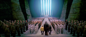
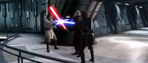
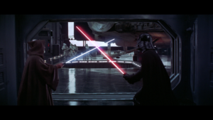
Set Design/Space (Star Wars, 1973)

The use of set design in this shot illuminates the surroundings of the characters in focus, and aids to maintain the verisimilitude, which is especially imperative in regards to the genre of the film being Sci-Fi and being made in the 1970s.

The backdrop has more than sufficient detail and creates the sense  of conflict with the Stormtroopers, adding layering of narrative within the scene.

Spike Lee View Point

Spike Lees view says that to tell a story around a political or racial view point you must belong to the group of people the story is about.

For example, a middle class white woman, in lees eyes, can not tell a story about working class black men. As she wouldn’t understand the struggles and hardships.

Do I agree?

  • To an extent, as although I believe they could tell the story in. a possibly successful way, they wouldn’t be able to tell the story with as much meaning and understanding as someone who comes from the same background as the characters he is telling a story about as if they come from the same background, then they will have special insight into how day to day life is for the characters of the story, in turn making the story more realisitic and relatable  to the target audience.