Category Archives: Uncategorized

Filters

Author:
Category:

Mise-En-Scene Example – Costume


Image result for gandalf

I chose this as a good example of costume because I think that it’s a good example of how the feeling of how the costume reflects the impression of the character in genres where the costume is really important like fantasy or science fiction

Film: The Lord of the Rings: The Fellowship of the Ring

Director: Peter Jackson

Year: 2001

Genre: Fantasy

Long take

A good example of a film which utilizes long takes is ‘Children Of Men’ (By Alfonso Cuaron, 2006). There is around three long takes in this film, which is a great achievement; considering how challenging they can be for a director to produce. It can be agreed that when done right, a long take can provide an interesting visual and can also be integral to the plot because it sets the tone. With action, thriller or horror genre; they can be used primarily to create suspense and keep the audience on the edge of their seat

However, despite the obvious pros, there can be a lot which can go wrong with a long take. They require lots of hard work, dedication and commitment to get right, so therefore I think that they should just be used if the director thinks it will work or is necessary

Since it is all filmed in one shot, everything comes down to timing. If an actor misses their cue, or a car drives in at even a fraction of the wrong second, the whole thing will need to be restarted. This can be frustrating for both directors and actors, especially if the take was working extremely well prior to the error. Long-takes require persistence and the ability to bounce back and continue onwards

There is also the possible issue of a lack of film. Some films intend on using long-takes but their cameras cannot hold enough film to make it work. A notable example of this is the film ‘Rope’ (By Alfred Hitchcock, 1948). Hitchcock intended for the film to have a continuous long-take, but the cameras could hold no more than 1000 feet of 35 mm film. As a result, each take used up to an entire roll of film and even lasts up to 10 minutes. In the end, the film consisted of only eleven shots

In this film, the usage of multiple long-takes were aided by CGI but still looked effective and worked well. Cuaron had also experimented with long-takes in several other movies including ‘Gravity’. Most of his work is influenced by varied different shots and takes which ensures that his work is as unique as possible. As well as the interesting plot, this film is mainly famous for it’s long-takes because of how unique they are. It is not a surprise that it grossed 70 million dollars at box office, due to its sucess

The Nun – Great use of Mise-En-Scene

“The Nun” (directed by Corin hardy, 2018) Is a horror film about a nun that took her own life and the death of which is investigated by a priest and a novitiate. Together, they uncover the “Order’s” unholy secret, risking their lives in the process. The Costume designer Sharon Gilham did an amazing job. The horrific makeup and costume for the nun created an extremely eerie atmosphere. Although this film did not have a large amount of cheap jump scares, it had a lot of psychological mind tricks that are arguably even more terrifying  than a jump scare. The costume design really helped create psychological  thrills and was very accurate. I’m sure many people are going to have the face of the demonic nun in their heads for a long time as the makeup was too frightening to forget.

Mad Max – Great use of Mise-En-Scene

A great example of amazing costume design is in the film “Mad Max: Fury Road” (George Miller, 2015) the English designer Jenny Beaven designed incredible costumes that turned regular people into vicious and relentless killers. Whether it is the use of makeup to make the “war boys” seem hollowed and concave or the use of costume to accentuate the horrible diseases these characters developed from years of being in this toxic wasteland, “Mad Max: Fury Road” earned Beaven her 11th Oscar nomination and is widely known as an incredible work of art.


Traits of a Film student

Knowledgeable: You must be aware of the world and the mechanics of objects to accurately portray them in movies.

Caring: You need to be caring to effectively implement a positive message within your movie.

Inquiring: You need to have a curiosity about the world around you and the world your creating through the movie.

Risk-takers: When making a movie or analysing one you need to be capable of finding features that may by uncongenial or could a theme in movies that may be considered inappropriate.

Balanced: You need to have equal focus on all aspects of a movie so all the mechanics work in harmony with each other.

Reflective: You need to be aware or observant in any flaws or shortcomings in your movie, so you can improve it and make as cohesive as possible. As well as being able to receive any possible criticism of your movie.

Principled: You should be consistent with your image and idea for a movie so you do not each up dramatically changing the plot and not finishing it on time.

Communicators: You need to regularly commutate your plans for your movie with your cast, so they know exactly how to preform there role and support your movie.

Open minded: You should be open and trying to unique ideas and concepts in your movie as to make it feel original and stand out compered to a lot of other movies.

Contexts for different movies

Historical films:

Toy Story: Innovated a popularised 3D animation, directed by John Lasseter

The Wizard of Oz: First movie to use colour, directed by Victor Fleming, Mrvyn LeRoy, King Vidor, George Cukor and Norman Taurog

Dr Strangelove: First movie to popularise the concept of political satire, Directed by Stanley Kubrick

Once upon a time in the West: Created a lot of the tropes frequently used in the western genre, Directed by Sergio Leone

Seventh Samurai: First Japanese produced film to find mainstream recondition outside of Japan. Directed by Akira Kurosawa

Alphaville: Popularised the genre of French new wave, Directed by Jean-Luc Godard

Art Films:

The shape of Water: A monster story inspired by some of H.P. Lovecrafts books, Directed by Guillermo del Toro

Submarine: A romantic drama about a boy trying to keep his family together, Directed by Richard Ayoade

Manhattan: A Woody Allen romantic comedy, Directed by Woody Allen

Love Simon: A comedy about a boy named Simon trying to tell his family he is gay, Directed by Greg Berlanti.

Mainstream Films:

Deadpool 2, A superhero comedy where the hero fights a cyborg, Directed by David Leitch

A bugs life: Pixar’s Second animated film about a group of bugs trying to fend of grasshoppers, Directed by John Lasseter

The breakfast club: A teen comedy about a group of people in detention, Directed by John Hughs

Battleship Potemkin: A Russian propaganda movie about a battle ship being revolted by the angry sailors working on it, Directed by Sergei Eisenstein

Fitzcarraldo: About a man getting funds for a opera house by smuggling rubber on a boat, Directed by Werner Herzog

This shows that there are a lot less Historical or innovative films being made, losing a lot of originality that could be found in early film. However there has been a dramatic increase of mainstream films recently like Deadpool 2 and A bugs life. However, this isn’t a bad thing as the quality of mainstream and art films like Deadpool 2 and The shape of Water have been constantly high

use of space in a film

My example of a good use of space in a film is this scene from Avengers: Age of Ultron

This use of space here is to show dominance and power in the character of Ultron.

This is done by having this shot seen below come in after Ultron has cut off the arm of the other character, Ulysses Klaw

This scene not only portrays ultron as a dominant character but also gives the audience a sense of his scale and size which again adds to this scenes portrayal of ultron as a large, scary and dominant character

Image result for age of ultron church scene

Film Classification

Name Date Director Genre Classification
Battleship Potemkin 1925 Sergei Einsenstein Drama/History Historically significant
Bugs Life 1998 John Lasseter Animated Comedy Mainstream Film
Shape Of Water 2017 Guillermo Del Toro Romantic Fantasy Art Film
Seven Samurai 1954 Akira Kurosawa Drama/Action Historically significant
The Breakfast Club 1985 John Hughes Comedy/Drama Historically significant
Wizard Of Oz 1939 Victor Fleming Fantasy Historically significant
Once upon A Time In The West 1968 Sergio Leone Drama/Action Mainstream film
Deadpool 2 2018 David Leitch Action/Comedy Mainstream Film
Submarine 2010 Richard Ayoade Melodrama Mainstream film
Love, Simon 2018 Greg Berlanti Comedy/Drama Mainstream Film`
Fitzcarraldo 1982 Werner Herzog Drama/Adventure Historically significant
Alphaville 1965 Jean-luc Godard Sci Fi Art Film
Manhattan 1975 Woody Alan Comedy Drama Historically Significant
Toy Story 1995 John Lasseter Animated Comedy Mainstream Film


Micro Elements


Micro elements

  •  Mise-en-scene
  • Cinematography
  • Editing
  • Sound


Lighting

In Seven the use of lighting keeps the audience on edge and even in the happier scenes they are still relatively dark and dull. In this scene they are having a meal and they are laughing but it isn’t a bright scene and this reminds the audience that there is still darkness in the film and this is just a small distraction.

Seven :David Fincher (1995)


Set design

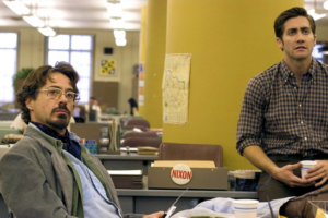
In the Zodiac, a lot of the film is shot inside the newspapers office where the 2 main characters work, I like how the film is focused on the paper rather then the police station like most murder related films. Also in the office there are papers scattered everywhere showing the chaos of the situation. During the scenes in the office the audience can be at ease knowing this is the safe environment and then it will skip to another murder scene

David Fincher


Costume

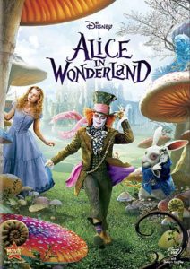
Alice wears a dress throughout most of the film which gives her a sense of vulnerability and allows the audience to sympathies for her.

Tim Burton


Mise-En-Scene Example – Set Design

Image result for enemy at the gates stalingrad

I like the use of set design in this because it shows that the city that the fighting is going on is ruined by war and that the fires show that the fighting is still going on or recent, In addition the smoke also makes it so we can’t see into the distance which may project a feeling a doubt and fear of the unknown.

Film: Enemy At The Gates

Year:2001

Genre: War Thriller

Director: Jean-Jacques Annaud