All posts by Erin C
Filters
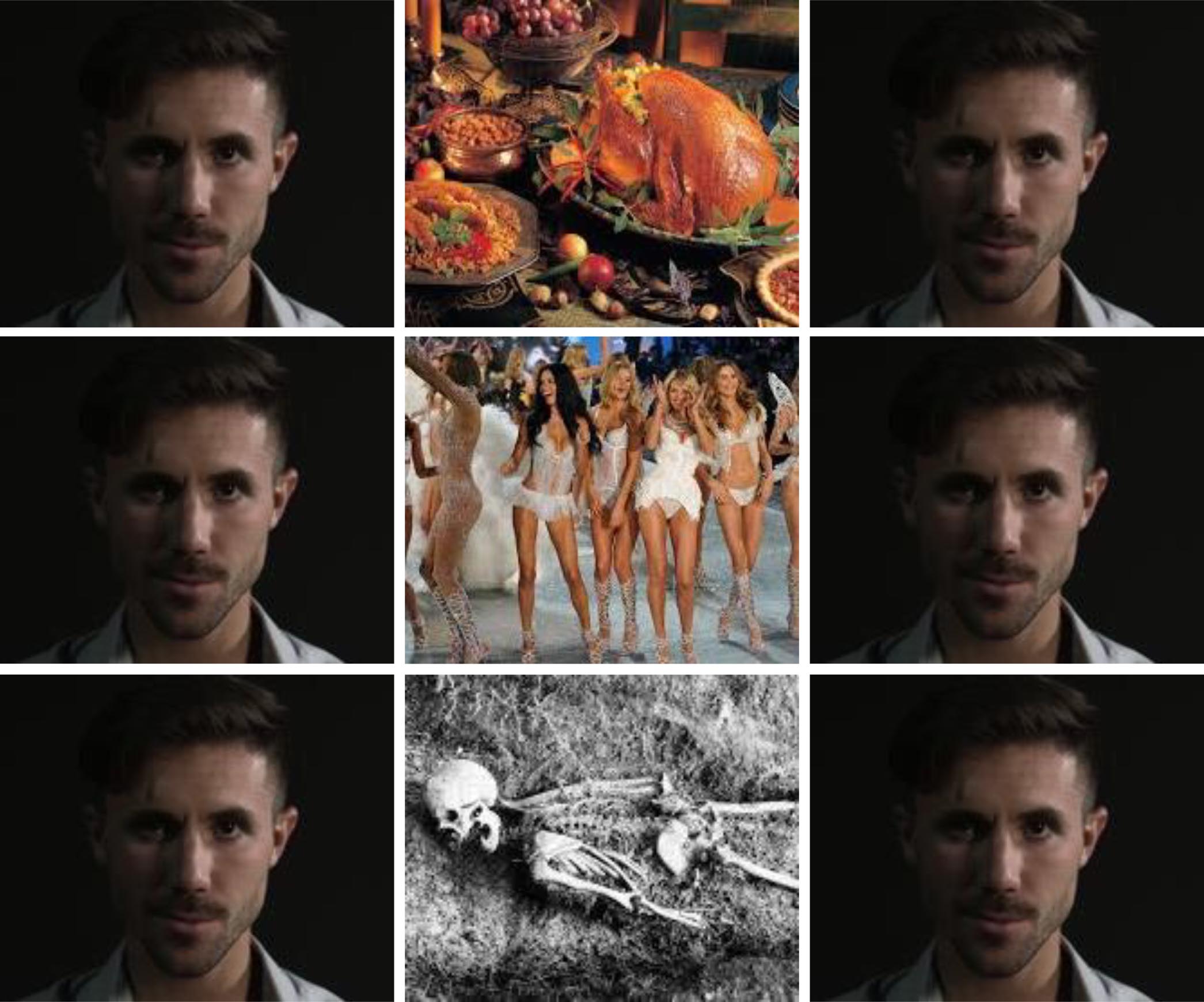
The Kuleshov Effect
Editing in Whiplash
Whiplash (dir. Damien Chazelle, 2014) is a drama about Andrew Neiman (Miles Teller) struggling to play in an orchestra, conducted by the abusive Terrence Fletcher (JK Simmons).
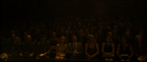
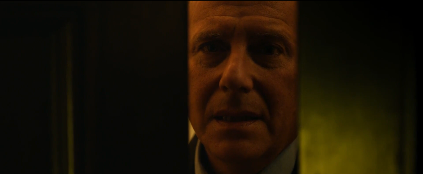
The end scene to this movie uses many different editing techniques to show Neiman’s performance on the drums, which all work together to create a very effective scene. For example, the scene begins with Neiman looking at the audience after he was humiliated by Fletcher. The shot first focuses on Neiman’s face, then cuts to the audience, and then back to Neiman’s face to show his reaction. Here, the editor has used the Kuleshov Effect to help the audience understand what Neiman is feeling in that moment. The shot of the audience is a wide angle, emphasising how many people were there to see Neiman fail. This makes the viewers realise how important this performance was for him. The structure of these shots help the viewers to understand how Neiman is reacting to being made to look like an idiot in front of all the people. The shot of the audience and Neiman reaction shot work together to perfectly present his feeling of failure for the viewers.
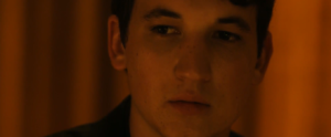
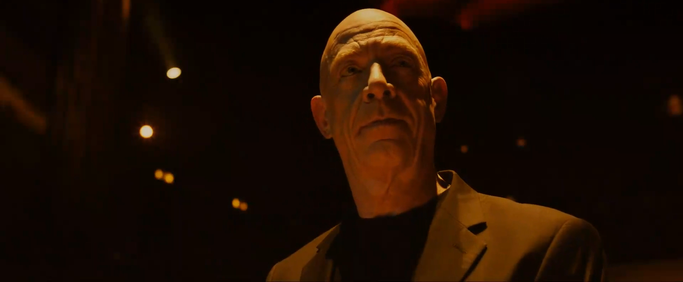
The scene later cuts from Fletcher’s face to Neiman’s face as Neiman walks off the stage. Their facial expressions are contrasting – Fletcher is smirking and Neiman looks very upset. This has been done so that the audience can understand how manipulative Fletcher has been to Neiman. The audience then sympathises with him, as Fletcher’s real intentions are revealed. These two shots have been edited together very effectively, emphasising its effect for the audience. It could be seen as an example of a matched cut, as Fletcher’s and Neiman’s faces are positioned in very similar ways. This helps to establish a strong continuity of the action, and amplifies the contrast between the two characters’ emotions.
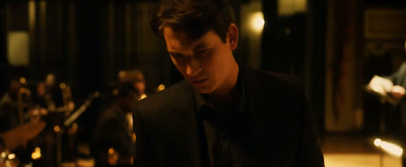
When Neiman starts playing the drums during Fletcher’s speech, the camera quickly cuts three times, each shot getting closer to his face. These jump cuts help to create the sense of determination that Neiman would be feeling at that moment. It also increases the pace of the scene, which makes what Neiman is doing seem even more risky. The camera then quickly switches to show Fletcher’s reaction, showing his shock and surprise. Again, this emphasises the possibility of danger that the audience could be feeling.
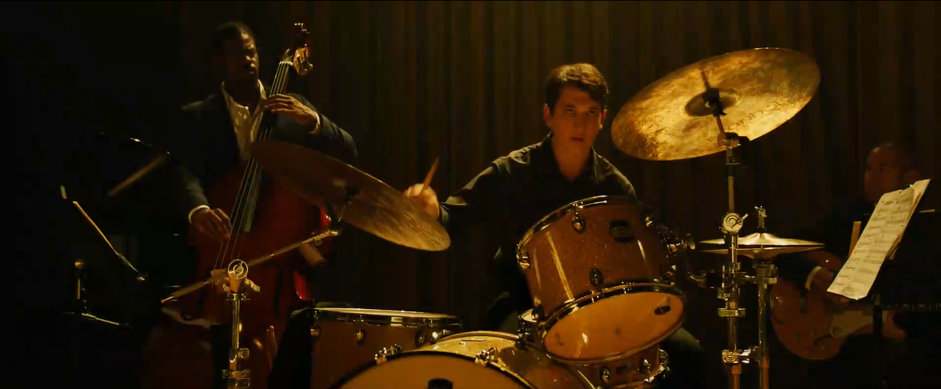
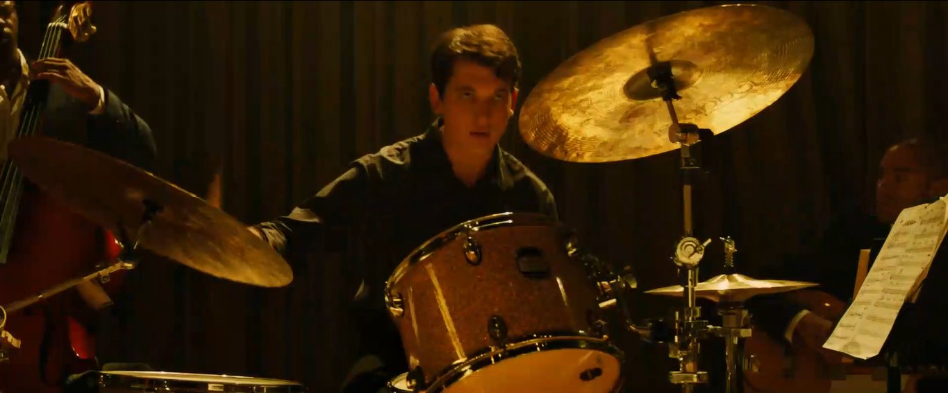
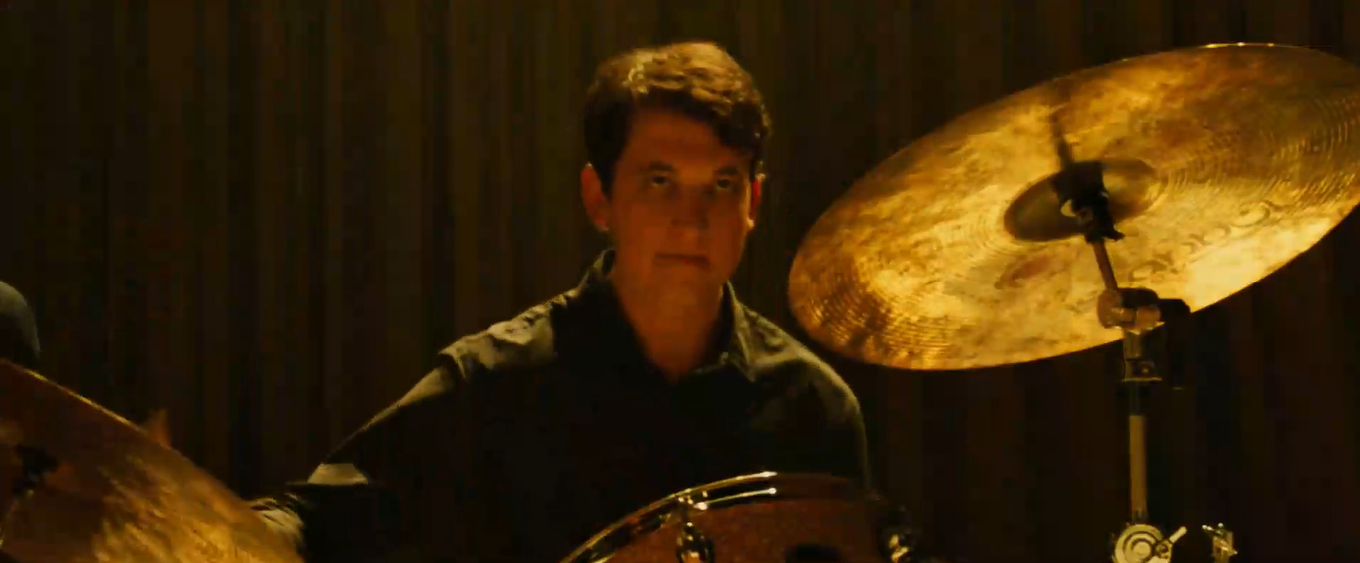
During the song, the camera cuts to different characters, showing their instruments as they join the song. These cuts are in time with the music, and make the scene seem very carefully planned. This montage of shots also includes cutting away to a high angle, allowing the audience to see the stage and orchestra in its entirety. This high angled shot is repeated again towards the end of the scene. Various quickly-edited shots of the orchestra are also repeated throughout.
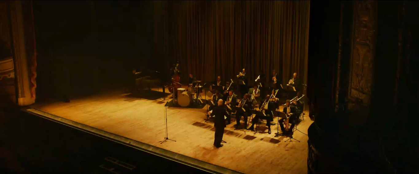
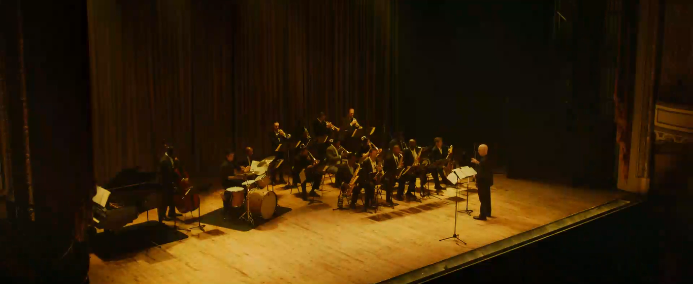
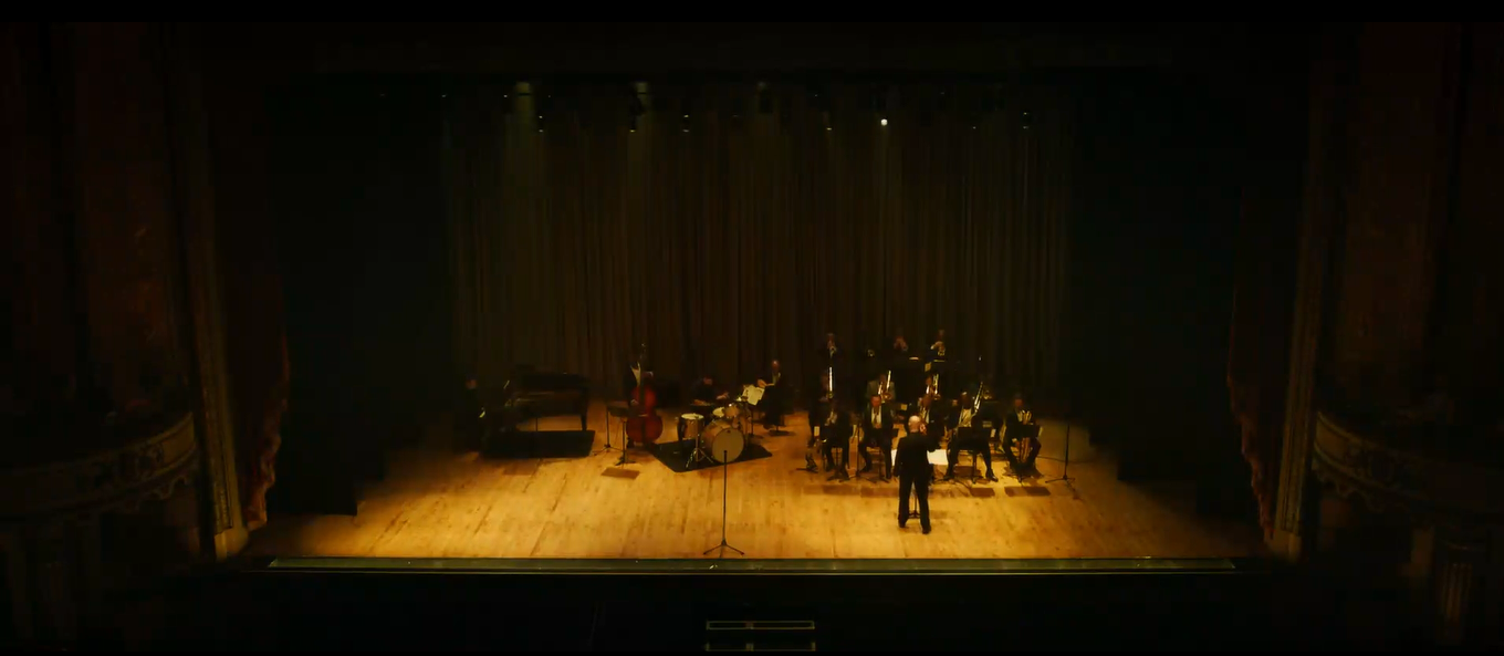
In this part of the scene, the camera doesn’t cut away at any point, instead choosing to quickly pan multiple times between the two points of action. This makes it seem like Fletcher and Neiman are working together, and sort of makes the audience think that they have ended their conflict. Also, the panning of the camera is in time with the music played by the orchestra, adding a sense of unity and control to this part. However, the longer shot makes the audience slightly uncomfortable, but it contrasts with the fast edited shots that came before it.
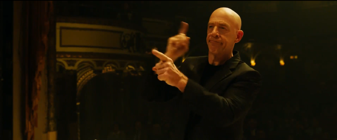
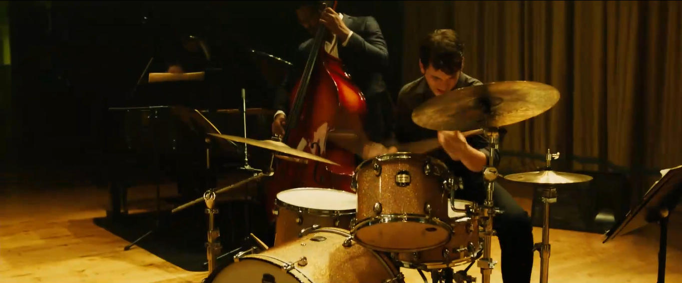
This section of the scene offers some variation for the audience. Instead of the camera focusing on the stage all the time, here it cuts away to show Neiman’s dad at the side of the stage, watching the performance. This cutaway shot reminds the audience that his dad is there, watching the entire thing happen. It also allows them to understand the scene from someone else’s perspective, as the shot cuts back to the stage after focusing on Neiman’s dad. This gives the audience the impression that they are seeing the action as his dad is seeing it, as it is a kind of eyeline match.
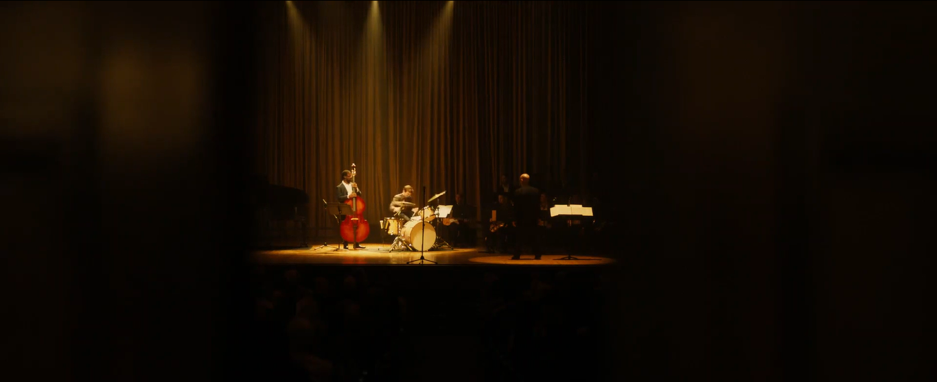
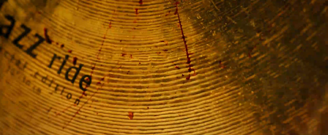
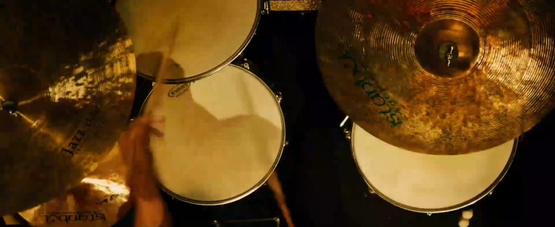
This heavily edited sequence comes right at the end of the final scene of the film. It shows a montage of different shots of Neiman playing the drums, focusing on parts like the cymbals and the bass drum. This is impactful for the audience, as it makes them realise how concentrated Neiman is to be able to hit all of the different parts of the drum as quickly as he is doing. The shot also cuts to show his blood on one of the cymbals – this shows how this performance is costing Neiman a lot of his effort. This is reiterated when the shot cuts back to his face, which seems to be in pain. This makes the audience sympathise with him, and makes his drumming seem more incredible.
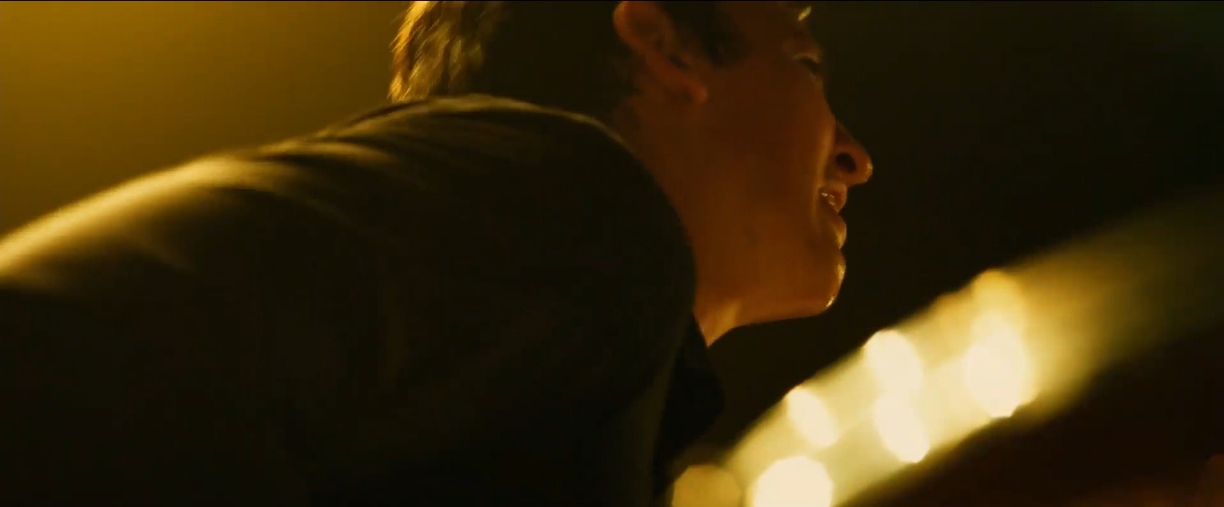
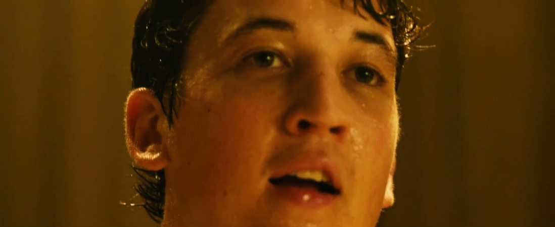
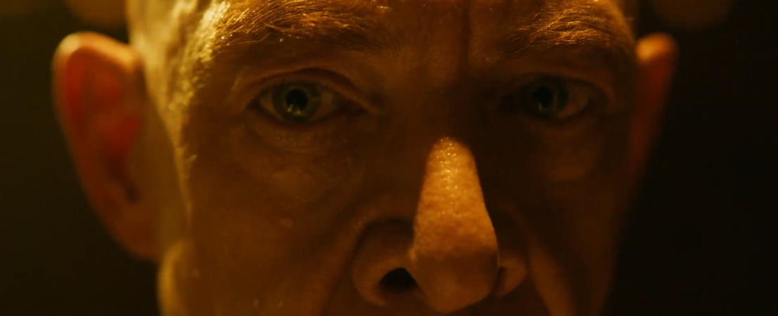
At the very end of the scene, there is a moment where Neiman and Fletcher stare at each other. This is another example of the Kuleshov Effect being used, like it was at the beginning of the scene. This time, both of their faces change in the second shots to show their reactions, rather than having the same expression. The smiles on both of their faces show the audience that Neiman has finally succeeded in making Fletcher happy with his drumming skills. This works as a good ending to the film, as it resolves the conflict that had occurred between the two characters, as Fletcher was abusive towards Neiman.
The Shining – Steadicam and Symmetry
Throughout this film the director, Stanley Kubrick, chose to shoot a lot of scenes using a Steadicam. This was new technology at the time, and Kubrick’s ideas helped to develop the camera even more. One example of a Steadicam shot in The Shining is towards the end of the film, when Wendy is running up the stairs, trying to find Danny after Jack has gone insane.
Here, the Steadicam shot helps the audience to understand Wendy more, as it follows her the whole time without cutting away. It increases her sense of panic, because the shot is sometimes very close to her face which allows the audience to clearly see her emotions and how she’s struggling with the situation that she’s in. Also, the Steadicam shot makes the scene more tense, as the smooth movement seems unnatural to the audience. This immerses the audience, and makes them feel like they don’t know what will be around the corners as Wendy climbs the stairs. The shot lasts for quite a while – longer than what audiences would typically expect from a film. Again, this gives the scene a sense of something not being quite right, which fits perfectly to the story behind the hotel and the strange things that the family have been seeing while living there.The camera does cut away at the end of this scene to focus on the man and the bear in the bedroom, reminding the audience of the weird things that have been occurring throughout the hotel.
In The Shining, Kubrick also focused on making many scenes symmetrical, where the audience’s gaze was directed towards a vanishing point at the center of the screen. This can be seen in this shot with Jack and Grady in the bathroom during the party scene.

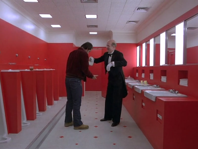
The two men in the center of the shot are symmetrically placed, so that they mirror each other. Kubrick has specifically chosen to place the actors here as it creates a slightly unnerving effect due to the symmetry of the whole scene. The walls of the bathroom reflect each other, because of the nearly identical decoration that they both have – red walls and either sinks or urinals coming out of them. There are many others ways that symmetry is used in this scene, which comes together at the vanishing point in the middle, behind the two characters. Using such a symmetrical set has the effect of the audience feeling like something isn’t quite right, as real life isn’t normally structured in this very organised way. It also makes them start to think about how Jack is beginning to copy Grady’s actions, as they are standing in similar poses, and how he might go on to copy him in other ways. With the dialogue used in this scene, it helps the audience to realise that Jack is turning insane, and that he wants to kill his family – just as Grady had done years before. Kubrick has also used a deep focus lens, which means that everything in the scene is in focus at the same time. This makes the audience unsure of where they should be looking, despite the two characters directly in the center.
Activity 5 – Depth of Field
Depth of field is the range of focus in a shot – whether the whole scene is in focus or if the camera if only focused on one part. A shallow focus, also called a small depth of field, is when only one part of the scene is in focus while the rest is blurry and unfocused. A deep focus uses a large depth of field, so the whole of the scene is in focus for the audience.
An example of a small depth of field is in The Circle (dir. James Ponsoldt, 2017).

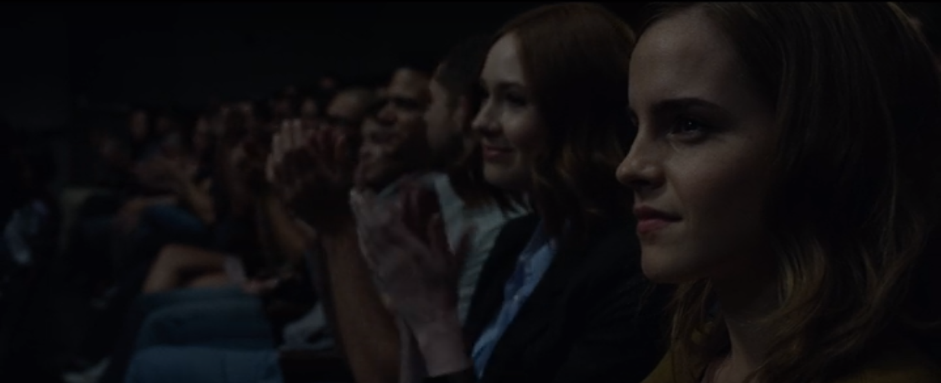
In this scene, only Mae is in focus, while everyone else sitting along the row is blurred. The director has chosen to use this shot so that the audience know that they should be focusing on her. This shot emphasises that she is the main character. It causes the audience to pay close attention to her face and her facial expressions, so they understand how they should be responding to the scene. This type of depth of field is used by directors in scenes when one character is important, and the audience need to be directed to look at them. It is useful because any irrelevant things that are happening in the background can be out of focus, so the viewers don’t look at it. If the director had wanted the audience to look at everyone in the scene equally, then he would have chosen to use a larger depth of field, so that they would all be in focus. This kind of depth of field is often used to show characters who all have equal importance in the scene. This means that the viewers will look at everyone rather than just focusing on one section.
Activity 4 – Camera Movements
Crab Left – Ghostbusters (dir. Paul Feig, 2016)
A crab left camera movement is when the camera moves left, showing the audience more of the scene. In this clip, the camera does a crab left movement at 0:28-0:32, when the camera moves over all four of the girls firing their proton guns. The director has chosen to use this movement at this moment to show the first main use of the guns in the film. It is a very powerful shot, and works very well with the rest of the scene, as it makes the audience feel like the girls have a new sense of power. If the camera had stayed fixed on the Ghostbusters instead of moving along, then it wouldn’t have given the same effect and wouldn’t have been as impressive to the audience.
Zooms – Shaun of the Dead (dir. Edgar Wright, 2004)
This scene uses a number of quick zoom shots, which each focus on a different thing. These shots give the audience a brief but specific glimpse of how average Shaun’s life is. It helps them to understand his character more, as the shots focus on more simple tasks in his morning, rather than anything majorly significant. It also creates a lighthearted sense to the film, as the audience wouldn’t expect a serious drama to use shots like these. These shots come near the beginning of the film, and they help to set the comedic tone that the rest of the film has. They also help to establish Shaun’s character to the audience, so that they understand the actions that he takes later on in the film.
Ped down – Psycho (dir. Alfred Hitchcock, 1960)
A ped down shot is when the camera moves down in the scene. In the famous shower scene in this film, the director has used a ped down shot to show Marion as she’s dying (1:24-1:30). The camera tracks her as she slides down the wall after being attacked and murdered. This shot has been well thought out by the director, as it emphasises her death for the audience, and makes it seem more real. It also helps the audience to sympathise with Marion and to be fully immersed in the scene. This shot follows her face as she falls down, which makes the audience feel like they’re experiencing the scene with her.
Activity 3 – Camera Angles
Bird’s Eye – To The Bone (dir. Marti Noxon, 2017)

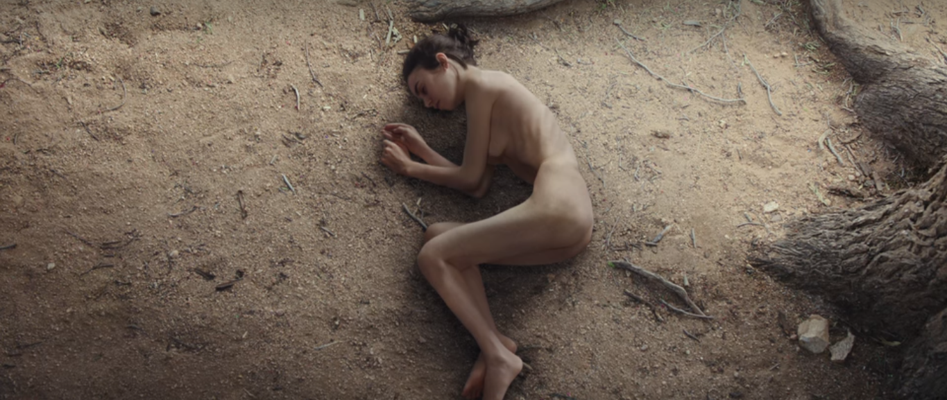
A bird’s-eye shot is when the scene is shown from a very high place, as a bird would see if it was watching. This particular scene is one of the most significant in the whole film, as Ellen realises what her body has started to look like because of her struggles with anorexia. The director’s choice to have a bird’s-eye view show this scene where she looks down at her body is very effective, as it reflects the out-of-body experience that Ellen is experiencing. This shot emphasises the shocking change in appearance that she has gone through in the film, and serves as a pivotal moment towards Ellen’s recovery.
Canted – Inception (dir. Christopher Nolan, 2010)

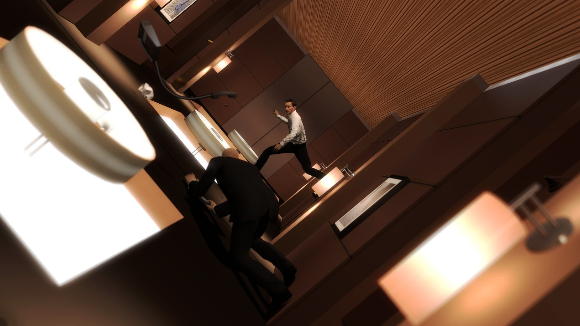
A canted angle is made when the horizon isn’t level, and it often gives the sense of something not being quite right in a scene. Inception uses a number of different shots in this famous corridor scene. The canted angle is created as the corridor tilts around, which is caused by the characters’ bodies swaying around in the real world. This shot helps to create a dream-like effect, which works very well in this part of the film, as it emphasises that none of this scene is really happening. It also increases the audience’s sense of confusion, as this shot makes the already weird scene ever stranger.
High Angle – Back to the Future (dir. Robert Zemeckis, 1985)

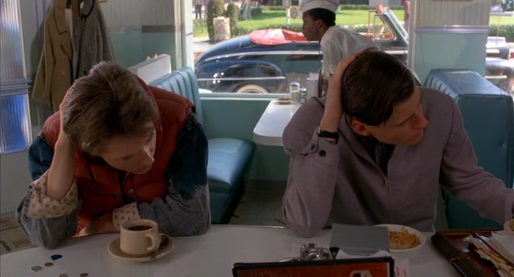
A high angle is a shot when the camera is tilted down, looking at the characters below. The use of the high angle in this scene is powerful as it shows the similarities between Marty and his father. From this, the audience can clearly see that it is his father, even if they weren’t aware of it yet, because of the way they are acting so alike. This angle also gives the audience a good look at the 50’s diner, so they can be fully immersed in the film. There are many details in this shot that help with this immersion – including the costumes, the style that the diner is decorated in, and the car outside of the window.
Activity 2 – Shot Distances
Long Shot – Star Wars: The Force Awakens (dir. JJ Abrams, 2015)


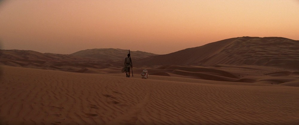
In this scene, Rey and BB-8 are the main focuses of the shot, as they are the only significant things in view. The use of the long shot helps to show the extent of the desert, to capture the mood of the scene. It is also a good way of showing the scenery, as the shots far into the distance help to immerse the audience into the idea of Rey’s life on an alien planet. This helps the audience to understand her situation, as she has been living on this desert planet for most of her life. The director could also have used an extreme long shot in this scene, but then the audience would have been more concentrated on the surroundings of the desert than of Rey and BB-8, who are the main focus here.
Close Up – Les Miserables (dir. Tom Hooper, 2012)
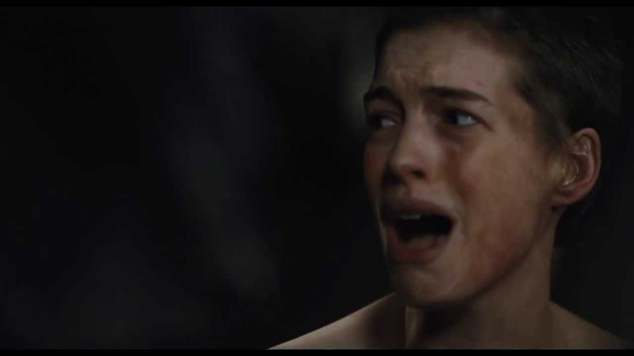

A close up shot is when the camera focuses on either props or characters in great detail. Throughout this film, there are many close-ups of different characters while they’re singing. This is an effective choice by the director, as it helps the audience to fully see the emotion in the character’s faces. For example, this shot focuses on Fantine, and it is clear to see the sadness in her eyes as she was just forced into the life of a prostitute and raped. This close up shot highlights the fact that she’s broken and has hardly any hope left within her life. If the director decided to use a different shot, for example a medium long shot, it wouldn’t have created as much of an intimate atmosphere and therefore, the audience wouldn’t have understood the intention behind the scene.
Medium Long Shot – Doctor Strange (dir. Scott Derrickson, 2016)

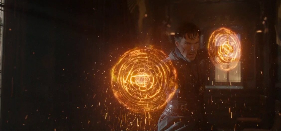
A medium long shot is a good way of structuring a scene as it allows a lot of information to be seen by the audience, while still focusing on the central character. This shot from the film allows the audience to clearly see Doctor Strange’s powers, showing how he has developed over the course of the film to get to this point. This type of shot also allows the audience to get a good look at the set behind the characters – in this case it is of the New York Sanctum. It shows the level of detail that went into the design of the set, to make it believable for the audience. However, it doesn’t show as much detail in the characters’ faces that would have been shown if a close up had been used instead.
Activity 1 – Diegesis
Diegetic film: The Wizard of Oz (dir. Victor Fleming, 1939)
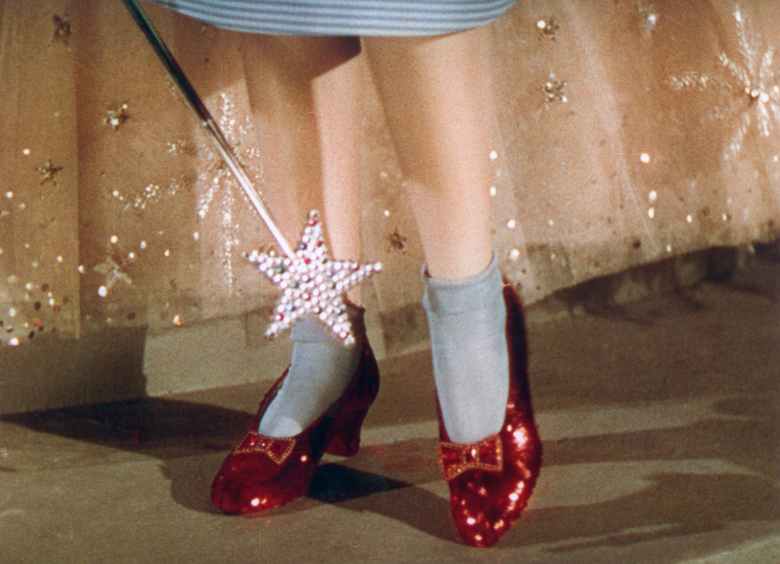
Diegesis is another word for the storyline that the film shows to the audience. The Wizard of Oz is a very good example of a diegetic film, as it creates a very believable world through the costumes, sets and camera work. Throughout the movie, many different props or scenes are carefully focused on to highlight their importance to the audience. For example in this scene, Dorothy first gets the ruby slippers and the camera changes to focus on them. This brings them to the attention of the audience, and helps them to realise their significance to the rest of the film.
Intra-diegetic film: The Blair Witch Project (dir. Eduardo Sanchez, 1999)
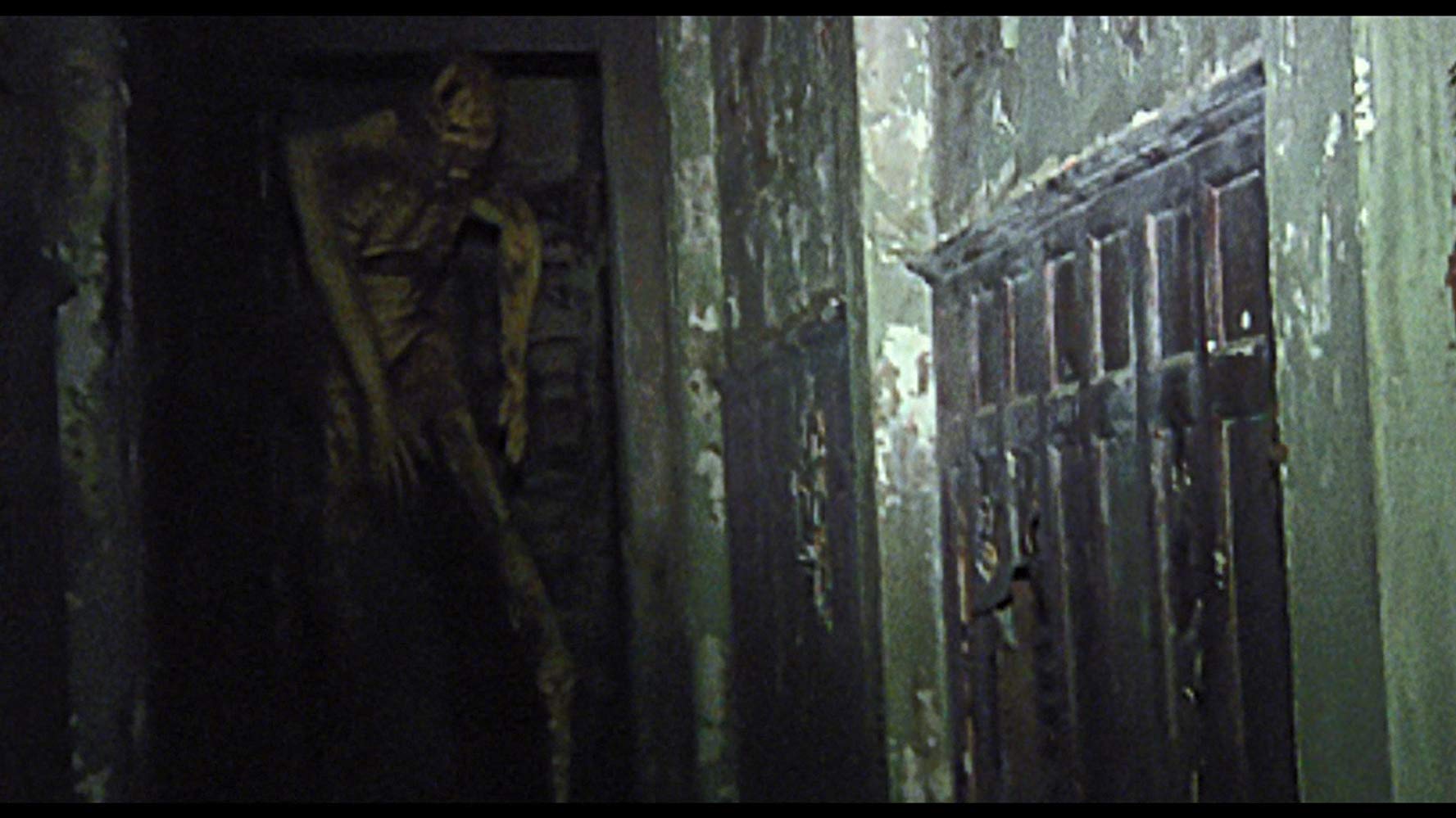
This film was filmed to look like found-footage, which suits the horror movie genre and adds to the tension created. For example, in this scene the monster comes towards the characters, but as the audience are shown the movie through the characters’ perspectives, it seems as if the monster is coming towards us. This way of shooting the movie makes the jump scares more effective and the overall movie more scary. It also adds to the believability of the film – even though the audience know it isn’t real, the shaky camera work and immersion with the characters make it seem almost like they’re there.
Extra-diegetic film: The Wolf of Wall Street (dir. Martin Scorsese, 2013)

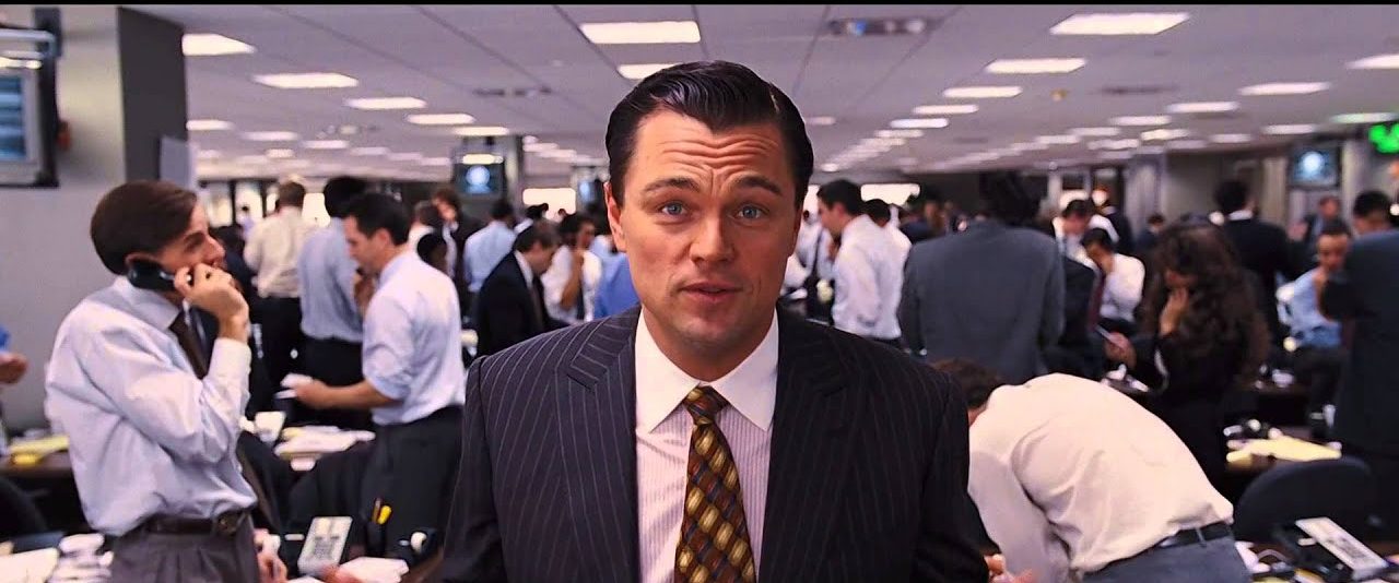
An extra-diegetic film is when characters break the fourth wall and talk directly to the audience. In The Wolf of Wall Street, the narrator often talks down the camera to the audience. This breaks the fourth wall of the film, as the audience are acknowledged, rather than leaving them as people just watching the film. This is effective, as it creates a more lighthearted feel to the serious film. However, it does take away a bit of the film’s believability, as it is no longer contained within the rules of its own universe. This film is based on the real Jordan Belfort’s memoirs, so the main character talking to the audience is appropriate in this sense.
Cinematography Definitions
Cinematography = the art of photography and camera work in film
Cinematographer = a person who oversees or directs photography and camerawork in film making
A cinematographer is in charge of directing the cameras and photography, while a director controls the entire cast and crew involved with the film.
