All posts by Daniel B

Filters

Author:
Category:

Camera Angles (Activity 3)

Thor (Kenneth Branagh, 2011)

Canted/Dutch Shots:
The Director of Thor has stated many times that he was not sure how to shoot the 2011 movie Thor. Along with the director of photography, Haris Zambarloukos, they decided to use a lot of canted/dutch angles. Most  of these kinds of shots are reserved for scenes where a character is dazed or confused, as it makes it seem like there is something off-kilter and strange going on. Unfortunately, because there were so many in Thor, it made many elements and scenes in the film feel clunky and not quite right; an effect the director was not after.

The Revanant (Alejandro González Iñárritu, 2016)

Worms eye Shots:
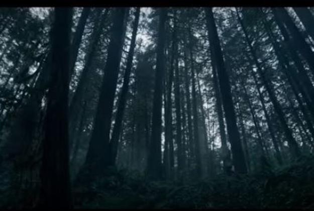
The Revenant utilities very low, swooping low angle shots to portray to the viewer the sense of scale and wonder that surrounds the protagonist. Many filmmakers tend to stick to using telephoto lenses when shooting landscapes, where as director of photography Emmanuel Lubezki, predominantly used wide angle lenses whilst shooting to make the world feel bigger and more life like.

The Dark Knight (Christopher Nolan, 2008)

Low Shots:
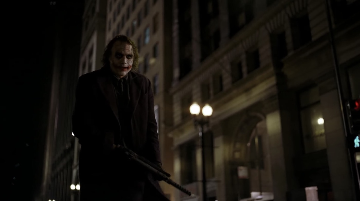
Nolan uses mostly Low and eye level shots when filming the antagonist of the film; the joker. This helps create a sense of humanity to the character and even though he is shown throughout the movie to be crazy, it helps keep the character grounded in reality, instead of making him seem like an over-dramatized villain.

Shot Distances (Activity 2)

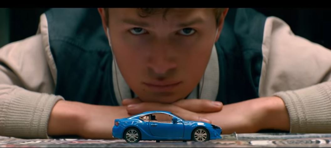
Baby Driver (Dir. Edgar Wright, 2017)

Eye-Level Close Up:

 In this scene from Baby Driver, the DoP (Bill Pope) has created a shot where the Main Character, Baby, is looking towards the camera, however he is not in focus. the camera is focused on the toy car and this is used as foreshadowing as later in the same scene, the car is pushed off of the table – hinting towards the car crash that happens later in the film.

The Shining (Dir. Stanley Kubrick, 1980)

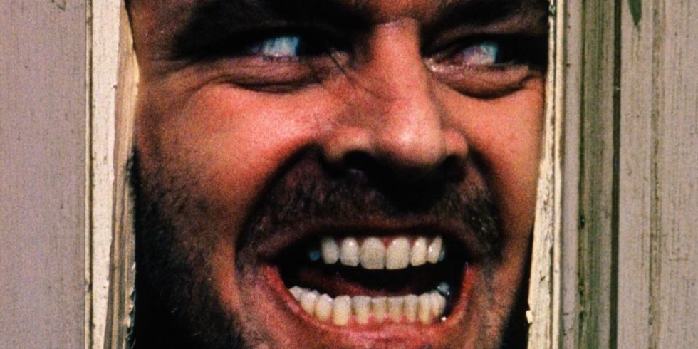
Extreme Close Up:

This famous scene from the Shining Uses an Extreme close up on the character of Jack Torrance (played by Jack Nicholson) to portray the levels of insanity that the character has gone to, and is also used to unsettle the audience. The use of this extreme close up also helps show the audience that there is nothing left of Jack Torrance, as we cannot see his body. it effectively shows how the character has completely changed, to the point where they are almost different people.

Logan (Dir. James Mangold, 2017)

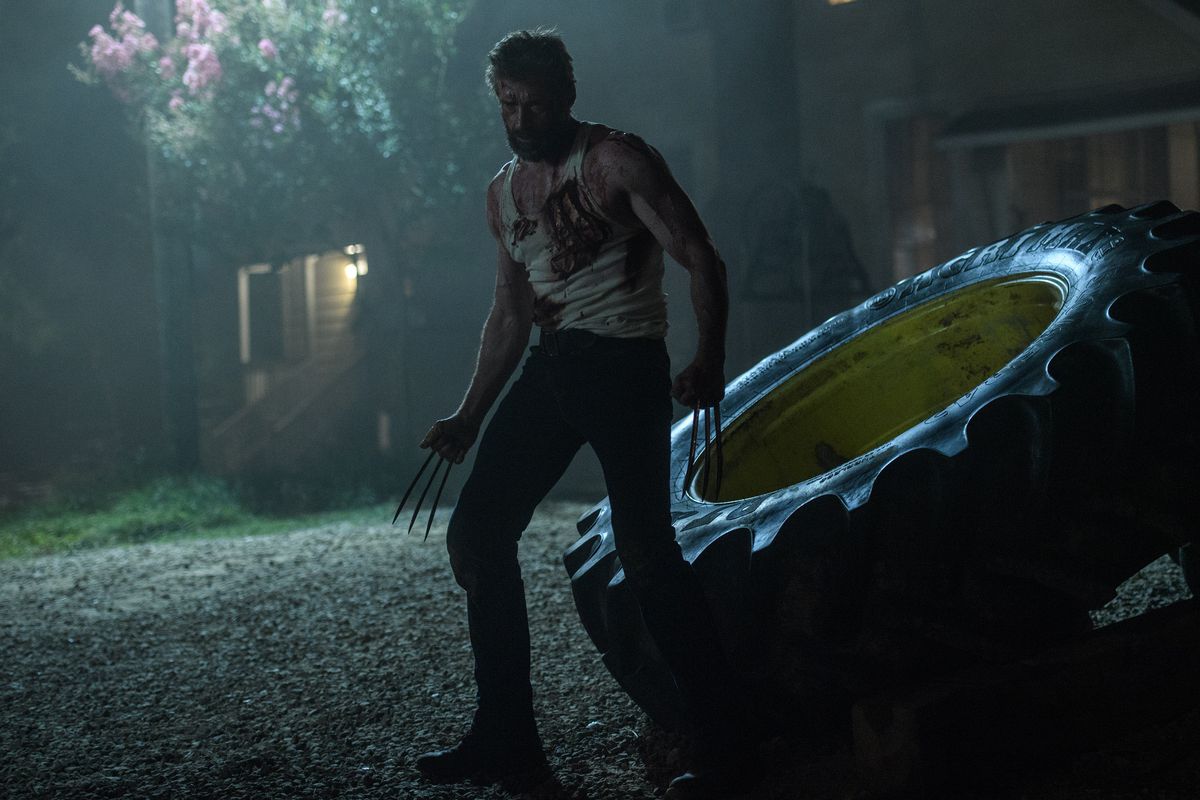
Long Shot:

This Shot gives the audience time to realize how hurt the protagonist of Logan (Hugh Jackman) is. In this film, his power is the ability to heal his wounds, and while it was hinted at previously in the film that he was becoming weaker, this shot confirms it to the audience.

Mise En Scene review for Blade Runner

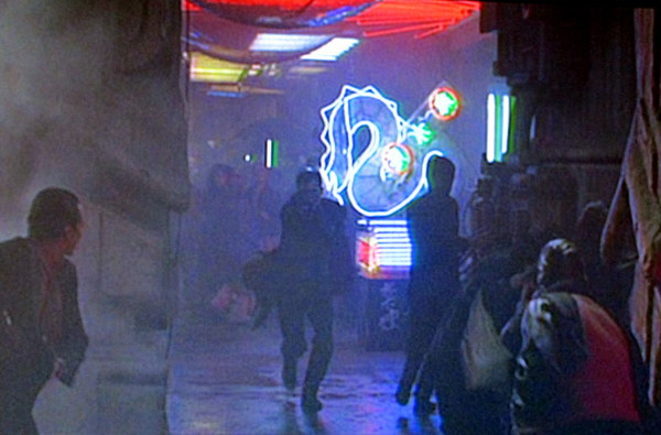
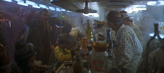
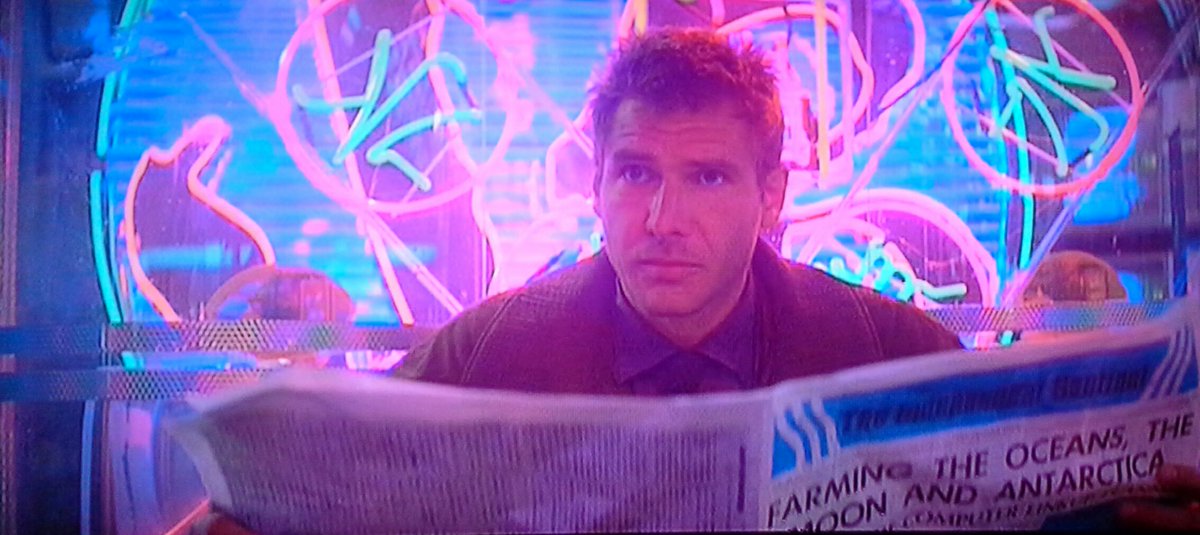
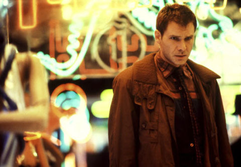
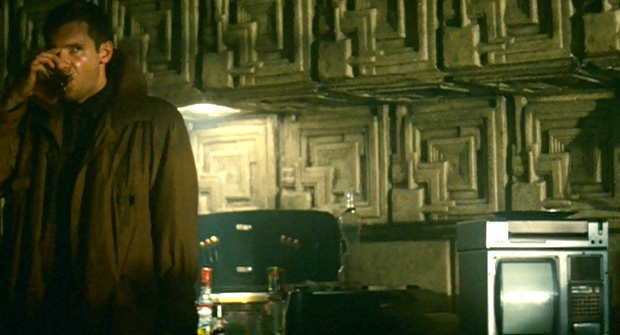
Blade runner uses many elements of mise en scene when introducing Deckard to the audience. Ridley Scott wants the audience to understand clearly who the protagonist is as well as the kind of world he lives in. As many other elements in the movie are very complex, it is understandable why Scott and his team wanted to help the audience get a grasp of the kind of world they will be entering.

SET DESIGN

I think that set design is arguably one of the most important parts of mise en scene for introducing an audience as it has the potential to immerse the audience right from the very start of the movie, creating a sense of immersion and verisimilitude. When the film was released in 1982, it had critical acclaim due to its realistic looking future (created by Syd Mead) as many people believed that the future would look similar to that of Blade Runner’s. The way that Mead and Scott created such a believable world using neon signs similar to that of the already futuristic city of Tokyo, or the high rise skyscrapers that tower over downtown Los Angeles, all of these elements were fairly accurate to real life and what has happened since the movie’s release. However there were still many elements that Mead was incorrect about such as the billowing smoke towers or flying cars. The introduction to Deckard in this cramped and busy environment, perfectly sets up the rest of the Blade Runner world, and manages to easily immerse the audience into the film.
LIGHTING

Lighting is yet another key feature in Blade Runner throughout the film, however the opening to the film when Deckard is introduced, is very different to much of the other lighting in the film, yet it still has undertones of the darker and more gritty world that the director wanted. This scene is very bright and the neon signs that litter the streets provide a top lit effect on Deckard. This effect creates shadows on Deckard’s face, and this combined with the rain and darkness of this scene shows the bleak undertones brought to us in the rest of the film. Throughout the First scene, Deckard is predominantly lit from above, or behind by artificial light, whether from the neon signs or the lights above him when he enters the noodle bar. Compare this to the minimal lighting used in the chase through the abandoned building between Deckard and Roy Batty. There is much less light and is lit mostly by shards of light from billboards outside, which is a huge contrast to the bright artificial light of Deckard’s introduction

COSTUME

Costume is incredibly important in a movie such as Blade Runner as it must be expertly designed to look how Syd Mead imagined it. The introduction to Deckard shows that he is out of place as many of the clothes worn by the mixed race culture that surrounds him are very different to his own. Similarly to the undertones of set design and lighting, Deckard is wearing a very bland and bleak outfit, with different shades of brown and black, where as many of the other people around him are wearing colourful, over the top outfits. Combine this with the bright colours of the neon lighting, and it makes Deckard seem very out of place in the current environment.

COMPOSITION

The composition in this scene is crafted incredibly well as the use of sound as well as the use of the rule of thirds. Deckard is shown in many of the Shots to be off to the side of the frame, while there is something else happening on the other side of the frame. This helps give the film a satisfying and professional look. The use of sounds help achieve verisimilitude by giving the audience a feeling of the busy and cramped world.

SPACE

The use of space in the Scene where Deckard is introduce shows the crowded and overwhelming world that the audience is stepping into. The use of extras walking through the busy street to give the city a feel of being alive and lived in makes the world much more believable and increases the sense of verisimilitude. The panning shot that opens the scene does not focus on anybody specifically until it reaches Deckard, showing the audience quickly and easily who the protagonist is.

Summer Task

Favorites

  • Best picture: Logan (James Mangold)
  • Best Director: Edgar Wright (Baby Driver)
  • Best Actor: Heath Ledger (The Dark Knight)
  • Best Actress: Uma Thurman (Kill Bill)
  • Best Soundtrack: Star Wars Episode IV: A New Hope


Oscars

  • Best Picture: Get Out (Jordan Peele)
  • Best Director: Jordan Peele
  • Best Actor: Garry Oldman (Darkest Hour)
  • Best Actress: Frances McDormand (Three Billboards…)
  • Best Original Screenplay: Lady Bird (Greta Gerwig)


I find that a “good” film has a balance of many different elements throughout. For instance, a film can be directed incredibly, have amazing cinematography, impeccable sound design and talented actors, but if the writing is awful, it brings the whole film down, and this is interchangeable with many of the micro and macro elements of filmmaking.

As well as this balance, there also must be a reason for people to want to watch your film; this could be due to a unique but recognizable editing style, like that of Edgar Wright’s films, or Quentin Tarantino’s writing and directing style of extended dialogue and non-chronological storylines. The style of a Director will attract different audiences to see different films. It is also important for a “good” film to include things that many audience members will take for granted, like sound design and editing. In my opinion, these elements are some of the most important as they can really immerse the audience into the film, and help the director get across what they want the audience to feel.

In connection with this to this, there is the cinematography of a film, and while it is a slightly more obvious part of filmmaking that audiences will likely notice more than sound or editing, there are still many people who will take for granted the way a film is shot. For instance, when I saw ‘The Revenant’ for the first time, I took the incredible sweeping shots of the forest and natural lighting for granted, but after researching it, finding out how it was shot and how there was no artificial lights used, it made me appreciate an entirely different side to the film that I wouldn’t have known about otherwise.

The narrative of a film is shown in many different ways; most obviously there is the narrative through dialogue and characters, however using visual elements to convey the story, when used effectively, can produce a much more realistic and immersive world for the audience to get involved in.

In conclusion, a “good” film must have a balance of all the key micro/macro elements, as well as a style to distinguish it from other movies and directors, making your film recognizable, without people necessarily knowing whom the director is before hand. However, I find the most important characteristic of a film is to get the audience immersed in the film using all of the micro and macro elements.

Activity 4 – Spike Lee

I agree with Spike Lee’s opinion on films staring black people must be directed by a black person to some extent. I think that Spike Lee has the right to be critical of people misrepresenting or misappropriating black culture or black individuals, however, I personally don’t believe that ONLY black people can create an authentic experience of a black character in film. Most directors,no matter their race, want to convey a good story, and i believe that if there has been proper research and planning carried out, especially in a film about black people in the past, that directors should not have to limit themselves in terms of how they cast and portray a character. Just because films like Django Unchained(Tarantino, 2012), or Detroit (Bigelow, 2017) star black people in leading roles, does not mean that their culture or race has been misrepresented. To conclude, I believe that it is understandable that Spike Lee thinks that his race is being misrepresented, and i do believe that there are a lot of films out there which do misappropriate black culture, however, just because a director is white, it should not limit them from the kind of films they should make, and similarly i believe that black directors can use white actors to portray characters in their films.

Challenges of a Long Take

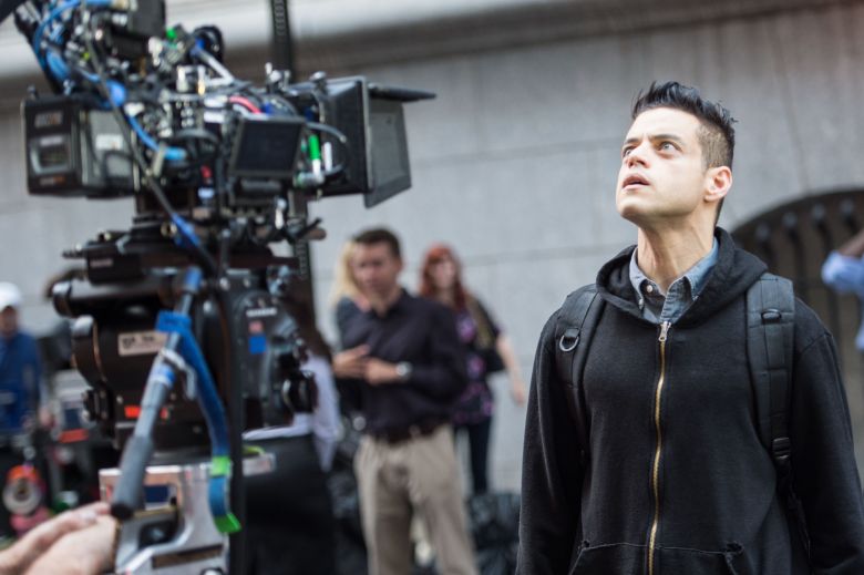
While not technically a piece of cinema, the TV show ‘Mr Robot'(Dir. Sam Esmail, 2015-Present) is known for its long takes. However Season 3 Episode 5 is shot to look entirely like one long take. The  forty-two minutes of seemingly uninterrupted filming was shot by director of photography Tod Campbell. By using Clever camera and editing tricks, Campbell was able to cut without the audience realizing, achieving the illusion of  one continuous take. Campbell and Esmail cut whenever there was a possibility to do so, but even then the whole episode is only made up of 31 completely  hidden camera changes that were seamlessly stitched together to ensure that it looked like the camera was still moving. The seamless edits were done when the camera was panning quickly (e.g. past a wall to turn around) or when showing something still. Director Sam Esmail even went to the extent of destroying many parts of the office building set like walls and widows to make sure the camera would be able to move around.

Rami Malek Shooting Mr Robot

While many Directors will secretly cut  when filming especially long panning camera shots, it is usually fairly obvious where the cuts would be, however, Esmail and Campbell would spend hours coming up with subtle cuts, with some even utilizing the visual effects team to make sure that each cut was essentially invisible. It was crafted so well that when the episode aired, many people genuinely thought the entire episode was shot in a single long take.

Hair and Make-Up

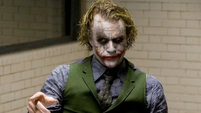
Heath Ledger’s Joker from The Dark Knight (Dir. Christopher Nolan, 2008) was renowned for having fairly subtle but incredibly impactful hair and make-up, designed by John Caglione Jr. Christopher Nolan said that he wanted a realistic joker, not the very cartoon based joker seen in other adaptations. Caglione worked with Nolan to develop a run-down, broken and insane man playing the joker. Through the use of subtle lines, cracks and creases shown in the Joker’s make-up, Caglione creates a sense of unhinged insanity, which makes the character feel and act unpredictably.

Composition

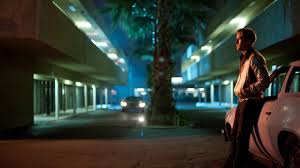
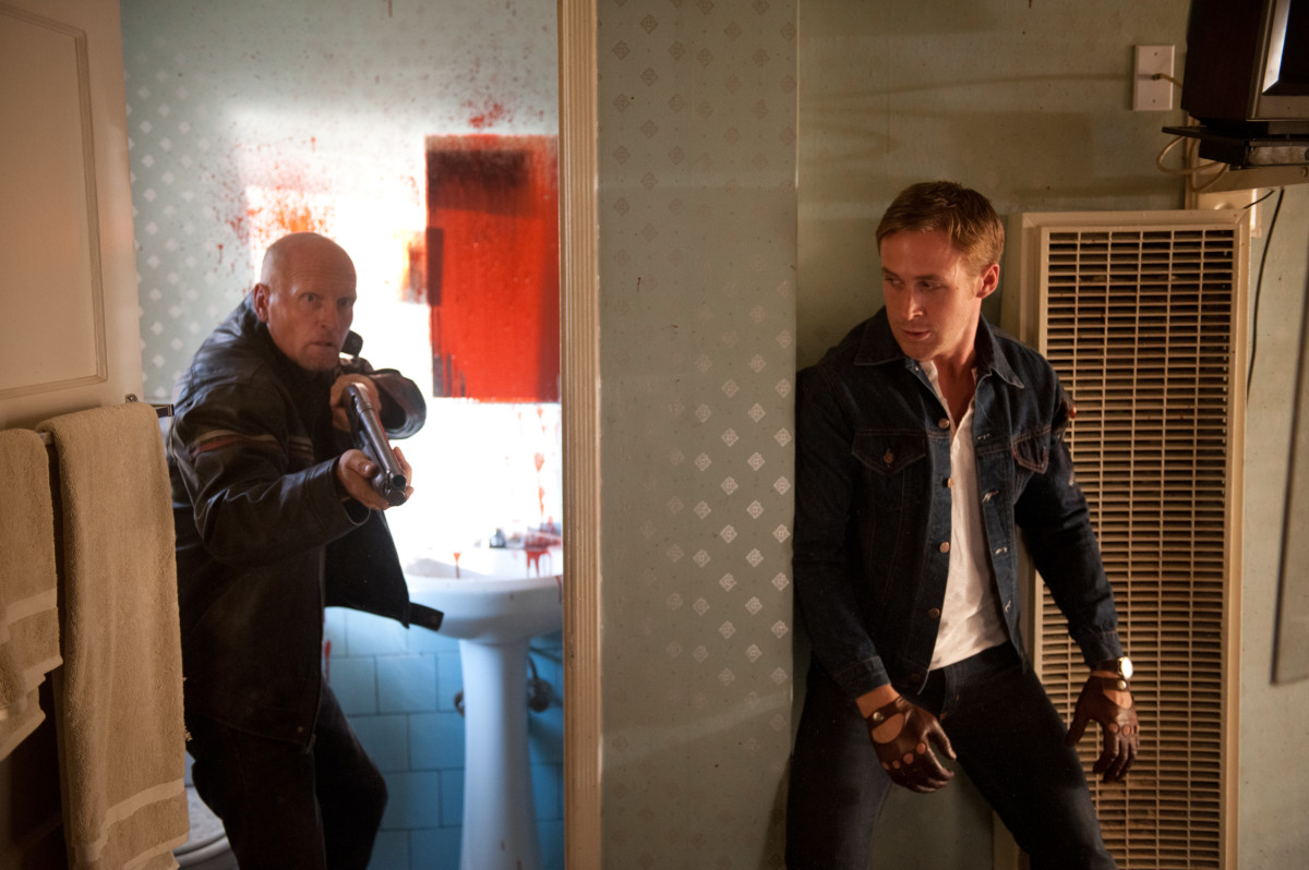
Drive (Dir.  Nicolas Winding Refn, 2011) was praised for its use of ‘the rule of thirds’. The cinematographer ( Newton Thomas Sigel) wanted to make sure that there was a lot of open space, so that the camera can be a lot tighter on the actor when there is action or a chase scene to increase the tension in the scene. The scene below is a good example of Sigel’s vision for the emphasis on the rule of thirds.

As you can see, there is a lot of empty space on the screen that Sigel is specifically leaving out of focus, with Ryan Gosling’s character being the only thing in focus. as you can seen in the shot below, the rule of thirds is still being utilized, but now the frame is a lot more full, with a lot more going on in the background.

Lighting

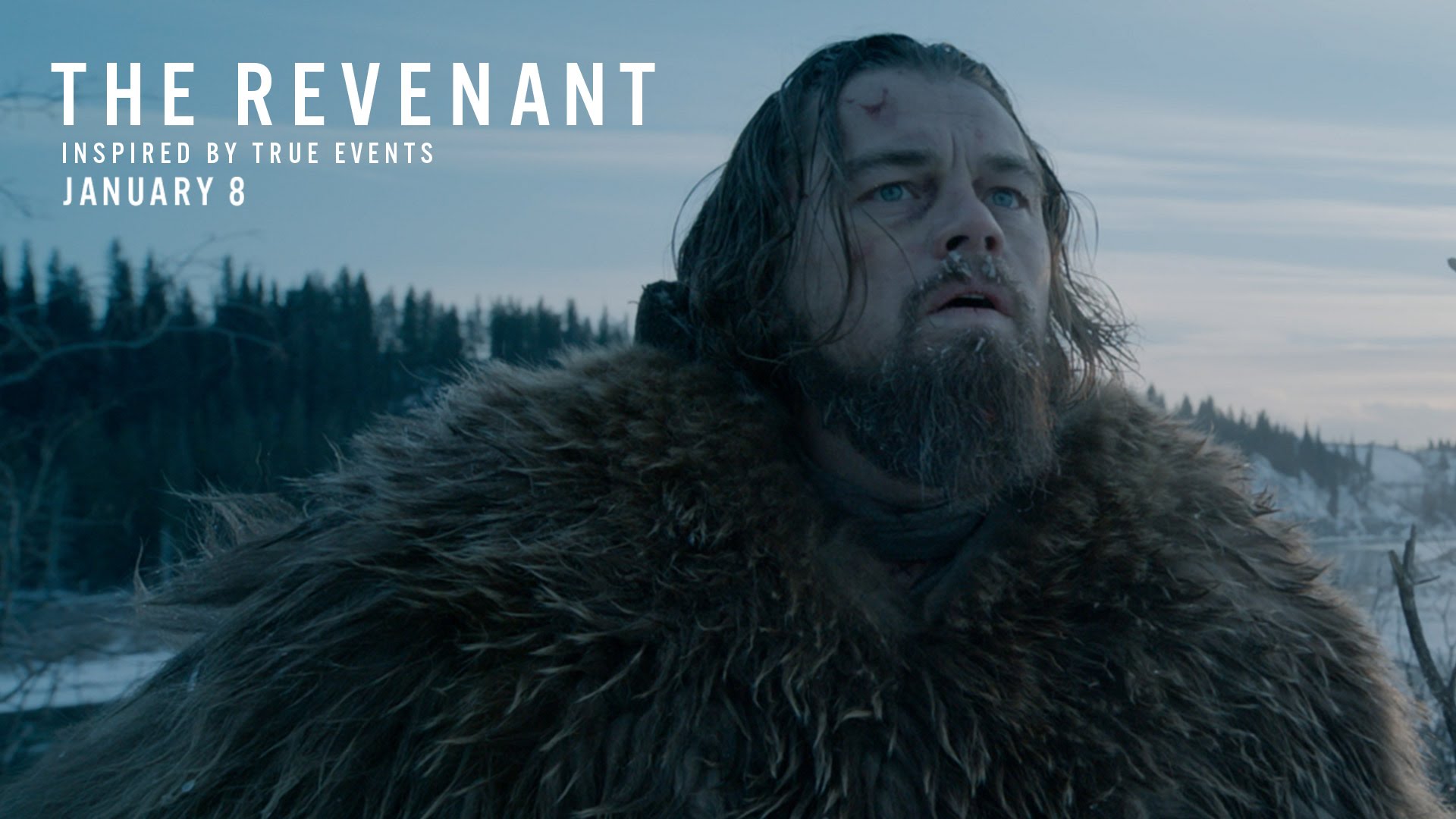
The lighting used in The Revanant (Dir. Alejandro González Iñárritu, 2015), is incredibly impressive as there were no artificial lights used whatsoever, meaning that Iñárritu had a very specific window in which to  get the shot he needed, as he could not control the light around him. However, this challenging task paid off in the long run as the movie was critically acclaimed for its use of natural light, and even won cinematographer Emmanuel Lubezki an Oscar. It is clear to see how this film’s cinematography differs from that of an artificially lighted film. This creates the effect of realism and gives the film a very low key and dark palate full of blues and blacks.