All posts by Alex

Filters

Author:
Category:

Comparative script for v.o

In this essay I will be comparing the use of cinematography as a principle storytelling device in the films of auteur director Stanley Kubrick. More importantly, I will analyse how this changes over his career by comparing techniques used, the intentions behind them, and the effects on the viewer in the films “2001: A Space Odyssey” (1968) and “Full Metal Jacket” (1987). In order to understand the change and progression of the role cinematography had as a narrative device in Kubrick’s work, I must look at his trademark techniques and his career as a whole. {taken a little bit out here} It is important to clarify that these movies were chosen, among other reasons, because of their different historical contexts; 2001 is set in the future, a fabrication of what society could be, whereas Full Metal Jacket is set in the past, loosely based around the Vietnam wars.

Before delving into Kubrick’s movies and techniques, It is imperative to explain the main overarching theme of this Video essay – how kubrick’s use of cinematography develops, in correlation with how Kubrick develops as an auteur.

An article on Britannica.com regarding Astruc, Bazin and others describes camera stylo in this quote, it says

caméra-stylo (“camera-pen”), holds that the director, who oversees all audio and visual elements of the motion picture, is more to be considered the “author” of the movie than is the writer of the screenplay.

Auteurs can nearly always be identified by their trademark techniques, Kubrick’s trademark techniques are:

Elaborate tracking shots, especially reversed ones, the one point perspective, the wide angle lens, and finally monolithic themes, which i will quickly touch on now

Monolithic themes: Kubrick often uses monolithic beings/elements in his fi lms that are far more powerful than the characters, these beings / elements convey a sense of dystopian control. This can be obvious in 2001 in the example of HAL: being a supercomputer with immoral intent and nearly full control over the protagonist and his surroundings. Or it can be very subtle like in full metal jacket the idea of war being a type of dystopian control, as if referencing to a future world where everyone fights for survival. This leads me on to further explain that in Kubrick’s later films, the intent behind these techniques started to be much more narrative based and these monolithic elements started being displayed in a more conceptual way. In fact, a quote from Gilles Deleuze talks about these monolithic beings / elements as being the products of a “cinematographic brain”. He talks about how the Mise En Scene is a brain and the beings inside it are on a journey through it, these monolithic beings / elements are catalysts for change and evolution and propel the character through not only the story, but through the cinematographic brain. (show quote) Here, it seems, Deleuze is referencing to how kubrick’s style is exponentially more than what can just be seen on the screen. Each different  component seen in his film is like a catalyst to spark emotions, they all work together interchangeably and form a giant “brain” 

“For in Kubrick, the world itself is a brain, there is identity of brain and world, as in the great circular and luminous table in Dr strangelove, the giant computer in 2001: a space Odyssey, the overlook hotel in the shining.” (3)

Moving forward, I must now look at how Kubrick uses his trademark techniques in his films and how predominant his cinematography was as a storytelling device as opposed to an aesthetic choice

Firstly,  in 2001 this shot (17:12) depicts the current world from the view of space, it establishes a narrative jump in time from a primitive period with primitive shots to this futuristic society as if to represent mankind’s evolution and colonization of space. Here, the cinematography is able to express the narrative without any human subjects or dialogue. Taken out here It is something that critics have picked up on continuously, praising Kubrick for his genius, In-fact In Alexander Walker’s book: “Stanley Kubrick, Director” he says that Kubrick forced his viewers to” jettison the outmoded notion of a story told largely in words,” (page 242).

Whereas full metal jacket uses many simple tracking shots to represent the narrative pulling it along with the characters.

This uncovers the foundation of my argument about how Kubrick’s use of cinematography as a storytelling device changes throughout his career:

during the start of his career his films were heavily based on creating beautiful cinematography, i believe that Kubrick’s partnership with Alcott inspired him and drove him to create these masterpieces. Taken out here The audience can be introduced to their worlds without any context, just what they can see, however in Full Metal jacket it felt very narrative based, the viewer moves with the subject and every shot seems to be based around the character. It is evident then, that in Kubrick’s later films (specifically after the loss of cinematographer John Alcott) the narrative carries a heavier priority in the end product over the cinematography.

Looking at the cinematography as a whole, 2001’s cinematography was so stylistic and artificial, it pushed the viewer away, this meant that the viewer would view the film from an outside perspective, as a member of the audience rather than being immersed into the narrative. By the time FMJ was released, Kubrick had started to value the importance of narrative and immersing the viewer into it, additionally, with the invention of the Steadicam, Kubrick was able to do combine beautiful shots with perfect immersion to help encapsulate the viewer into the narrative.

Kubrick’s representation of monolithic themes also clearly changes between the two films, in 2001 The obelisk and Hal are the two most obvious examples. Rather than looking at the lack of cinematographic substance now in FMJ, I’d like to bring to light how well FMJ uses the monolithic themes to bring the audience into the narrative, The camp as a whole represents the monolithic themes, and the drill sergeant is like an output for this. In fact, by seeing the world through Private Jokers eyes, the viewers can create an emotional connection with the characters in FMJ. They see his emotions and his experiences, as David kehr from the Chicago Tribune says: “There is a real fear at the heart of this monstrously armored, desperately defensive film.” – re rotten tomatoes they follow him and are made to feel a part of the movie, they feel his fear, making it all the more real. Contrastingly, in 2001, the scene where the space men approach the obelisk demonstrates how little emotional connection the audience has with the characters. The absence of close-ups on their faces, the exclusion of dialogue and lack of cinematographic connection all lead to the scene feeling like less of a progression of the narrative and more of an aesthetic choice. There is a visual disconnection in 2001 because the camera seems to not be focused on any one subject, it roams around almost in pain with no repeating pattern or correlation with subject matter. Moreover, what would be considered as the main character is stripped, devoid of all emotion, expressionless and monotone, at 1:29:36 one can compare Dave to Private Pyle, dehumanised by the situation, however, unlike in FMJ there is no counterweight like Joker to balance the situation and help the viewers connect emotionally, the audience has to force themselves into the film. In fact the closest moment they have to an emotional connection is the termination of HAL towards the end, Hal being one of the most visually recognisable symbols of film to date. 

Taken out here. It is possible then, that Kubrick may have created a film with such a strong narrative in order to open the audiences eyes to the horrors of war rather than glorifying it with epic cinematographic shots. He may have been using the glorification of war to entice people to watch his film, hoping to instead reveal the living hell that war really is. Similarly, 2001 was set around the time of the Apollo missions, starting 1967 with Apollo 1 and ending in Apollo 17 in 1972, during this time the idea of living in space was in media everywhere, it became an obsession. Kubrick may have created 2001 to show what space travel could be like, he knew that this was exactly what the audience wanted to see. Therefore, Kubrick’s use of cinematography also changed as a result of the current historical context.

From the glorification of space travel, to the disparagement of war, I am led to conclude that over the 13 film career that Kubrick led, his use of cinematography as a principle story telling device evolved and exponentially expanded until he finished his final film, creating an arc and legacy, unrivalled by many other legendary filmmakers, a change that would establish him as one of the greatest for years to come.

Sources

1 – Editors of Encyclopaedia Britannica (Dec 27 2017) , “Auteur Theory” published by Encyclopaedia Britannica inc, available at : https://www.britannica.com/art/auteur-theory Access Date March 25 2020

2 – Landy, M. “The Cinematographic Brain In 2001: A Space Odyssey” From Kolker, R. “Stanley Kubrick’s 2001: A Space Odyssey: New Essays” (2006) Oxford University press (page 99) Available as a preview at: https://books.google.je/books?id=YpritcZXPFoC&printsec=frontcover&source=gbs_ge_summary_r&cad=0#v=onepage&q&f=false

3 – Alexander King (2000) “Stanley Kubrick, Director” Published by: Norton (page 242)

4 – Kehr, D. (1987) `JACKET` A COLD, PERVERSE FILM OF UNSETTLING POWER Via Chicago Tribune. Available at: https://www.chicagotribune.com/news/ct-xpm-1987-06-26-8702170008-story.html Accessed on (26th March 2020)

5 – Full Metal Jacket (1987) Dir, Kubrick. DVD – deluxe edition (2008) USA: Warner Bros. Entertainment Inc.

6 – 2001: a space odyssey (1968) Dir, Kubrick. DVD – digitally restored and remastered edition (2019) USA: Turner Entertainment

psychological horror – cinematography

No Dialogue in this short film

shots need to be uncomfortable, audience can’t get the resolution it wants by seeing what it wants, i aim to keep interest by making them wait for that resolution, but it needs to be subtle so that it is a subconscious reaction.

starts with 1 sitting on end of bed,

shot idea – upper chest in the bottom of the frame and upper nose top of frame, eyes are not in view and lips are the focus which makes it uncomfortable for the viewer, as if they are this close to a strangers face.

Camera following protagonist at high angle, establishing the protagonist as a victim

additionally birds eye view helps to establish the protagonist as a victim however is difficult to set up true birds eye view.

The money shot – set up with the camera fixed to a bicycle wheel, the shot is of a person in the bath, it is a very flat, 2D shot, the lip of the bath lines up with the middle of the shot so you cannot see inside the bath at all (although this will depend on the height of the bath and wheel and whether or not i can get the camera low enough without the wheel touching the ground) the person falls back into the bath and camera follows trying to keep person in focus, once it rotates 180 degrees from the top to the bottom, the shot will be cut, the person will move to the other end of the bath and rise up with the camera, as if they had fully rotated in the bath with the camera in the new shot, i’m hoping that the blur during the middle of the spin will mask the transition and make it smooth.

I’m using this shot to show what the world is like from the character’s view, it will be less focused on Mise-En-Scene and more on how his mental illness’s are distorting his mind, visually i will represent this with uncomfortable camera techniques such as dutch angles (canted angles) close up shot lengths, bringing the audience very close to a character that they haven’t had time to empathise or connect with and contrast between low and high angles.

For example, at the start of the scene, i don’t want to show the full character in shot so as to not let the audience recognise or associate the character at all, its still a mystery to them, so close ups will make up most of the first few shots. Additionally the shots will be quite flat angles to start off with, for example – eye level. This helps keep the mood a little more neutral, therefore leaving me space to build discomfort. later on in the scene i will slowly start to pan out further from the character when following it, this is like giving the audience a break from the presence of this unknown character, so that when i bring my turning point in the scene, it will be abrupt and uncomfortable. I could also use angles like a birds eye view if possible or high angles to establish the character as a victim of his own mind. The character seems far less intimidating when the audience is above it.

Finally, in the turning point of my scene, the shot i discussed before is used and now the camera is brought right back up to the characters face / body, the angles are low, the audience feels discomfort since this character that seemed mysterious yet docile is suddenly in their face. Dutch angles will reflect the confusion that the character is experiencing, and the idea of how nauseating it is to be in their mind.

Since there is no diegetic dialogue in the scene, i am going to use non-diegetic voices to represent the voices in the characters head, for example – a multitude of people arguing.

Full Metal Jacket clips

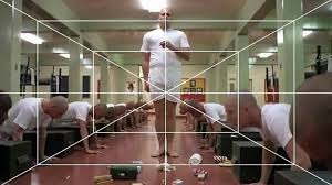
This 10 minute clip employs multiple different camera techniques. For example, there are many uses of one point perspective, the most notable one being at 00:22 where there is the classic shot with all of the soldiers lined up along the end of their beds. Additionally, a tracking shot is used to help change the viewers focus from character to character as the sergeant moves forward, even though the shot is in deep focus, because the shot tracks backwards and the sergeant stays the same distance relative to the camera, it helps the viewer to be constantly focusing on where the sergeant is, and since he is constantly moving it shifts our focus without actually needing a different shot or zoom or focus. This is an excellent piece of cinematography that helps Kubrick stand out, to be able to do something (change viewers focus) in a way that is hardly done at all, and do it perfectly helps solidify his title as an auteur of cinematography, even without Alcott. The question is now, was this a shot influenced by Alcott or purely by Kubrick himself?

Here is another example on one point perspective and symmetry. Pyle is in the exact middle, center of frame and attention. All the other soldiers are lined up symmetrically on either side in a repeating pattern, as if they are all the same and don’t matter.

a very large portion of this scene are tracking shots, both Steadicam and tracks were used to create this effect.

2001: A Space Odyssey clips

This clip makes use of the wide angle lens in a very obvious manner, it stands out to the viewer more so than other examples (like below). At 1:17 we see Bowman walking around however there is a wider perspective of view, i believe this is used to represent the idea of “beyond the infinite” the idea that this room isn’t situated in any particular place but rather past infinity. A place where the laws of physics don’t apply. This wide angle lens bordering an infinite perspective, or at least more so than before helps to represent that he is no longer in a place where humanity resides. Kubrick uses wide angle lenses often in his films, however usually not in such an obvious way. This clip seems to give it a fish-eye look. other examples include when Bowman is walking through the tunnels of the space ship, a great example of one point perspective.

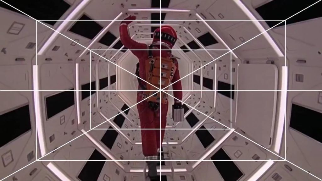
Here is a clearer example of one point perspective, there are multiple times in the film where Bowman walks through these tunnels, Kubrick uses the same perspective to bring familiarity back into the scenes. However, since Bowman is blocking our view to his destination it creates a sense of anxiety as to what might happen next and where he may go.

from 2:15 – 2:46 there is a brilliant tracking shot, following Bowman as he runs around the ship, it is used to represent the curvature of the spherical room.

Comparative study

How do the early films of auteur director Stanley Kubrick compare to his later works in terms of the use of cinematography as a principal storytelling device?

(Explained using examples from “2001: A Space Odyssey” – 1968 and “Full Metal jacket” – 1987

What is an Auteur Theory ?

Auteur theory is a theory of filmmaking in which “The director is viewed as the major creative force in a motion picture” (1)

“The auteur theory, which was derived largely from Astruc’s elucidation of the concept of Caméra-Stylo (“camera-pen”), holds that the director, who oversees all audio and visual elements of the motion picture, is more to be considered the “author” of the movie than is the writer of the screenplay.” (1)

In essence, An auteur is a director who is in full creative control of their film, this is usually identifiable by having original traits or styles that they may have popularised / invented or are known for using often.

What are Kubrick’s textbook characteristics/ styles/ themes than run through most of his films?

Symmetry – the use of one point perspective. Although one point perspective is not an exact representation of symmetry in cinema, it is a way of creating cinematic shots with near perfect symmetry. O.P.P is perfect for drawing the viewers attention into the center, Kubrick used it to encapsulate the viewer in his fictional environments, this is so effective due to the fact that there is only one way out – forward, for example in “The Shining” – 1980 When following Danny through the halls, the viewer is constantly moving forward with Danny, therefore immersing the viewer into the film as if they are in just as much danger as Danny. It can be very subtle but many films have used it especially 2001 and Full Metal Jacket

Tracking shots – especially the “Steadicam”. This is another technique used in many of his films. Tracking shots are any shot where the camera moves forwards, backwards, or along the side of / with the subject as it moves. Usually tracking shots are constructed by putting a camera on a Dolly then on a track however if following in front or behind the subject, the tracks will be seen. This is the reason for the invention of the Steadicam, not only is it easier to maneuver and set up (no need for a track) but there is no trace of presence unlike a track. Kubrick uses this constantly to help connect his audience with the characters and incite all the different emotions the subject might be exposed to. In 2001 the tracking shots helped preserve the symmetry as Dr Bowman moved through the space station’s tunnels because the camera moved with him. In Full Metal Jacket, tracking shots follow the sergeant as he speaks to each of the soldiers in a line, its a smooth way to follow him looking from soldier to soldier whilst preserving symmetry.

Wide angle lens – Kubrick was extremely interested in the wide angle lens in his early photography and he has carried it into his films as a beautiful technique that he likes to pair with one point perspective. The wide angle lens is like a feast for the audiences eyes as there is much more to take in, its subtle and extravagant at the same time, enough to become a staple technique but no enough that it seems disruptive or uncomfortable. Kubrick has created a perfect balance of subtlety and originality. This is what makes Kubrick such an amazing film maker.

Monolithic themes: Kubrick often uses monolithic beings/elements in his films that are far more powerful than our characters, these beings / elements convey a sense of dystopian control. This can be obvious in 2001 in the example of HAL: being a super computer with immoral intent and nearly full control over our protagonist and his surroundings. Or it can be very subtle like in full metal jacket the idea of war being a type of dystopian control, as if referencing to a future world where everyone fights for survival. This links to the timeline of Kubrick’s films where before “A Clockwork Orange” – 1971 Kubrick’s films presented these monolithic beings/ elements in very visual ways like in 2001, The Shining and Dr Strangelove – 1964. Whereas after Clockwork, the style did slightly change, and these monolithic elements started being displayed in a more conceptual way. In fact, a quote from Gilles Deleuze talks about these monolithic beings / elements as being products of a “cinematographic brain”. He talks about how the Mise En Scene is a brain and the beings inside it are on a journey through it, these monolithic beings / elements are catalysts for change and evolution and propel our character through not only the story, but through the cinematographic brain. However it is worth mentioning that in Full Metal Jacket the drill sergeant also represents the monolithic themes, He is extremely harsh and inhumane. But as well as that he is a catalyst for change, similar to the obelisk / monolith in the 2001. He is the reason these characters become what they are and is a very big part of the “Cinematographic brain” that Deleuze talks about. This obviously is a very visual representation of the monolithic themes, similar to 2001, which begs the question how much of Kubrick’s cinematographic auteur style, relies on Alcott, and how much is influenced by him?

“If we look at Kubrick’s work, we see the degree to which it is the brain, which is the Mis[e] En Scene. Attitudes of body achieve a maximum level of violence, but they depend on the brain. For in Kubrick, the world itself is a brain, there is identity of brain and world, as in the great circular and luminous table in Dr strangelove, the giant computer in 2001: a space Odyssey, the overlook hotel in the shining. The black stone of 2001 presides of cosmic states and cerebral states, it is the soul of three bodies, earth, sun and moon. But also the seed of three brains, animal, human, machine. Kubrick is renewing the theme of the initiatory journey, because every journey in the world is an exploration of the brain (3) –
Gilles Deleuze

Here, it seems, Deleuze is referencing to how kubrick’s style is exponentially more than what can just be seen on the screen. Each different component seen in his film is like a catalyst to spark emotions, they all work together interchangeably and form a giant “brain”

“For in Kubrick, the world itself is a brain, there is identity of brain and world, as in the great circular and luminous table in Dr strangelove, the giant computer in 2001: a space Odyssey, the overlook hotel in the shining.(3)

Even though Kubrick’s later films did not have Alcott as a D.O.P, regardless of how it visually looks, Kubrick’s ability to create a deep and incredibly complex world that’s almost representative of a brain is still there and that plays a big part in distinguishing his style.

How did Kubrick’s Style Develop and where did it come from?

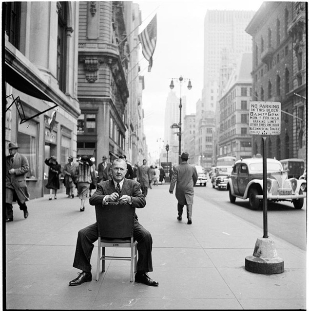
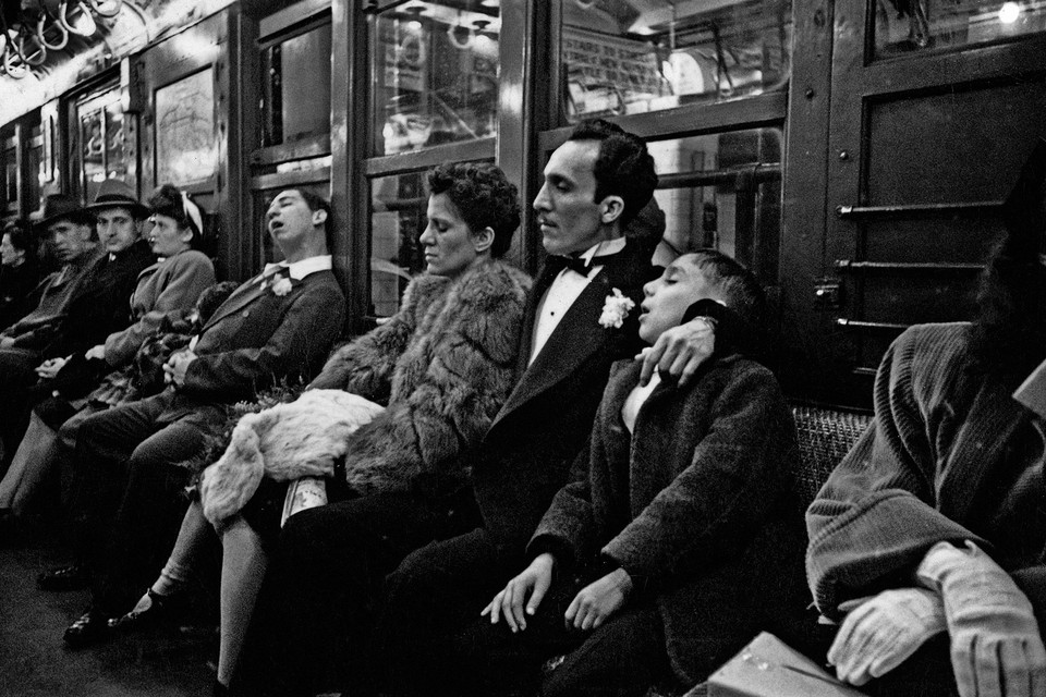
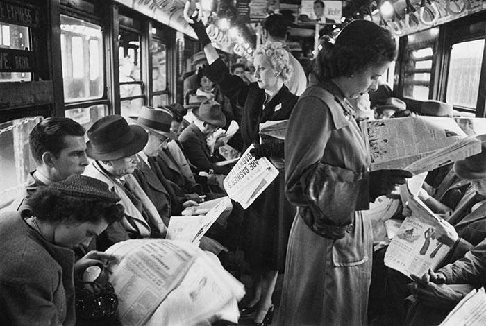
A large proportion of kubrick’s visual style was derived from his previous work as a street photographer, capturing the highs and lows of life in New York.

most notably his use of the wide angle lens and O.P.P – the vanishing point:

At this age, Kubrick’s style was still developing, however we can see some early inspiration for the deep focus that is an important factor in the wide angle shots we see in his later films, especially 2001:

Kubrick’s partnership with Alcott

Kubrick first started to work with Alcott on the film “2001: A Space Odyssey” (1968). It is evident here that Alcott helped Kubrick to voice his style, all the early ideas blossomed into reality during this partnership. 2001 was a breakthrough in cinematography and Visual effects, in fact, it won an academy award for best visual effects. This was kubrick’s first film that left an immense impression on the world and brought his name to the top. Alcott & Kubrick introduced multiple beautiful cinematographic techniques into this film like the O.P.P, tracking shots and the wide angle lens + deep focus. And although there was evidence of these techniques earlier on in his career, Alcott really helped him to bring it into practice in his films. After 2001 Alcott worked on 3 more films with Kubrick as his cinematographer:

Clockwork orange – 1971. Barry Lyndon – 1975. The Shining – 1980.

These were all visual masterpieces, anything from the Mise-En-Scene in Clockwork Orange to the cinematography in Barry Lyndon and The Shining. However The Shining was the last film that they worked on together due to Alcott’s death in 1986. This leads us to Full Metal Jacket where the cinematographer is now Douglas Milsome.

How does his visual storytelling change throughout his career.

In order to answer this i will have to closely look at the cinematography in from one of Kubrick’s earlier films: “2001: A space odyssey” 1968. And compare it to one of his last films “Full metal Jacket” 1987. I will assess the range and volume of cinematographic techniques and decide whether each one is narrative driven or visually driven – through the cinematography.

[ Research done on separate document looking at specific examples to compare cinematography ]

research:

2001:

timestamp 17:12 starts with a establishing shot of the current world, although this isn’t the first shot in the film, it is establishing the narrative jump in time, from a more primitive time with primitive basic shots to this futuristic society, we get to see the earth from the space as if to represent mankind evolution and colonization of space. The cinematography is able to express the narrative without any human subjects or dialogue

if we compare this to full metal jacket where at 1:16 we have another establishing shot, we can see that the scene is more narrative based, rather than using the cinematography as its own device by enticing the viewer with brilliant cinematic shots, it directly follows the character to keep them in shot, moving with them – the narrative moves the camera.

2001 does this constantly throughout it’s film, extraordinary shots of space with little to no human subject, creating the narrative on its own. Whereas full metal jacket uses many simple tracking shots to represent the narrative pulling it along with the characters.

This uncovers the foundation of my argument about Kubrick’s use of cinematography as a story telling device changes throughout his career:

during the start of his career his films were heavily based on beautiful cinematography, i believe that Kubrick’s partnership with Alcott inspired him and drove him to create these masterpieces. In films like 2001 or the shining, the magnificent shots are what create the narrative and story, to the point where it seems that if the human subjects were removed, the story would continue. We can be introduced to their worlds without any context, just what we can see, however in Full Metal jacket it felt very narrative based, we move with the subject and every shot seems to be based around the character.

It is evident then, that in Kubrick’s later films (specifically after the loss of cinematographer John Alcott) the narrative carries a heavier priority in the end product over the cinematography.

2001: 24:38 camera not moving but the moon in the background is represents that the film is less based upon the characters and the narrative but rather of the evolution and progression of that cinematic universe.

older films seem artificial because the cinematography is so innovative, however newer films are made so cinematography brings viewer into the narrative, the Steadicam brought the viewer in whereas 2001 kept them away, stopped them empathising and rather made them watch.

2001’s cinematography seems artificial because it very obviously is. Practical effects were used over CGI to make it seem like the characters were actually in zero gravity, large spinning sets were actually created to simulate the ship, the camera would stay fixed as the set rotated and the actor walked to stay upright, because the camera moved with the set, it made it look like it was the actor that was the odd one out and was moving giving it a impossibly weird, centrifugal gravity effect, because 2001’s cinematography was so stylistic and artificial, it pushed the viewer away, this mean’t that the viewer would view the film from an outside perspective, as a member of the audience rather than being immersed into the narrative. By the time FMJ was released, Kubrick had started to value the importance of narrative and immersing the viewer into it, additionally, with the invention of the Steadicam, Kubrick was able to do combine beautiful shots with perfect immersion to help encapsulate the viewer into the narrative.

Additionally, the way Kubrick used the camera as a narrative device changes by the time we get to FMJ. In 2001 the monolithic themes are represented very literally in the example of the obelisk type monument. From 48:07 onward in that scene, Kubrick

FMJ – monolithic theme is the camp and the drill sergeant is the output for it. In fmj we have an emotional connection and we interact with the monolithic themes through joker – immersing us into the narrative, in 2001, there is no emotional connection between HAL and Dave. in 2001 moon scene with obelisk, the absence of dialogue, facial close ups and emotional connection helps portray the scene as more aesthetic than as narrative progression to the story.

2001 in 1:29:36 the close up of Dave reminds us of private Pyle, dehumanised by the situation, however unlike in FMJ there is no counterweight, no output to connect emotionally to the situation, there is no Joker for us to see the world through, since there isn’t this emotional connection, once again, it seems an aesthetic move rather than a method of storytelling. The audience has to force themselves into the film (2001) because there is no perspective to see the world through like Joker is to us in FMJ.

The drill sergeant is never flinching even up to his death.

quotes:

1: https://www.britannica.com/art/auteur-theory

2: http://www.mediafactory.org.au/natalie-milidoni/2014/03/14/astrucs-camera-stylo/

3: https://books.google.je/books?id=2pzfL7PJWBsC&pg=PT167&lpg=PT167&dq=the+cinematographic+brain+of+2001:+space+odyssey+marcia+landy&source=bl&ots=E-IOfNXINb&sig=ACfU3U037TTXsdNps40Q0X1HhuXDBt33bQ&hl=en&sa=X&ved=2ahUKEwigqaz_0_fiAhXNasAKHdB-BwsQ6AEwAnoECAkQAQ#v=onepage&q=the%20cinematographic%20brain%20of%202001%3A%20space%20odyssey%20marcia%20landy&f=false

general research:

http://criticaltheoryindex.org/assets/naremore%2C-james-stanley-kubrick-and-the-aesthetics-of-the-grotesque.pdf

Comedy shot ideas with screenplay

Scene 1:

INT – DAY – LOUNGE

Two characters – 1 and 2 – are seen lying on a couch fast asleep, the rubbish from what seemed to be a party litter the room. Suddenly the doorbell buzzes very loudly and wakes both characters up. 1 however tries to fall back asleep and so 2 gets up and answers the door.

handheld shots give the idea of the camera being a person – helps the audience relate to the situation and the jokes, zooms and pulls and pushes also represent a human eye looking at specific things and give off a comedic effect.

camera MS follows someone walking up to house, zooms in on the window

cuts to see the 2 characters sitting on the couch, it pans to see crisp packets and cups on the floor and table and around the room then it pans back to the characters and zooms on their face. One of them groans and moves a little

cuts to person outside stepping up to the door.

back inside, doorbell buzzes and they both wake up very suddenly, zoom in on 2 getting up to get the door, follows him as he leaves the room then pans back to look at character 1 trying to fall back asleep

“Ah hello I’m Mr 3, 1’s Landlord, is he in?”

zooms in on 1 as his eyes open suddenly with an extremely shocked and worried look on his face.

A hand from out of scene gives 2 a note. When opened it reads – ‘I’M NOT HERE – in a rushed and messy handwriting. 2 stands close to the door so as to block view into the house, however not completely.

From 2’s perspective, hand appears as if out of nowhere (from lounge) and sticks out for a bit. then cut to 3’s perspective, the hand still sticking out, it shakes a bit to get 2’s attention then 2 takes it and says thanks without taking his eyes off of 3. cut to 2’s perspective, zoom in on 3 then zoom out and focus on the note.

back to 3’s perspective (shot)

“Oh you know what, he JUST left for work”

right after saying this 1 rushes across frame

back to 2’s perspective. (reverse shot)

Mr 3:
“was that-“

Shot:

“ahhh no that was just someone from the party last night”

reverse shot:

“PARTY?! oh no there is no parties allowed and 1 knows this, i definitely need to speak to him now.”

shot: camera slightly stepped back

“Oh no don’t worry we didn’t have the party here, we…. used the neighbours house ?”

shot: zooms in on 2 realising what he just said

“You broke into the Taylor’s house?! That’s highly Illegal-”

shot

a loud bang and “Ow” from the side of the frame that 1 disappeared to interrupts Mr 3

“right let me see right now”

camera zooms in on 2 looking very worries, then zooms out and follows 3 as he walks into the house and turns the corner.

Mr 3 walks into the house only to see 1 peeking out of a small cupboard, 2 quickly sits on the cupboard, shutting 1 in so he cannot be seen followed by another “OW” from 1.

camera sees 2 sit down on the bench / cupboard then zooms in on 3’s face to see his anger and mixed with confusion.

2:
“See? Nothing”

Mr 3 stutters a bit in confusion