All posts by Ayisha A

Filters

Author:
Category:

cinematography and digesis activity three

This is an example of a Dutch angle from Do The Right Thing(1989, director Spike Lee) and it averts the expectations of the audience by using an unusual camera technique and it makes the world appear to be off – kilter and this may alert to the audience to the fact that something may be wrong and in the case of this film a lot of things are  wrong.

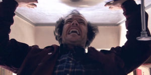
This low -angle shot from The Shining (1980 ,directed by Stanley Kubrick) makes the audience feel like the character was being watched and this  may make them feel uneasy and it helps to develop tension within the scene and it adds to the feeling of  uneasiness that the audience may feel.

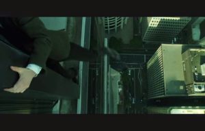
This High angle shot from The Matrix (1999, directed by the Wachowski siblings ) makes the audience feel nervous because Neo is about to fall off the building  and the shot establishes what is at stake by showing the distance that Neo has to fall and this helps to establish verisimilitude because if a person falls off of a tall building  they will die and this shot suggests that this will happen to Neo if he falls down.


cinematography and digesis activity one

Deadpool(2016 , directed by Tim Miller) is a great example of the Extra  digetic  gaze being used effectively because it is used for comedic impact and in that regard , the technique is incredibly effective and it helps to include us in the inner world of the character. Furthermore ,Deadpool is the only Character to break the fourth wall and this adds to the comedic effect of the film.

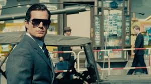
This scene from The Man from U.N.C.L.E(2015 , directed by Guy Ritchie)  uses digetic perspective to put emphasis on the main character Napoleon Solo – this conveys the fact that he is a pivotal character within the narrative as the focus is on him specifically and all of the other people in the frame are  out of focus and blurry and this lets the audience know that they are unimportant.


This Scene from The Good , The Bad and the Ugly(1966 , directed by Sergio Leone ) famously utilizes the intra digetic gaze – the two opponents are glaring at each other and they have a tense stand -off and the gaze helps to build up the tension within the scene  and it tells the audience that the two characters absolutely despise each other.


Blade Runner mise en scene review


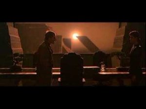
The lighting in this scene is high – key but it does not convey a positive mood to the audience because the lighting is really harsh and this tells the audience that the film is set in a harsh world and there is harsh light as a result. From a narrative standpoint , the lighting  shows how badly this world is polluted as the light from the sun seems to be unnaturally bright and distorted and this may make the audience feel  unsettled. Furthermore , the Lighting tells a story on it’s  own and it saves the characters from having to explain what had happened to the environment to the audience as they would be able to work out what had happened from the fact that the sky had turned black and from the context of the film and this helps to add to the story in an innovative manner


The costumes in this scene are reminiscent of the clothes that were worn in the 1940’s and this pays homage to the classic noir thrillers and Blade runner is part of the Neo – noir movement that was prevalent in the mid 1970s and early 1980s. Rachel’s hairstyle and makeup is also an homage to the old noir thrillers of the 1940s and she resembles a typical femme fatale that was a common archetype from films in that era and this may make the audience feel nostalgia due to all of the homages that are paid to the film noir style in the film and this helps to establish the as part of the Neo – noir movement , which was a movement that was inspired by the classic noir thrillers but it updates them for a more contemporary audience.

In this scene , the set design is very simple and it is quite understated and this may be because the costumes and the lighting are meant to draw the viewer’s attention and the sets are designed to add extra dimension to the scene by making the sets seem more realistic and this will help convince the viewers that what they are watching could be real. In addition, there are few props in this scene and this helps to bring attention to the characters and their motivations and it helps the audience to become emotionally  invested in the characters and what happens to them in the rest of the story and this is a pivotal scene where the relationship dynamics between the characters are being established so the minimalist set design helps to draw attention towards the characters. Furthermore , the set and prop design resembles decor that was popular during the 1940s  and this is in keeping with the noir style which Blade Runner pays homage to.

In this particular scene , Deckard and Rachel are placed at opposing ends of the frame ant this may indicate to the audience that  they might become enemies and this may also serve as a subtle hint to the fact that Rachel is a replicant  because Deckard is a Blade Runner and Blade Runners and replicants are sworn enemies and it is  unknown at this point in the film if Rachel and Deckard will become enemies because of Rachel’s status as a replicant . Rachel is supposed to look like the traditional femme fatal  and this scene helps to add to the ambiguity of her character , as ambiguity was a common facet of the femme fatal archetype  and the scene composition also makes her relationship with Deckard ambiguous until they enter into a romantic relationship and then the ambiguity fades.

https://www.youtube.com/watch?v=yWPyRSURYFQ


full film studies summer task

Ayisha Audrain

What makes a film a good film ?

I think that a good film has a unique and relevant story and it has to have a message that the audience can understand, for example The Matrix is set in a hypothetical future where humanity is trapped in an illusion that is created by machines and a chosen one rises up to defeat this evil force that is keeping humanity enslaved. Although this film was released almost twenty years ago it also incorporates some scathing commentary on our increasing reliance on machines, in addition, the film has many philosophical layers to it and this makes The Matrix a piece of cinema that will endure for years to come. My chosen film is a sci – fi film and it presents the audience with a bleak, dystopian future – the film was written and directed by the Wachowski siblings and the film stands out in the way that it integrates the colour green into its environments and it is also distinguished by its use of dark and muted colours in the environments and the costumes that the characters wear.

The film is written from the point of view of a hacker called Neo and we see his journey from a slave to the system to the chosen one who will save humanity from bondage and in the beginning Neo is scared and frantic but by the end of the film he has evolved and he has taken up the mantle of the ‘Chosen One’ and he is more calm and composed and this shows Neo’s growth thought the story.

The cinematography in The Matrix contrasts shiny office buildings with a bleak underbelly and this symbolises the illusion that The Matrix has created in order to oppress and enslave humanity and it shows the duality of all humans , in addition, the constant use of mirrors throughout the film symbolises Neo’s search for the truth and that is one of the major themes that encapsulates the entire film and it also serves as a cautionary tale about the arrogance of humanity and the potential power of technology, furthermore , sound is used to build tension in the film , especially when the heroes are being perused during the high – speed chase scenes and much of the background music utilises a lot of synthesisers and this is highly suitable for the theme of the film which is about computers and how they have come to dominate humanity.

The mise – en – scene in this film is sparse and minimal because the world of the film is very harsh and the characters in this film wouldn’t own anything frivolous , that being said most of the mise – en – scene in this film either consists of reflective objects like the spoon and mirrors and computers which helps to reinforce one of the key themes in the film which is the power of technology and the revolutionary potential it holds. The Matrix is a film about the destructive potential of human arrogance and it is also about hope for a better future , furthermore , the editing helps to extenuate the slick action scenes and it drives the story

forward because it makes said action scenes more dynamic and the editing becomes a story technique in its own right.

To conclude , I firmly believe that a film can only be good if it has a good story and plot and all of the other aspects that I just mentioned are secondary because if you don’t have a good story which you use as a starting point all of the other aspects of a film will fall completely flat and it won’t end up b

continuous shot example

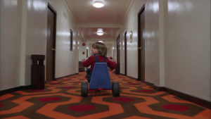
I have chosen the famous continuous shot from The Shining (1980 , directed by Stanley Kubrick) because it feels as if something is following the main character and the camera  is following him at a fast pace and this helps to create a sense of tension within the scene and Kubrick has suggested that the camera represents the spirit of the hotel that was watching Danny. In addition , the shot helps to establish the claustrophobic nature and that the Torrence family are trapped within it and this can make some of the audience feel wary of what is about to occur.


https://www.youtube.com/watch?v=cy7ztJ3NUMI