Mise-en-scene in Bladerunner

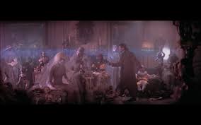
The scene I believe represents a lot of mise-en-scene elements is the scene Towards the end of the film where Rick Deckard (Harrison Ford) is in the building and is trying to find and kill Roy Batty (Rutger Hauer) and Pris (Daryl Hannah).
In the scene there are lots of examples of mise-en-scene such as set design. As you can see in this part of the scene there are a lot of random and weird objects such as dolls and mannequins which fill the room and give an even stranger impression of Pris and Roys character. It also gives Pris a place to hide which is amusing to the viewer as she is hiding in plain sight and adds suspense because we don’t know when she will reveal herself but we know she is there and Rick doesn’t.
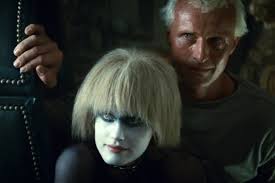
Another obvious feature in this scene is costume. Pris’ costume is representing that of a bride, she also has a skin-tight white suit on the help with her disguise as a mannequin. This costume gives her an inhumane personality.

Hair and Makeup: my favorite use of hair and makeup in this film is Pris’ because it makes her look crazy and deranged, the viewer sees this by her short frizzy hair and pale skin with splodges of colour and eye shadow.
When Rick shoots Pris she lets out a horrifying sound of screaming, This links to my next mise-en-scene feature: sound. The screaming sounds as though it is in the background and Pris isn’t making the noises which give the viewer a sense of her soul leaving her body and it alienates her even more.Another example of sound in this scene is where Roy is howling whilst running around the building, this feature is used because Roy sounds like a werewolf and werewolves are partially human just like the replicants, the howling allows the viewer to differentiate Roy from Rick even more.
The lighting in this scene is very dark, this creates a sense of unease for the viewer as there is lots of shadows and for the most part of the fight scene you never know where Roy is going to appear from. The shadows give this an even more unknowing feel. Although it is dark there are shimmers of light from outside, this allows the camera to pick up the action so that it isn’t too dark for us to see, the rays of light from the outside of the building have a natural sense of light rather than the more obvious choice of having lamps dotted around the rooms.When Rick first walks into the room with Pris and all the dolls it is quite light which gives a safer feel for the viewer, as soon as rick discovers one of the mannequins is actually Pris he gets kicked backwards into a much darker room, this was no coincidence, the director had this done so that the darker room is where the fight happens and this makes the audience more scared.As a part of set design, the whole building seems to be leaking with water, this makes it seem like it is raining, rain is a negative weather and directors use rain to add a sense of unease to their scenes.

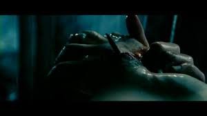
Finally, the use of special effects in the final scene create a more brutal feel like when Roy takes the nail out the floor board and puts it straight through his hand to pry it open. Of course, the nail didn’t really go through Rutger Hauer’s hand, in the final cut (2007) the nail going through the hand was edited out because it was too brutal, this shows how good the special effects were in 1982 without CGI. This also adds to the brutality of the scene and makes the viewer even more scared of Rutger because of the lengths he will go to so that he can kill Rick.
