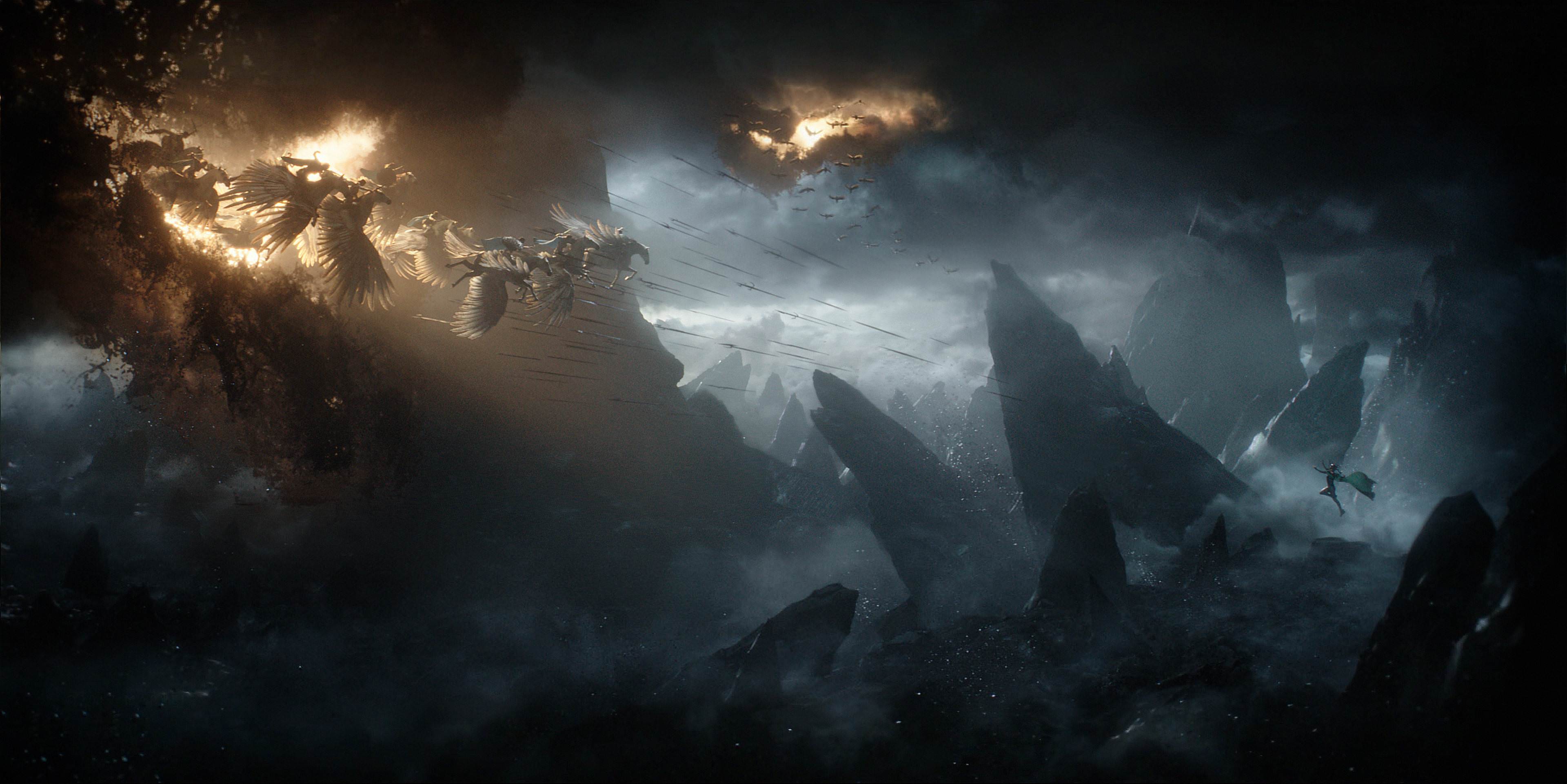

I think that this scene from Thor: Ragnarok (dir. Taika Waititi, 2017) has used the idea of spacing very effectively. The director has chosen to have the Valkyrior coming from above, and for Hela to be positioned below, which creates a stunning contrast between the two. The audience could also interpret this as having a symbolic meaning – as the Valkyrior above represent heavenly angels. This was a very good decision by the director, as the positioning emphasises how Hela is bad and could bring chaos to Asgard. Even though nearly the entire scene was made using visual effects in post production, it still looks amazing.
