Dr Caligari – cinematography

Lighting is very simple within Dr Caligari as it mainly involves the stark yet deliberate contrast off dark against light and black against white. A prime example of this comes from the makeup of Cesare. As I previously explained, black is used to represent darkness and evil within his character; that of the implication that he is a murderer by the unreliable narrator of Francis. The remarkably white tint of his face stands out sharply against the black hair, makeup and background. White and black are interesting colours to contrast because they are considered opposites; innocence and evil representatives. The surrounding of darkness suggests that Cesare is being affected by evil and this malevolence is slowly spreading. This interpretation can be considered corrupted by Francis’ warped mind which makes us question everything.

Shadows are actually used to show Cesare killing Alan. Throughout the film, we see Cesare as a dark, twisted character. However, by not actually showing him murder Alan, and instead using his shadows; we are given the implication or perhaps foreshadowing that he is not actually a murderer. But by this point, we do not know this so we assume that he is this evil, dark character. Murdering Alan in darkness and hidden by shadows serves as a good representation of Cesare as a dark character himself. We are led to believe this because the darkness hides his true character. Visually, the shadows contrast against the limited lighting to show the audience exactly what is happening. I don’t think the murder would be as effective if shown in broad daylight because by this, we never actually see Cesare do it; this shows that he is not truly evil to the point where Francis’ twisted memory cannot even conjure the image of him murdering Alan
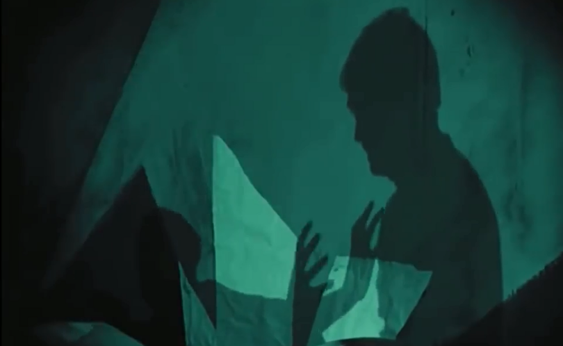
This image has an empty alt attribute; its file name is x3.png

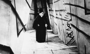
Another main focus of lighting, is that of the contrast between light and dark. Most of the characters wear black, or dark colours aside from Jane. This stands out against the brighter lights and interior designs which are typically white or grey as seen in the picture. Since the characters are usually depicted in darkness, we get the assumption that Francis perceives others as evil and not to be trusted. Since we are watching the film from his ‘flashbacks’, we assume that he is telling the truth. However, his deranged world is fiction and the characters shown in darkness are simply reimagined people from his environment. The contrast is significant to show the clear difference between the characters and the set. This can be derived from the idea that although the people themselves are real their characters created by Francis were not and we are actually not viewing an environment but instead trapped inside the warped mind of Francis

Since the film is filmed entirely within a studio, there is also the idea that there is no access to the real world and the characters are trapped within this hellish nightmare. Fear is a main feelings imposed upon the audience by the unnatural approach to the set. This is very significant in setting the mood for the rest of the film and suggesting that the characters are trapped within this world. We are given a look into the mind of Francis from his perspective since we did not know that his story is fabricated. However, this separate world is disrupted by the elements of normalcy shown through certain sets such as that of Jane’s house. This is a shortened and edited version of the essay, the rest can be found on the blog not in the film role 2 category*

Dr Caligari – editing

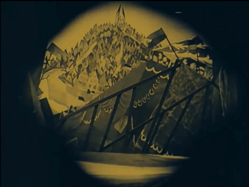
The editing within Dr Caligari is unique and innovative because it reflects the unsettling atmosphere of the film. Iris wipes are frequently used to make the transition between scenes much smoother which continues the fraught tension. This technique is adapted and utilised throughout the film’s entirety and many versions are used. In this particular scene, a diamond shaped iris wipe is used to unsettle the audience by showing Cesare. Since we can only see him within the setting, fear is successfully achieved because everything else is blacked out. A fade is used to cut in and out of the scene, giving a smooth transition which is significant in retaining the tension created by the dark, ghoulish lighting. In this particular sense, the iris wipe is vital in keeping the scene as fluid as possible since it can be considered one of the most anticipated and exciting scenes so needs to run smooth. Since we are engaged in the film, the idea of darkness surrounding us ensures verisimilitude because not only does it make us feel part of the film but it represents how we are viewing the film from Francis’ mind and observing his story.

This image has an empty alt attribute; its file name is p1-4.jpg

However, iris wipes are also used to represent a flashback. When Francis; the narrator retells the story of the fair, an iris wipe is used immediately after to physically show us a difference in scene which can represent the time period difference; signalling a flashback. The cut emphasises that this is a flashback because the camera’s iris is shut slowly then re-opened. This can represent the reopening of Francis’ ‘memories’ to narrate what happened that day. The physical change in scenes reminds us that there will be clear differences because we can see the change on screen between both the two scenes but also the different time frames. This is vital in showing that there is a clear difference to not confuse the audience as to whether the flashback is actually happening now. This the film does not follow a clear linear, and the flashback demonstrates that there is a time difference. The fluidity of this transition was very significant to show that there is actually a difference because it should not confuse the audience.

This image has an empty alt attribute; its file name is p2.png

There is a lack of intercutting within the whole film due to the difficulty occurring with manual cutting, changing and addition of the film. This meant that it relied on fades and iris wipes to smoothly transition each scene to the next which was important for a horror film but especially for one which builds up tension. However, since the film is silent there are period where scenes cut to title cards which narrate and explain what is going on. This gives us background knowledge and also separates each scene clearly which is useful to ensure that the audience know what is happening and when. This is important because it ensures that we fully understand Francis’ story. As he is the narrator, we trust everything that he tells us without the dialogue to prove this.

Shots vary in length to keep the audiences engaged. For example, when Cesare is first introduced to the audience; the shot lingers on Dr Caligari and Cesare to ensure that the audience realize how significant the characters are. There is also the element of delaying the anticipation, as the audience eagerly await to see how the onscreen audience will react to Cesare. But the shot is dragged out so the tension builds as the audience continue to wait for the reaction. However, when it finally cuts to the audience, the frame only lasts a few seconds before flitting back to Caligari and Cesare. This could perhaps represent the significance of the two characters by getting the audience to focus on them. This is an edited and shortened version of the essay because of the high word count, the rest ids avaibile on my blog but not for film role 1 category*

Breathless – cinematography

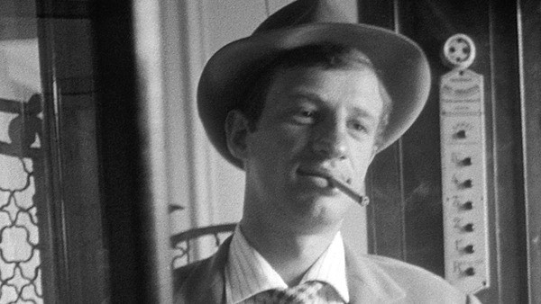
The jerking, sometimes hard to follow visual style is interesting because it continues the abrupt, jarring editing style within the film. Since this represents Michel’s character, we can assume that he is not behaving rationally because the camera style is shaky and out of control, perhaps representing his wild and careless thoughts.

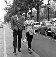
Monologues were not typically common at the time, during the year of release, there were many French drama and crime films produced which led to the need for diversity. Many films, such as ‘The Hole’ (1960, by Jacques Becker) utilise action and short shots to keep the audience on the edge of their seat. Whereas Breathless breaks this convention and uses long shots to ensure verisimilitude by keeping the audience fully engaged and ready for what will happen next. Although the sequences and shots seem sometimes unnecessarily long, they keep a chatty and unique element to the film which makes it so influential

This image has an empty alt attribute; its file name is p8.jpg

Another innovative technique used by Godard is the lack of colour stock in favour for black and white. This creates a unique effect by setting Breathless apart from the other films which were typically in colour at the time. Although colour film was still very expensive in the 1950’s, more popular films were beginning to use it. This technique may seem intentional as Godard may just be using black and white to save money, but the lack of colour can represent the honesty of the film because it does not hold back.

Breathless – editing

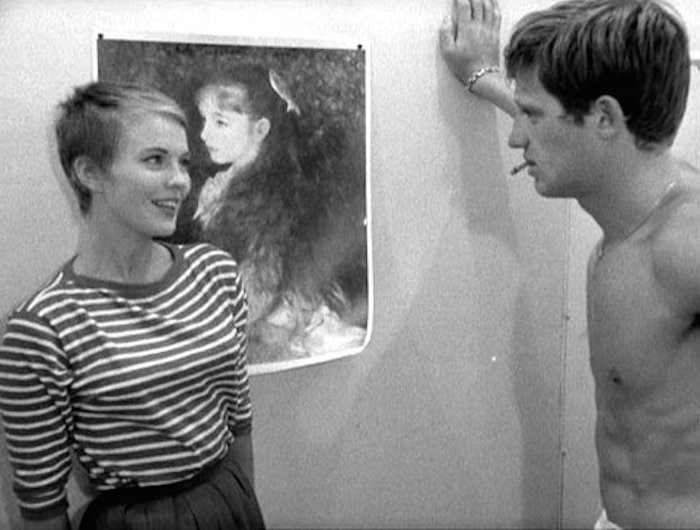
One of the most arguably innovative editing aspects of Breathless is the jump cuts which seem quite random but help to elevate the film and give it character. An example of this comes from the opening scene, where Michel converses with a woman getting changed. As the scene continues, jump cuts are frequently used to join random fragments of the scene together. Sometimes, this does not necessarily make sense but keeps the audience fully engaged and on edge because they are interested due to the unawareness of what will happen next.

This scene in particular draws the audience in immediately because they want to know what will happen next. By using such random jump cuts, they are kept on their edge of their seat at all times and aware that anything could happen next. Although they seem aimless and very random, they play a pivotal role and purpose in retaining a methodical, yet chaotic and sometimes messy pace of the film. Jump cuts are also used to represent the reckless nature of Michel. After shooting the police officer, a jump cut is used to show him carelessly driving in Paris. This abrupt change can show that he does not care about getting caught and the chaotic jump cut used to transition the scenes can represent his careless nature. Since Michel kills the officer for almost no apparent reason, this careless behaviour is reflected in the editing style as an abrupt and considered unnecessary jump cut is used to transition scene. This is significant because it develops Michel’s character

This image has an empty alt attribute; its file name is p1-3.jpg

In general, the editing style of Godard influences the drop in continuity editing in favour for jump cuts, longer shots and a wider focus for cinematography and editing opposed to narrative and plots. This has an interesting impact on films because it sets them apart from similar genres and plots by ensuring a unique visual style and look.

This image has an empty alt attribute; its file name is p5-1.jpg

At the time, most popular Hollywood films adopted a typical, continuity style of editing. Godard breaks this convention right at the start of the film which begins with alternating shots of a close-up of Michel and another close-up of a woman. By using close-ups, we get the impression that the characters are positioned close to each other because of the proximity we are viewing them from. However as wide shots are introduced instead, we see that they are positioned quite distant. This may confuse viewers, who are used to the simple and easily perceivable style of continuity editing used by many Hollywood films. Another unique element of Breathless’ editing is the varying shot length. Certain films adopt a usual shot style, by utilizing fast cuts to break up shots or slow, drawn out shots which build tension. This is a shortened and edited version of the essay, the full version remains on the blog*