‘Strike’ directed by Sergei Eisenstein is the first example of Soviet cinema which had both an emotional but also visual impact on the audience. The fast paced yet intelligent and thoughtful editing influences a range of other films and the innovative montage style is cited as being one of the most visually appealing elements within film. Eisenstein utilises a variety of montages to exhibit a strong hold over the pace of the film. Regardless of the varied montage style adopted by Eisenstein, the film mainly uses intellectual montage to show the extremely thought-provoking emotion clear in the film. Although it can be regarded as a form of propaganda, it is a remarkably emotional piece of film because of the harsh reality and messages shown.
Parallel and rhythmic montages are used to represent the severity of the conditions and resonates with the audience at the time because they were experiencing what was happening. In turn, this was extremely significant in immersing the audience because they understood what was happening so could engage further with the film; ultimately getting the most emotion and experience from the film. In particular, parallel montages are used to show clear themes of divide within the society. This is done to perhaps blame greed and selfishness for the social divide because despite being poor; the workers are typically pictured as happy with family compared to the mainly alone industrialists.
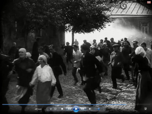
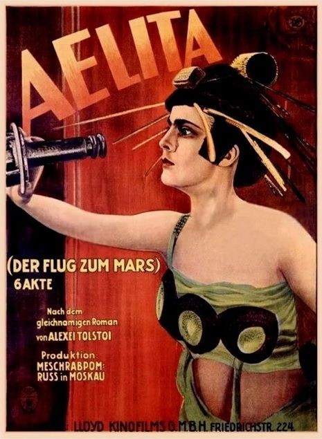
‘Strike’ was one of the first classic soviet constructivism films, and the style of soviet montage was used and adapted in many other films. Sergei Eisenstein continued to evolve and adapt his innovative montage technique within other films, most notably; ‘Battleship Potemkin’ released only months after Strike. The concepts of political propaganda continued throughout the later aftermath of the revolution, and films such as ‘Man with the movie camera’ adopted some of the visual style from Strike and the Russian avant-garde movement.
There were many aspects of the film which influenced other later films, particularly the visual style of defined shapes. As well as how the film was composed, the montage style was also very popular and considered so innovative because no other director, cinematographer or editor had achieved such a unique visual style or trademark to such standard and generic political films at the time. As well as the influence on Soviet cinema during the 1930’s, the visual style of Strike and innovative five methods of montage also had a strong influence on contemporary cinema. The overall style and atmosphere of Strike is admired by directors such as Brian De Palma who directed the 1987 drama ’The untouchables’. Despite over a sixty year gap between the two films, De Palma is heavily influenced by Eisenstein and the visual style of Strike. Although different methods of montage appear throughout the film, it is the general style and Mise en scene which is reflective of the innovative political propaganda from 1925 which is most prominent in the piece of contemporary cinema.
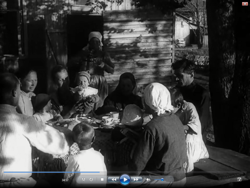
One of the main themes from the film, comes as the form of a clear social divide. The workers are seen as worlds away from the industrialists, perhaps representing the widening gap between the classes at the time. Audiences would relate to this, regardless of their class because this idea was actually happening within the society at the time of the tsarist regime ending in 1917. A parallel montage is used to show a happy scene of the workers eating with their family. This shows unity and a bond which resonates particularly with the lower working class at the time of the film’s release. Although they did not have much money, they had love which is shown by their clear happiness.
Next, we are shown a similar scene where the industrialists also eat breakfast. However, they are shown without family to represent their selfish greed leading to a lonely life of isolation. This can represent how despite being richer and more ‘powerful’ than the workers, they are not as happy and loved. This montage is significant because it shows a clear divide, this is more important for the audience at the time because their emotional investment in the film would increase because they are understanding and first-hand experiencing this social divide. However, an interesting way to view a parallel montage is that is gives the audience both sides of the argument. We are shown the workers then industrialists to perhaps represent that we are all human and are more similar than we think regardless of our social, economic differences.
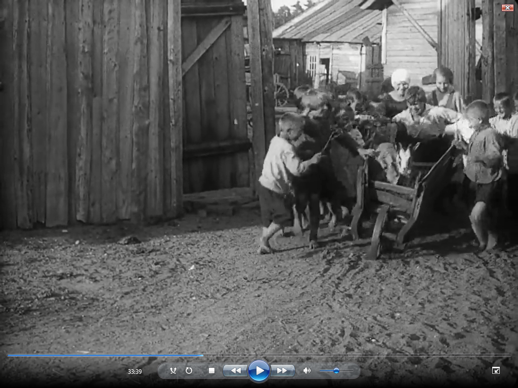
Parallel montage is also used to represent the strong political message within the film and put emphasis on the fact that although the characters and actions may be fictional: the story is very real and honest. A short scene depicts the children working which is not an uncommon occurrence at the time. A parallel montage is then cut to a similar scene where the workers are resting and sleeping. This contrast can represent the struggles and hardships that the youth inherited from the workers. The cut between scenes are fast, and Eisenstein does not linger on a shot too long to create a wild flurry of emotions which would resonate with the audience at the time who would have experienced the events within the film. The cuts are very sharp so we only get a glimpse of what is happening, this is vital in ensuring that the film does not fall into just storytelling. This allows the film to serve as a political message, of which had a far greater impact on the 1920’s soviet audience in comparison with a contemporary audience.
The messages of unfair treatment and social class divide were more significant at the time of the film’s release because they were an actual reflection of the Soviet government at the time. In particular, this parallel montage is significant in representing the impact of the strike on the whole country. By showing children working, this can perhaps serve as a foreshadowing for the long, hard life of labour ahead for the working class generation. Comparing the children working to the workers resting can represent how it will be the new younger generation who will soon take over the working duties. This can show the tedious circle of hardship and work endured by the lower classes, which can evoke sympathy from a contemporary audience whereas understanding and reality from the 1920s soviet audience who would have understood and experienced these feelings.
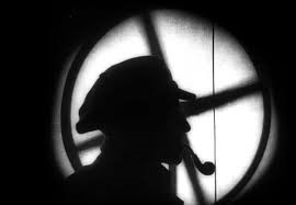
A parallel montage is used again to juxtaposition shots of the workers meeting against the industrialists’. The workers are surrounded with trees and nature which could perhaps represent the natural aspect of their world. Whereas in comparison, the industrialists are smoking with heavy pillars and artificial props surrounding them. The artificial elements introduced by the industrialists represents the solemn, lifeless aspect of the industrialists who are driven by their own power and greed. Although the workers are poor, they are surrounded by family and their lives seem much more natural. This is significant because it continues to represent the important theme of social divide, this is particularly important as it shows a physical divide between the two social classes who are very different. By showing them in parallel, we can see that although they are all humans, they live very different lives. This would resonate more with the target audience because they are experiencing this social divide.
Most images are juxtaposed together to convey either political or typically emotional meaning and significance to have a strong impact on the audience. Some shots are parallel edited together to continue with the theme of a social divide and show us both sides of the argument. This is significant because it means that the film is understandable and relatable to the soviet audience of both higher and lower classes. But another significant idea comes from the comparison of animals being slaughtered to the treatment of the workers. An emotive and remarkably significant example of this is the parallel cross cutting of workers running away in fear, to the merciless slaughtering of animals. For perhaps once in the film, the shots are agonizingly long and linger slowly to show the pain and torment.
This is not just done to create pity and understanding from the audience; but also to make them truly make the connection between the overworked, slaughtered animals and the workers who were getting the same treatment. As well as being visually overwhelming, these sensitive scenes have a political impact on the film because they represent the barbaric and horrific treatment of the workers in Russia. These scenes may seem upsetting to the audience, but since they are juxtaposed with shots of workers; it is essential for Eisenstein to get his political representation of the strike across by making the film as sensitive and emotional as possible to resonate with the audience.
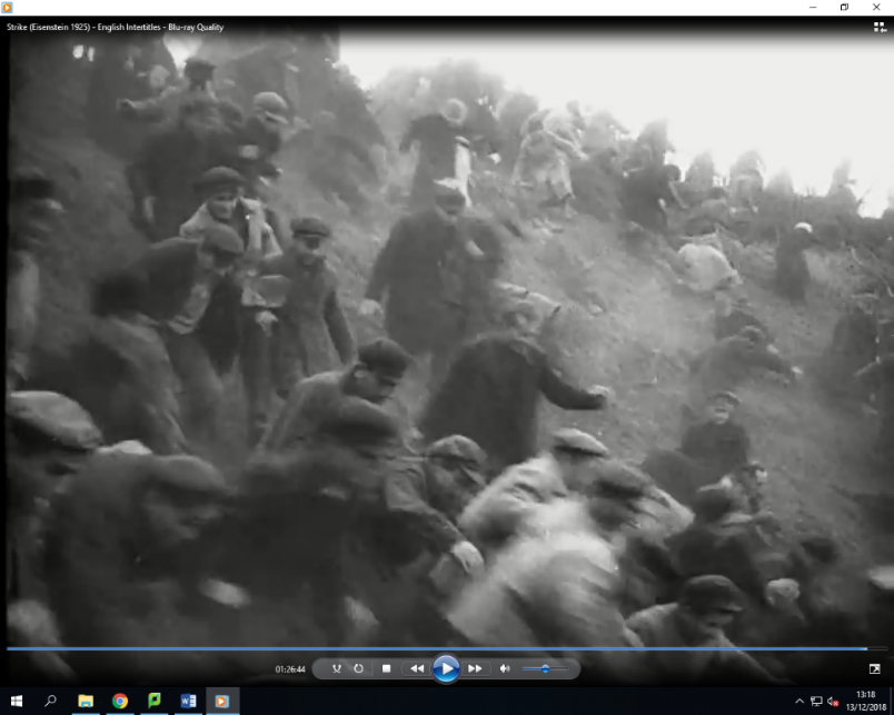
Fast cutting is another technique used to speed up the pace which in turn builds up more tension since we are shown lots of images at once which provoke an emotive reaction. The shot length is dramatically shortened so the action is very fast paced and chaotic. Towards the very end of the film, fast cutting is heavily used to perhaps represent the society’s descent into chaos. By showing us the images so rapidly, everything feels bizarre and unnecessarily messy. This represents the wild frenzy of the strike and the jarring impact it had on those involved and the society as a whole. But by juxtaposing such emotive and sensitive scenes together with an almost careless frenzy; the audience are more emotionally invested in the film. This can apply to both the target and contemporary audience because despite not experiencing what was going on, the reality and honesty of the film can evoke emotional reactions from any engaged audience.
Fast cutting is pivotal to retain a fast pace and engage the audience fully because they are awaiting what will happen next, it is also significant in joining the scenes in such a fluid way which really forms a connection with the audience. By tightening the images and shortening the shot length; tension is successfully built because the fast pace keeps us awaiting what will happen next. Using a variety of emotive images juxtaposed together is also significant because it represents the chaotic nature of the strike which would resonate with the audience at the time of the film’s release.
To continue the theme of relating the animals’ slaughter to that of the workers and society; non-diegetic shots are used frequently. This involves shots which are not directly related to the plot or action happening onscreen. For example, shots of animals being slaughtered are juxtaposed with shots of the workers fighting the industrialists. Although the animals are relevant in terms of the film’s message; they bear no significance to the actual plot of the film. The effect of this juxtaposition is to make the audience perceive the deaths of the workers as the same brutal slaughter as the animals. This is done by juxtaposing the seemingly irrelevant shots of animals alongside the workers in a parallel montage to make the similarities obvious to the audience. Although the animals do seem irrelevant; they provide a significant comparison to the brutal treatment of the workers because they are juxtaposed into parallel montages alongside the workers. This is significant because it provides a visual comparison between the two, which will make the audience understand and sympathize for the workers who are getting treated so badly. It also serves as a metaphor for the way workers are treated, alike animals.
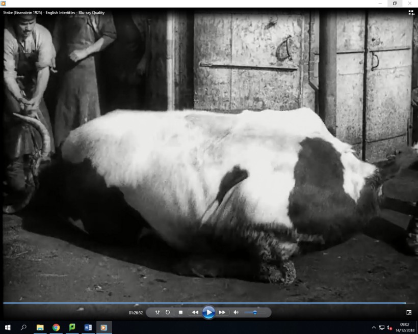
By comparing workers to animals; Eisenstein could be suggesting that alike animals, workers were overworked, treated poor and ultimately used for their work. Reducing humans to just animals perhaps serves as a powerful political opinion of Eisenstein that the society was doomed. This could impact anyone watching the film at the time because they could see how badly the society had become.
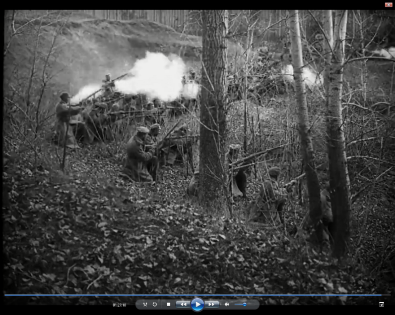
Eisenstein also uses juxtaposition to have an emotional impact on the audience without necessarily showing the scene’s entirety. When the workers are being shot at, we don’t seem them actually die; shots are just cut to them on the floor dead or the further chaos. This creates a disturbing sense of carelessness and almost normality. Although the scenes are horrendous, it would resonate with the audience because they would’ve experienced what was happening. The shots from where they are running are also juxtaposed into tricking us by seeming very inaccurate. When the workers seem to be running downhill they are actually running uphill.
This illusion is interesting because it represents how despite their failures and attempts they carry on but still have a long battle ahead of them. It also tricks us into thinking that they are continuing into a downward spiral which suggests that they are not going to succeed. This adds more tension to the film because this technique was not used before in cinema. As we see the workers running so much, this could represent how they are trying to escape from the hard, troublesome life of lower class to no avail. This is significant in showing the hardships and issues faced by workers, which would result in understanding from the working class audience at the time who had experienced these hardships.
Tonal montage is also used to create tension and keep the audience engaged. For example, the shot of a ducking represents new beginnings but also innocence. This is then cut to several non-diegetic shots of animals which are irrelevant to the plot but generate the feeling of the workers having a new start. This conveys positivity and happiness for the workers because the duckling is a motif for their newfound freedom and beginning. These shots are held for longer than some other shots within the film which makes the audience understand the relevance of their comparison to the workers new start. This is significant in conveying to the audience that the workers are happy and free, for now. The idea of a young duckling is a picture of innocence and fresh start which can represent the workers at the beginning of the strike. Whereas the harsh reality of the strike and its devastating consequences begin to dawn on the workers; they have lost this likeable innocence which makes the film more relatable because the audience at the time would’ve experienced those feelings first-hand.
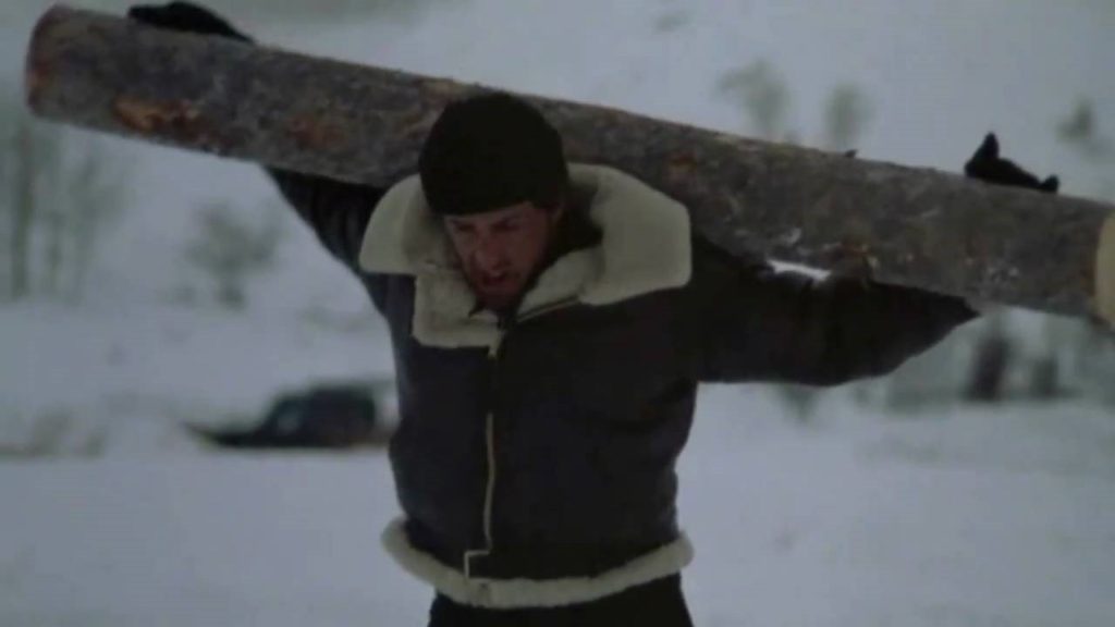
Other films are more influenced by soviet constructivism as a movement, most notably the famous ‘Odessa step sequence’ from Battleship Potemkin. The most prominent example of this comes from the repeated motif used in ‘Rocky’ (1976, by Avildsen), of the ascension with steps within the training sequence both in a literal or metaphorical sense. The comparison is close, and Avildsen utilises the popular montage to create tension and reflect the fraught atmosphere similar to Eisenstein. In rocky IV, the juxtaposition of shots detailing the comparison between Rocky and Drago’s different training routines follows Eisenstein’s method of montage. The cuts are very fast between shots, comparing the natural and real training of Rocky with the artificial training of Drago which represents the traits of the two characters.
Intellectual montage is utilised by many filmmakers and cinematographers, in contemporary cinema the most notable film is ‘Requiem for a Dream’ (2000, by Darren Aronofsky). The film includes a collection of montages, which depict meanings without always explicitly showing or stating things. For example, when a character consumes drugs, a fast-paced montage is shown: shots of various things are cut to match the rhythm of the intense music which introduces metric editing. The shots are cut together with simple imagery, such as the packet of drugs, rolled up cash etc. when edited together, a fast paced montage is formed to symbolically show the audience what it is like for the character to take drugs. The narrative is easily transmitted and the meaning is more deeply conveyed than just showing the character taking the drugs because the juxtaposition of shots together represents the wild thoughts of the character and makes the audience sympathize with them because they can see how chaotic their mind has become. The close-up shots are juxtaposed together in a fast, intense montage: which makes the audience experience the world of which they are by taking the drugs. This has a profound impact because the audience would be drawn into the character’s perspective.
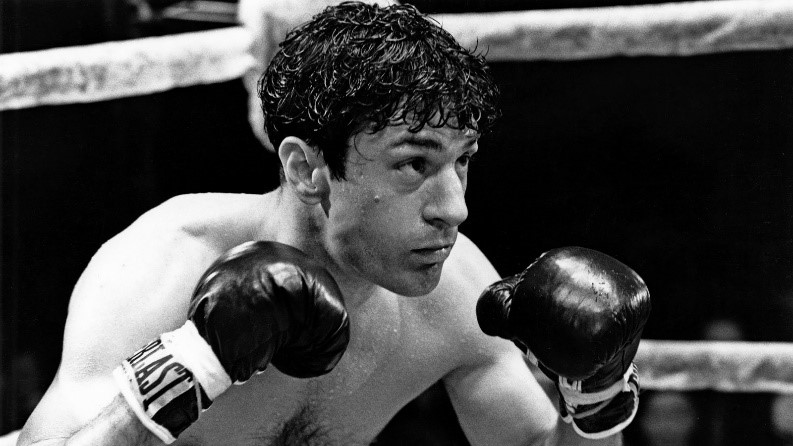
Another film which uses intellectual editing is the 1980 autobiographical drama ‘Raging Bull’ by Martin Scorsese. The whole film is in black and white, apart from a montage which juxtapositions still from the boxing match to a collection of home videos which are the only thing in colour. This pays homage to Eisenstein who utilises black and white to focus on the narrative, editing and messages behind certain things. There is also the idea that nostalgia and memory can be tainted, and this is shown through the montage. The idea of two personalities is introduced by the comparison between the sharp, harsh stills of LaMotta in the ring – attacking his opponent in brutal black and white, whereas the warm colours are representative of his seemingly loving relationship with his family. This is a fake concept, as he is later shown as horrid to his family, which is representative of how memories can be tainted. Comparing the black and white to colour scenes represents the fake memories of warmness and compassion to the almost animalistic state of LaMotta while fighting.
The ideas of cubism are also briefly explored through the different viewpoints shown from the varying camera angles. Although this technique may be difficult for the audience to perceive what is actually happening; it introduces more characters and viewpoints which makes the film seem more understandable and reliable. This is an interesting technique because although it is visually hard to follow, it allows the story to develop more because the understanding is more prominent to the audience. By showing multiple viewpoints, the film seems more adaptable since there are multiple ways of looking at things. It can also perhaps represent the vast target audience and how it wold be everyone watching the film. Therefore it would need a large viewpoint to seem realistic to the entire soviet audience of the 1920s. This is significant because it ensures that the film is as accurate and also relatable as it can be.
Wipes are used to make the transition between each scene smooth. The film does not follow any specific narrative or families which may seem slightly dull but interest is added by the wipe bringing each scene to life. This allows the audience to feel engaged as the film is swept into another scene from darkness. This could also represent how the workers are trying to drag themselves away from the hardships and struggles of their everyday life. The shot type is kept as varied as possible to also interest the audience. For example, close-ups are used to show the clear emotion of fear and happiness on the characters faces which would influence the audience’s opinion of them. Depth of field is also something with a varied and relatively restricted use. For example, within the water scenes there is no depth of field. This can perhaps be done to give the film a naturalistic, realistic and also simple style. A result of this is that the film feels more natural and would resonate even more with the audience at the time because they could engage with it fully as it looks as seems believable.
At the time, filmmakers were becoming more creative and started to think outside the box. Change occurred mainly during the late 1910’s, with the formation of the film school VGIK. It’s considered the oldest film school in the world, and was taught by an impressive alumni. It was founded by Vladimir Gardin and involved a number of Russian filmmakers sharing their skills. In particularly the 1930’s, the school was heavily influenced by the work of Eisenstein; most notably ‘Strike’ and ‘Battleship Potemkin’. Between 1934-1991 the school was known as the ‘All-union State Institution of Cinematography’, perhaps due to the success of filmmakers including Kuleshov, Romm and Klimov. This time period was perhaps the birth of Soviet constructivism and led to a wave of new films which didn’t define the ‘normal’, and creativity was beginning to be further explored in comparison to the typical films produced beforehand.
Rhythmic editing is also used to control the pace and creates climatic tension. Cuts are made based around the timing of music paired with the action on screen. This successfully creates tension because the pace of the scene and editing matches the tone of the non-diegetic score. For example, towards the end of the film; the implications of the strike are dangerous for the society as the industrialists fights both workers and civilians. Terror is mainly conveyed by the fast-paced, dramatic score which keeps the audience engaged within the action. The editing in this scene is rhythmic because the fast, short cuts between shots matches the dramatic, fast pace of the score.
The cuts themselves are actually quite simple, perhaps because they appear in places we would expect. In this retrospect, rhythmic editing relies mainly on the pace of the music to establish a general atmosphere for the scene. In this scene; the fast, yet thoughtful and deliberate editing reflects the wild and chaos that is the strike. This would have a profound impact on the audience, who can see, but also understand the wild, intense action happening in the film. The cuts also help the film to flow, because the audio clearly and cleverly matches the onscreen action. Shots appear everywhere on screen in short periods of time, almost overwhelming the audience. This can reflect the overbearing and intense yet honest nature of the film which seems to show too much at once. Although not every shot may seem relevant, each helps to build a sense of power because edited together in one fast intense scene makes the audience emphasize and understand what is going on.
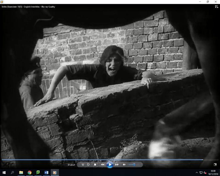
The visual style of Strike was also remarkably unique, which was inspired mainly by the Soviet fine art movement. Sharp, defined shapes and mise en scene was innovative and cinematographer Tisse utilised these clear, evident shapes in a deliberate manner to set Strike apart from any other film: and help ensure that it is quite visually unsettling because it defied conventions at the time. Popular artists such as Talin and Malevich created revolutionary pieces of artwork each which told their own story and conveyed a significant message.
The art movement varied, as each artist put their own spin on their work. However, the movement is based around bold, defining shapes which clearly stand out in the art. This particular type of Mise en scene was used by Tisse who set the visual style of Strike apart from any other film at the time. This was significant because it ensured that the audience would actually want to watch the film and made it interesting opposed to just real and honest. The movement, also known as ’Russian avant-garde’ made a particular breakthrough and development during the revolution of 1917. Propaganda was a main reasoning behind the rapid production of literature and art, which in turn tried to persuade and inform its audiences.
Cuba-Futurism, Constructivism, and Supremacism with their simple shapes and unimposing structure fitted the new requirements of the movement. The revolution brought around change in Russia, the people were finally gaining control and expressing their views in the country. Many people turned to art to express their thoughts, political parties commanding various forms of propaganda such as leaflets, paintings, books and even architecture on buildings.
