Micro Elements in Citizen Kane

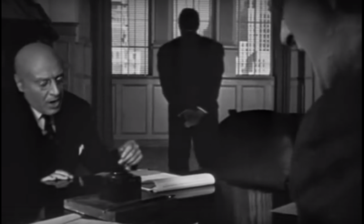
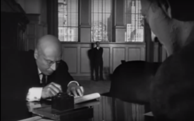
In my opinion, this scene from Citizen Kane (1941, dir. Orson Welles) has a wide range of different micro elements, which work together to create a subtle but overall very incredible effect. It is a scene from towards the beginning of the film, where Kane’s childhood is partially explained to the audience.

This scene begins with a fade from the text that is being read to Kane as a young boy playing in the snow. Firstly, this is helpful to the audience as it focuses on the sentence ‘I first met Mr Kane in 1871.’ before fading into the snowy scene, which helps them to understand the context. In addition, the slightly tense music that is playing at the beginning smoothly changes into a happier tone, creating a Christmas feel. This makes the transition between the two shots seem smoother, and helps to immerse the audience in the winter scene.

This scene also features a long take, from 0:26 to 2:06. It begins with the camera zooming out through the window from the shot of Kane playing in the snow. The camera then continues to move backwards through the room, stopping at the end of a table. However, for this take to be possible, the camera must have passed through the table. To solve this problem, the cinematographer for Citizen Kane, Gregg Toland, came up with a table that would split in half to allow the camera to pass through, then quickly attach back together in time for the shot. This was an incredibly innovative idea, as it immerses the audience within the scene and creates a high sense of verisimilitude.

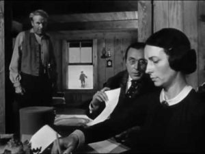
The use of a deep focus lens in this scene is also significant in the message that it portrays. For example, here everything in the scene is in focus, so the audience aren’t quite sure on what they should focus on – the signing of the paperwork in the foreground or Kane playing in the snow in the background.

The deep focus shot causes the emphasis on characters to be drawn from their actions and movements, rather than them just being in focus. The fact that Mrs Kane is in the foreground suggests that she is holding the power in this scene, as she is in control of young Kane’s future. Kane is also in focus because of the lens, and he is shown to be playing happily in the snow. The mood of his actions contrast the atmosphere inside the room, which emphasises to the audience how much this deal will affect his life.

The lighting used in this scene is subtle, but still creates an effect. Compared to some other scenes in the film, it isn’t used as heavily here, but the bright lighting could be suggesting how Kane’s childhood was a happy time where he didn’t have to worry much. As the film progresses, the scenes become darker, which could be showing how his life is going downhill – especially towards the end when his wife leaves him and he’s left in Xanadu all alone. In addition, Mrs Kane is in slightly brighter lighting than Mr Kane, again implying that she holds all the power over the boy’s future.

At the end of this scene, the camera eventually switches from using medium shots to a close up of Mrs Kane and Kane’s faces. These shots are some of the only close-ups used in the film, and they help the audience to clearly see the emotions in the characters’ faces. It helps the audience to realise how much Kane doesn’t want to go and live with Mr Thatcher, and it makes them sympathise with the young boy.

Why Film critics label Citizen Kane as the best film ever made

Citizen Kane (Orson Welles, 1941) is widely regarded as the best film ever made by many critics largely because of its use of cinematography and editing, it was of a far higher standard than usual. At the time many camera shots were from the same heights, same angles – there was not a lot of variation.

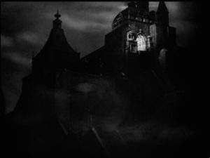
Additionally, there was great use of editing in the film. The famous transition wipe scene in the opera house when the camera is rising and rising, the use of deep focus when Mrs Kane is signing the papers, the Xanadu miniature fading away to reveal the next shot. All these techniques were far ahead of their time and left the audience in awe.

Here is an example of a very good tracking shot, very few movies had used this kind of cinematography before and that is why Citizen Kane receives such high reviews

Here the camera is on what i presume is a crane which then moves up to a restaurant sign, through it and finally a transition is very well hidden with the stormy weather where rain covers the glass roof which then dissolves into the next scene. The creativity of this shot is what makes Welles such an amazing director and shows off his artistic capabilities in film.

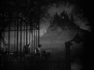
Not only that but one of its most famous scenes situated at the beginning of the film in the opening sequence where the camera, through a series off dissolves transitions, zooms in on the room Kane is in, from the bottom of a mountain to the single room lit with a light. This kind of masterpiece of cinematography is what pioneered film into the wonder it is today and plays a huge part in what makes Citizen Kane one of the greatest movies of all time.

Furthermore, Welles’ use of deep focus in the scene in Mrs Kane’s boarding school causes the viewer to sympathise with Kane. Normally you would expect the camera to be focused om the conversation however in this instance it is focused on both the conversation and the subject of the conversation. We can feel as much a part of the conversation as we feel a part of Kane playing in the snow – this allows the viewer to connect with Kane on a more emotional level.

Deep focus was not widely used at the time and it was difficult to discretely create an emotional attachment with a character. That is why when these types of shots were introduced it shocked and inspired film critics and directors for decades to come.

the shining – steadicam and symmetry

use of steadicam in the shining-

A major part of the filming process of the shining was the use of the steadicam mounts created by Garrett Brown. This allowed the cameraman’s movement to not affect the level or position of the camera meaning a steady shot almost anywhere, not just limited to using tracks etc.

Kubrik, the films director, got the creator to operate the steadicam during filming as to make sure it was used correctly as it was a brand new invention.

notable uses in the shining-

In one scene in the shining we follow behind Danny riding a tricycle around the the hotel hallways, the use of the steadicam in this scene helps massively to create tension within the audience, and help to emerse them within the film. This is done by, firstly, the steadicam itself not making any noise which focuses the audience on the loud noise of the wheels on Dannys tricycle, this eerie noise of the wheels unsettles the audience and builds tension and secondly, helps to emerse the viewer in the film by having zero other noises then the tricycle. For example noises that could have possibly been made by the operator of the steadicam was removed by using a wheelchair to push the operator along to film, the use of this wheelchair also allowed the steadicam to be at a lower level which is why we are able to have the along the floor shot behind Danny, which itself also helps to build tension and  emerse the viewer because as we are following behind Danny, we don’t know what is coming next or what will be around a corner, which will engage the audience as they will want to see what is coming next.

Image result for danny on big wheel shining

symmetry in the shining-

The use off symmetry within the shining is extremely prominent. Symmetry is used frequently through the course of the film, to effect the viewer in a way that aids the scene.

The first way the use of symmetry will effect the audiuacne is an immediate attention grab, anything centred in a shot will draw the attention of the viewer to it straight away and give them a sense that whatever object or person is being centered is important and should we payed attention to.

An example of this is the twins in the halls in the shining hotel.

Image result for twins shining

Already, twin girls in matching close silent and starring would be an eerie or spooky sight for an audience, however when symmetry is added the audience no longer see this as a small eerie thought an they might have if for example the girls where features in the background of another shot. They become the entire focus of the viewer and all thoughts are on them, and as naturally auidiances try to guess hat will happen next, which in a scene like this combined with the tone and dark imagery of the film leads to some uneasy thoughts about what could happen to these girls, or what they might do.


blade runner – mine en scene

Location/set design –

Blade runner is set in Los Angeles in the dystopian year of 2019, the setting is made to feel dark, mysterious and scary. This is done in a few ways.

Firstly, the skyscrapers in the city do a good job of giving a daunting vibe to the film by making everyone feel small, in comparison to the massive structures all the characters look small which makes the audience feel as if they are less powerful, which in turn makes the film more suspenseful as the characters face off against the antagonists.

Also, the constant clouds of smoke pouring out buildings adds an eerie atmosphere to the whole film, in multiple scenes of the film the smoke is used to aid the scene by means of adding suspense or camera work for example.

Image result for smoking buildings blade runner

lighting-

The lighting in blade runner is not just there for the aiding of scenes and audience enjoyment, but it also serves a more metaphoric purpose.

Everything about blade runner is dark, the story, the characters, the place, there are very few highly lit shots however these are done with neon lights that are scattered about the city. The contrast of the neon lights against the dark smokey setting, suddenly bright then suddenly dark makes the city feel scary to the audiance and gives the film and unpredictable nature.

Image result for neon lights blade runner 2019

Lighting is also used in the film to portray character, for example in the scene where we see Deckard’s apartment.

In this scene Deckard’s apartment is poorly lit and we have very little detail in what we can see, similar to how Deckard has been closed up and not showing too much of himself as a person or the way he feels. However, later on while he is with his girlfriend Racheal, not only does the character of Deckard open up from the cold or emotionless person he showed at the beginning of the film, but the lighting also opens up and we more more details of this apartment allowing the audience to learn more about him.

costume-

Costume design is probably one of the most iconic parts of blade runner to many viewers, the costumes combine the attire of the 1930s and 40s with a futuristic look that fits the setting of the film brilliantly.

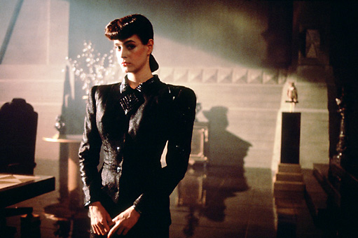
Costume is used in blade runner, more so in the female characters, to make them unforgettable. For example Racheal’s rather wide shoulders in her costume. The first time you see the character, immediately this part of her costume is noticed by everyone in the audience, this focuses the attention of the audience on her even more and helps to solidify her as an important character in the minds of the viewers.

Image result for rachel blade runner shoulder

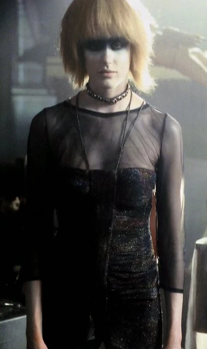
The same can be said for the character of Pris, her extensive makeup/face-paint immediately catches the viewers attention and makes her a memorable character, and also her clothes may not be as outgoing as her hair/makeup the all black gives a mysterious touch to her appearance along with her odd personality ands mannerisms.

Image result for pris blade runner


The Production of Citizen Kane

Citizen Kane (dir. Orson Welles, 1941) is widely considered the greatest film ever made. The production context behind this film greatly influenced the end look and feel of this film.

Welles came into the fame after his radio broadcast of War of the Worlds in 1938. This led to the Hollywood studio RKO hiring him to make a film, which they ultimately gave him complete creative control over. This was practically unheard of in Hollywood, and meant that the film was exactly what Welles wanted it to be, as long as it stayed under the budget of $500,000. Welles’ history working in the theater influenced the film to look like a stage production in some ways. In addition, the cast were part of Welles’ theater group, so they were trained to act on stage, rather than on-screen.

There were a number of new inventions that made Citizen Kane an incredible film. The cinematographer, Gregg Toland, made use of a new deep focus lens, which allowed everything in the scene to be in focus all at once. This very effective in some scenes, because it creates optical illusions that change the way audience see some things. For example, in the shot below, Kane seems to be the same size as the window, but as he walks towards it, he is dwarfed by its size. This is reflects how Kane is becoming smaller as he loses his power and influence. Inventions like this one, and the use of them throughout Citizen Kane, make the film very innovative.

Citizen Kane is famously based on the life of William Randolph Hearst, an American businessman, politician and newspaper publisher. While Welles denied these accusations, Hearst used his immense power and influence to limit the amount of theaters where Citizen Kane could be shown. This led to the film failing at the box office, and Welles’ career being seriously harmed. However, the character of Kane – a prominent newspaper owner who tries to start a career in politics – reflects Hearst’s life in many ways. As Hearst was an easily recognisable figure for the audience, Welles’ portrayal of him led to the boycotting of the film. It wasn’t until 1956 when Citizen Kane was revived, that the film received the recognition that it deserved.