Daily Archives: October 16, 2018
Filters
Film Tableau
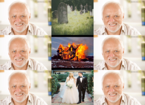
Kuleshov effect example
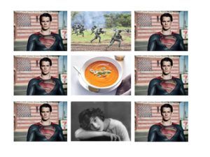
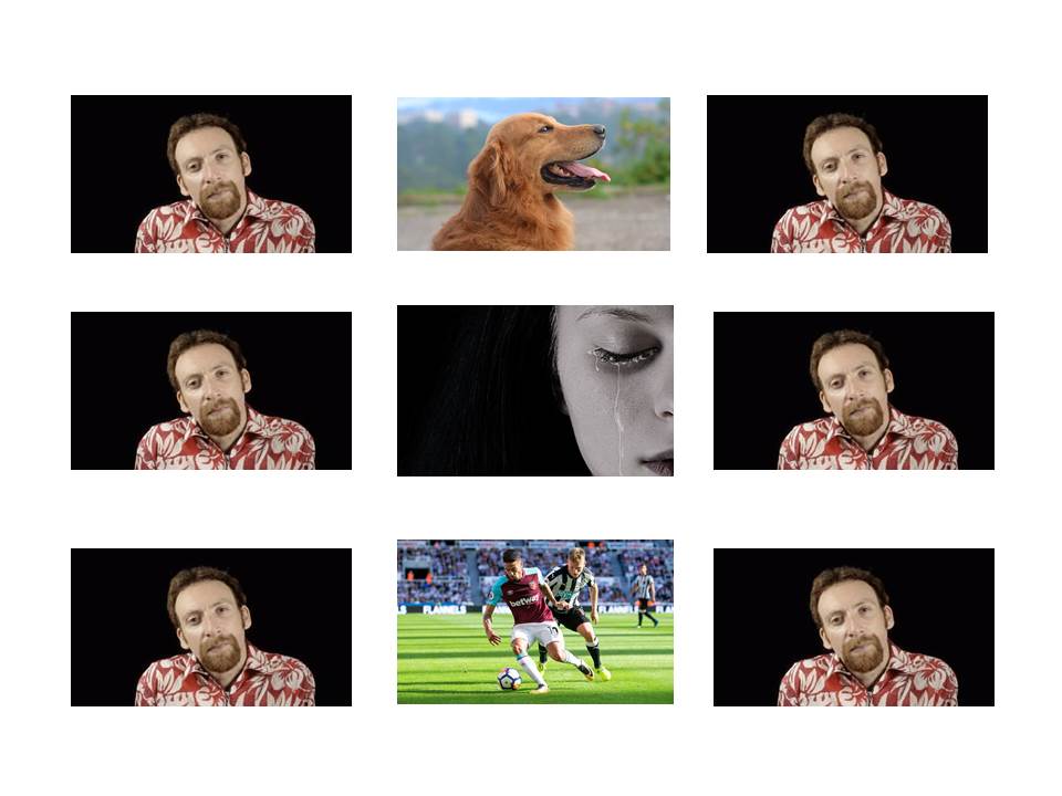
This is an example of the Kuleshov effect. The effect of juxtaposition is of upset and somewhat fear from the first image because photos of war typically evoke these feelings. The second image portrays the character as hungry, by using a photo of soup to contrast. Finally, the photo of the girl portrays the character as a dirty old man by implicating his attraction towards the young girl
The Kuleshov Effect
The Shining – Symmetry
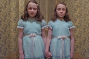
The use of symmetry is used a lot in this movie. It relates to the idea that the concept of doubles is viewed as creepy within human-kind because there is something disturbing about the idea that there can be duplicates of something, or that one thing can be two conflicting entities at once. The “evil-twins” concept is used with the shining as they are introduced with no context to the audience, but simply give off a creepy vibe by the way they are stood still, staring at Danny. The way they hold hands means that there is no good twin, evil twin. If they are evil entities, it means they are both evil since they are shown to be on the same page as each other. This creates a frightening feeling for the audience because we don’t know what is going to happen next, and the “double” idea is generally creepy. As for specifically the twins, there is something for-boding and corpse-like about their demeanor. Their sunken-in eyes stare at Danny and there is something very unnatural about their symmetry, they are not identical but they don’t need to be. It’s the idea that if one of them is terrifying enough. Two of them up the horror ante.
The Shining – Steadicam
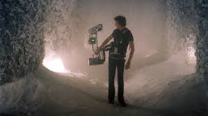
The scene from the 1980 horror film “The Shining” in which Jack Torrance is chasing Danny in the hotel’s maze is shot using a Steadicam. A Steadicam combines the stabilized steady footage of a tripod with the fluid motion of a dolly shot and the flexibility of hand-held camera work. While smoothly following the operator’s broad movements, the Steadicam’s arm absorbs jerks, bumps, and shakes; while it’s almost frictionless gimbal gives precise control of the camera and framing. During this specific scene, Danny running for his life through the maze in the snow and Jack limping behind with an axe, the look of the maze is being shot using a Steadicam. The operator is filming the dark, snowy hedges that contain lights in order to show the audience the eeriness of where they are. This creates an atmosphere to make the scene more intense and creepy. A smooth filming of the maze is shown to eliminate some of the chaos that an unsteady camera would create, so that the audience is fully focusing on the location rather than the situation.
Shot Distance in Film – Long Shot (LS)
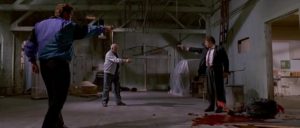
This scene from Reservoir Dogs is an example of a long shot, which shows to the audience the standoff during the conclusion of the film. The choice of shot allows for the director to display the aftermath of the events in the warehouse, which mirrors the reason behind this altercation. This is further emphasized with the injured Mr Orange visible at the bottom right of the shot, who represented the conflict and deception within the movie, therefore the audience can visually understand a moral challenge with the narrative as it succeeds with blurring the lines of protagonist and antagonist.
Mise-En-Scene Bladerunner Repost
Bladerunner – Mise-En-Scene Scene
The scene that I have decided to choose for my analysis of mise-en-scene is the ‘Tears in the Rain’ scene. I have chosen this scene because I think that it shows most of the elements of Mise-En-Scene.
Firstly, the use of set design in the scene is important, the scene is the rooftop of a building and this is reflected in the movie, the scene doesn’t have any props that the actors interact with and the lack of anything in close range causes the viewer to fully focus on the actors and pay more attention to what they are saying.
The use of space in the scene is also important, Deckard and Roy are very close to each other and their proximity reflects their relationship as how with Roy’s dying moments they seem to grow a bond.
One of the more worked on aspects of Mise-En-Scene in the film is the use of lighting, the scene is usually dark but occasionally has flashes of light that usually highlight the features of the character that the camera is currently at. The use of the low light reflects the sad nature of the scene, the flashes of light are often used to show the details on the characters faces.
The use of hair and makeup are also important in the scene because it shows the character as being close to death. Roy’s hair being white shows that he’s near death, and how his hair is disheveled shows how tired the character is and that he’s ready to die. Deckard’s hair shows fatigue and exhaustion and fear because he isn’t sure of Roy’s motives and from the fight and pursuit scene from before.
Storyboard
