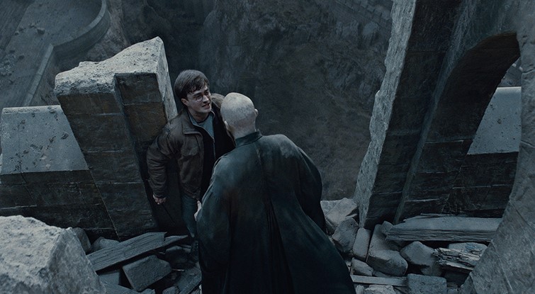
A good example of a high angle shot is from ‘Harry Potter and the Deathly Hallows: Part 2’ (2011, by David Yates) This angle is significant, particularly to the plot because it gives a representation of Voldemort’s power as he physically towers over Harry which shows the audience his sheer power. As the audience, we are frightened for Harry at the severity of his disastrous situation; this solidifies his character as a protagonist because despite the challenges he faces, we are still meant to stick by him. The angle is also well-framed, because it makes us look down on the scene as if we are a part of it. By having Voldemort tower over Harry, we feel that his situation is precarious and does not look good. There is also a sense of superiority by positioning Voldemort over Harry, insinuating that Voldemort thinks he is above Harry. This is also suggesting that he is more powerful than him, foreshadowing the ending where everyone believes that Harry was killed but it turned out that he defeated his arch rival

The film ‘Raising Arizona’ (1987, by Joel Coen) makes good use of low angles. This particular shot is highly effective in portraying Smalls as a menacing and dangerous character. This is done by forcing the camera to look up to him, implying that he believes to be superior to everyone, adding a touch of arrogance to his traits. The shot is well framed by positioning him in the centre, surrounded by guns. This implies that violence is his world, and all he ever knows. The audience should feel intimidated, or afraid for the characters because of the way that the camera is angled looking upwards at the character. He looks frightening because of the confidence expressed in his facial features, which represents his character very well
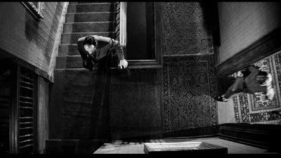
This example of a bird’s eye view is from the film ‘Psycho’ (1960, by Alfred Hitchcock) I think this is a strong example because everything seems eerie and out of place. The scene depicts the secret antagonist Norman’s attempt to hide the identity of his ‘mother’ who supposedly killed the investigator. The interesting aspect is that we do not know that his ‘mother’ is actually just the corpse, so I think this scene is very effective for the audience because it prevents them from finding out about the true identity, which creates even more tension. This type of angle is significant because it shows the entire setting, which allows our attention to drift away from ‘mother’, thus allowing her true identity to remain a secret. I think this is vital in retaining an element of mystery and surprise throughout the entire film

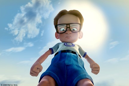
This is an example of a worm’s eye view camera angle from the film ‘The ant bully’ (2006, by John Davis) I particularly like this angle used because; although this film isn’t usually my favourite genre I think that both the plot and cinematography conveyed important messages. We perceive the scene in the same point of view as the ants, so view Lucas as gigantic in comparison. His anger is evident, which twists his character negatively, making him seen cruel and harsh; especially when he attacks the ants. From this, we don’t particularly like Lucas, although to a certain extent we do understand his rage; coming from his recent bullying. However, since he is looking down on the ants, this gives us a sense of his feelings of superiority. This is contradicted when he is shrunk down to their size and learns that he is equal to them. I think this shot is useful in conveying the main messages portrayed in the film, including equality

The film ‘Battlefield Earth’ (2000, by Rodger Christian) is well-known for its usage of Dutch tilt camera angles, I particularly like this one because of how abstract and complex it appears. The film itself is extremely complex; there are many different ideas and aspects which are varied. I think that this is also represented in this scene. The camera is only slightly tilted, which contrasts against the scaffolding bars and the outlines of buildings. There is a lot going on in this scene, so tilting the camera ensures that the audience can notice how uniquely balanced everything is.
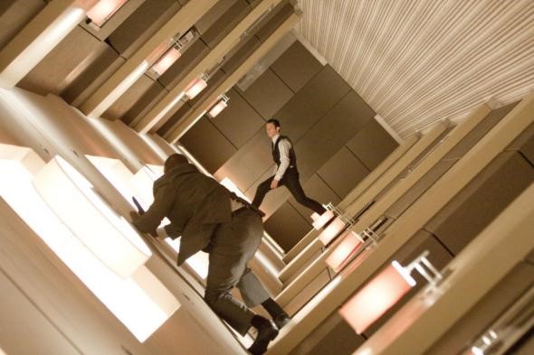
This example of a canted shot is from the film ‘Inception’ (2010, by Christopher Nolan) I really like it because of how complicating it is to look at. I think that it reflects the confusing yet engaging nature of the film which ends with a complex and not fully explained ending. The whole plot revolves around the manipulation of dreams to receive what the main character Dom wants. By showing the characters swaying and manoeuvring across the corridor, this represents the shaky line separating dreams from reality. Since everything seems floaty, and on edge; it is hard to determine what is reality and dreams. I think the audience would be interested by the complexity of this shot, but might feel a bit confused about how to look at it without a headache

