I chose Alice in Wonderland’s Queen of hearts character. This is because she is supposed to represent Mary, Queen of Scots who had a rivalry with her sister, and the big head is a metaphor for Queen Mary’s selfishness. The hair, being red and heart shaped, was a clever play on the “Queen of Hearts” façade and the makeup represents how royalty used to wear their makeup in the 1500’s.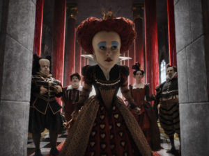
Daily Archives: September 20, 2018
Filters
Costume Design
I chose Zendaya’s character in “The Greatest Showman” because her purple leotard and pink hair was her signature look when performing her trapeze art on stage, however in other scenes outside of performing, she had her natural dark hair. This shows that she portrays the skilful trapeze artist separately from the character “Anne” when she is herself and not a “freak” on stage. I like this portrayal because even though everyone considers the performers all freaks, it shows that they are still people with personal lives.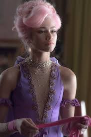
Spike Lee’s cultural viewpoints
Spike Lee famously said that in order for a film to authentically reflect the experience of black culture, it should be directed by a black person. I do agree with this statement as you can only speak about an experience, if you have experienced it. Spike Lee claimed that movies such as Detroit (Bigelow, 2017) and Django Unchained (Tarrantino, 2012) were misinterpreting black narrative. This is because those films were directed by white people and therefore Lee concluded that because they did not have the experience they could not create the film. In my opinion anyone should be able to make any film however i do believe that It would be more accurate, more politically correct, or just a better film in general (perhaps) if it was directed by someone with the experience of the situation.
Long Take Example
I have chosen this scene from The Shining (dir. Stanley Kubrick, 1980) as it is an interesting example of a long take. Creating long take scenes are very difficult for directors, as everything must be filmed in one continuous shot, with no stopping or camera cutting. This means that the entire scene must be well rehearsed, especially when it contains lots of extras. If anything goes wrong in the scene, then the entire thing must be started again. Even though this scene doesn’t contain a lot of characters, it is still difficult to get something like this right. This scene adds to the suspense of the film, as the audience thinks there could be something around any corner.
Set Design
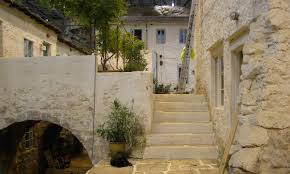
I chose Mamma Mia as they used a beautiful (real) place for where Donna lived. The iconic hut on the island made a reappearance in the prequel “Mamma Mia – Here We Go Again” however, they used a different island for the second movie. In Mamma Mia, most of the outdoor scenes were filmed on location at the small Greek island of Skopelos, and the seaside hamlet of Damouchari in the Pelion area of Greece. The film’s main location site in Skopelos was Kastani beach on the south west coast but Mamma Mia 2 was filmed on August 12, 2017 in Croatia, including the island of Vis. In October 2017, the cast gathered at Shepperton Studios in Surrey, England, to film song and dance numbers with Cher. 
Costume Design
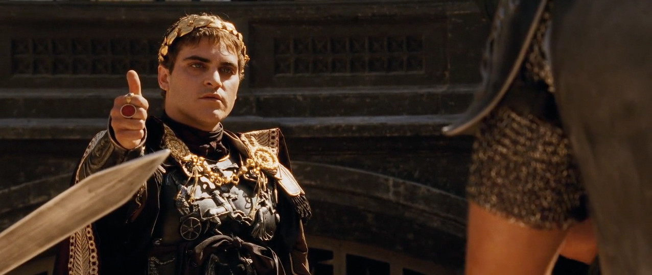
I chose the movie Gladiator (Dir. Ridley Scott, 2000) for its costume design because of the work put in by Janty Yates in researching not only the clothing worn by the Emperors of 180 AD, but also of the lesser known and far less represented gladiators of this era. Yates won an Oscar in 2001 for her work on Gladiator because of how accurate and complex the clothing was for the time. Yates was especially praised foe her work on Maximus’ clothes and armor as well as a very high level of continuity throughout the film.
Mise-En-Scene: Set Design
Mise-En-Scene Example – Costume

I chose this as a good example of costume because I think that it’s a good example of how the feeling of how the costume reflects the impression of the character in genres where the costume is really important like fantasy or science fiction
Film: The Lord of the Rings: The Fellowship of the Ring
Director: Peter Jackson
Year: 2001
Genre: Fantasy
Set Design
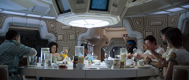
Alien was directed by Ridley Scott, David Fincher, James Cameron, Jean-Pierre jeunet in 1979. I chose this film for its set design because how everything was created to look futuristic, yet familiar to audiences in 1979. Even though it is set in 2122, the main area where the crew of the Nostromo interact feels realistic and lived in. it is also a stark contrast to the horror elements of the film, as it feels very safe and normal, compared to the danger and disturbing nature of the alien Xenomorph itself.
Long take
A good example of a film which utilizes long takes is ‘Children Of Men’ (By Alfonso Cuaron, 2006). There is around three long takes in this film, which is a great achievement; considering how challenging they can be for a director to produce. It can be agreed that when done right, a long take can provide an interesting visual and can also be integral to the plot because it sets the tone. With action, thriller or horror genre; they can be used primarily to create suspense and keep the audience on the edge of their seat
However, despite the obvious pros, there can be a lot which can go wrong with a long take. They require lots of hard work, dedication and commitment to get right, so therefore I think that they should just be used if the director thinks it will work or is necessary
Since it is all filmed in one shot, everything comes down to timing. If an actor misses their cue, or a car drives in at even a fraction of the wrong second, the whole thing will need to be restarted. This can be frustrating for both directors and actors, especially if the take was working extremely well prior to the error. Long-takes require persistence and the ability to bounce back and continue onwards
There is also the possible issue of a lack of film. Some films intend on using long-takes but their cameras cannot hold enough film to make it work. A notable example of this is the film ‘Rope’ (By Alfred Hitchcock, 1948). Hitchcock intended for the film to have a continuous long-take, but the cameras could hold no more than 1000 feet of 35 mm film. As a result, each take used up to an entire roll of film and even lasts up to 10 minutes. In the end, the film consisted of only eleven shots
In this film, the usage of multiple long-takes were aided by CGI but still looked effective and worked well. Cuaron had also experimented with long-takes in several other movies including ‘Gravity’. Most of his work is influenced by varied different shots and takes which ensures that his work is as unique as possible. As well as the interesting plot, this film is mainly famous for it’s long-takes because of how unique they are. It is not a surprise that it grossed 70 million dollars at box office, due to its sucess
