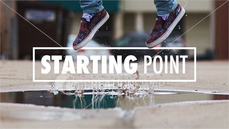
I thought it would be interesting to add a lens flare to my sky images that had the sun in so I decided to bring some photos over to Photoshop to try it.
Process:
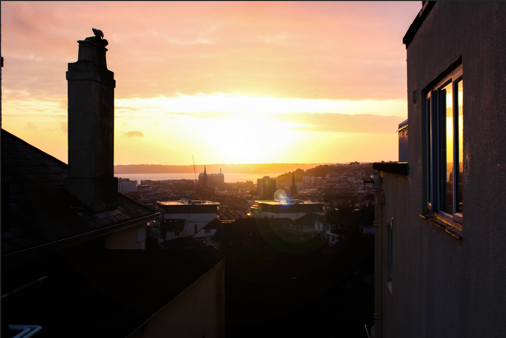
Before –

After –
Some more lens flares –
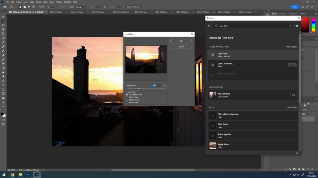
I thought it would be interesting to add a lens flare to my sky images that had the sun in so I decided to bring some photos over to Photoshop to try it.
Process:
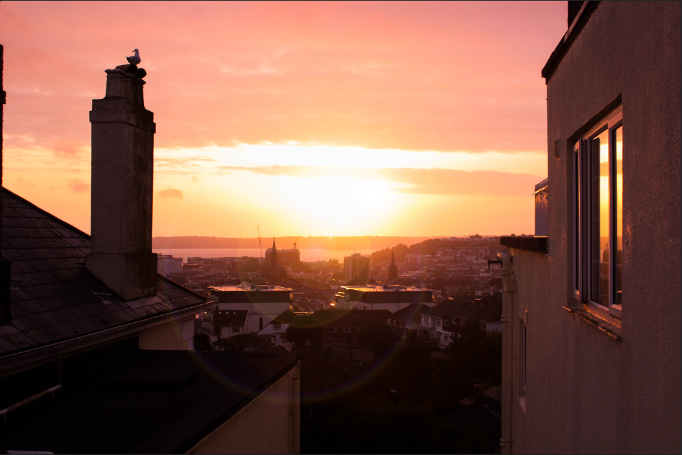
Before –
After –
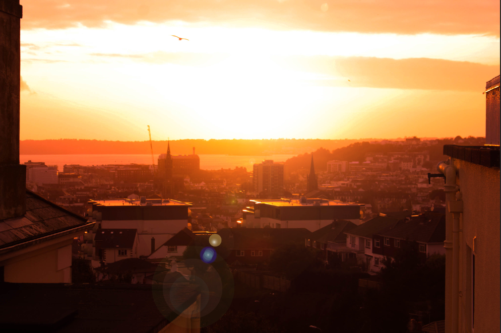
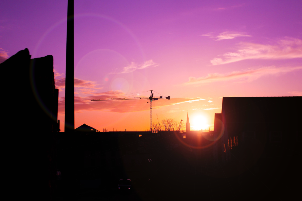
Some more lens flares –

Overall, I feel that this project was challenging in the sense that it was quite difficult to interpret at first, and I had trouble connecting ideas to make any kind of start, which slowly changed as the ball rolled and I broke down the theme into three separate parts. This enabled me to achieve a wide variety of different compositions, both in style and concept, whilst still contributing to the project. I experimented with several new methods and techniques within both my photography and post-production, and I feel that I’m a lot more equipped and knowledgeable in my work now as a result.

Rinko Kawauchi definitely had the largest impact on my work and how I shoot photographs, technically and stylistically. Kawauchi’s work taught me to focus less on the larger picture and to focus on a smaller part of it, to capture the smaller parts and ‘systems’ behind each scene. As a result of this however, I feel that I was able to execute my Simone Bramante-inspired shoot perfectly, using natural lighting and the surrealist composition created through the use of the bin liners to my advantage.


I’m also happy with how I presented my work as final outcomes, using window mounts and different formations to present some of my photoshoots as a singular outcome, but also by linking two separate images together. My favourite outcome was organised similarly to the two images above from my Bramante shoot, where the subject from the image on the right-hand side looks in the direction of the other, linking the two together. Additionally, the use of colour within the image is a nice contrast of warm and cold tones, which pairs well with the golden hour lighting.

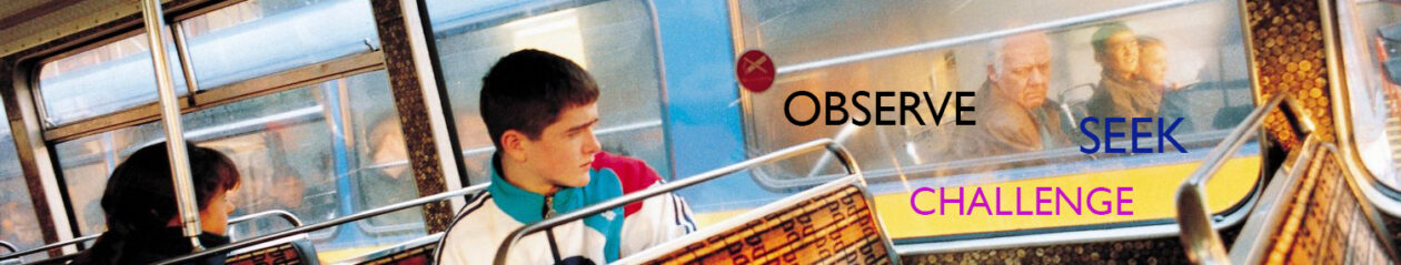
This set of final outcomes are from one of my Rinko Kawauchi-inspired photoshoots, following the theme of ‘observe’ through watching nature as it is, without human intervention.

This triptych is from my final images from my Simone Bramante-inspired photoshoot, following the theme of ‘seek’ through looking for a solution/raising awareness to the plastic pollution crisis.

This last set of four pieces come from my Nicholas Goodden-inspired shoot, following the theme of ‘challenge’ through graffiti and street art.

I also wanted to create some final outcomes from the Paris Photo 2023 trip from last year as I hadn’t made any from them yet.
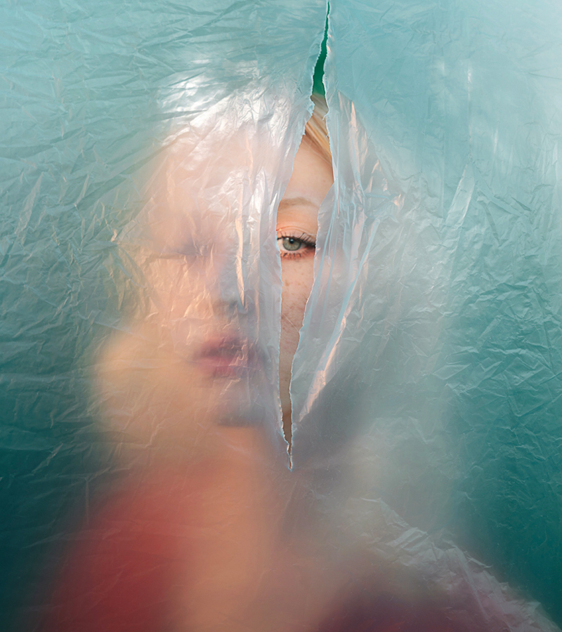

In response to Bramante’s work, I did a photoshoot with Wiktoria, aiming to achieve a similar composition to that of her work with plastic drapings. Using this for inspiration, I hung up different coloured and textured bin liners on a clothesline, along with some plastic packaging, which I thought looked relatively similar. I cut a slit in each liner, leaving enough room for Wiktoria to be seen through it, and we experimented with different poses and angles that would work with the natural lighting.

After editing and sorting through each image, I was left with a series of dramatic, interesting compositions. My main focus for editing with this shoot was the availability of natural light in each photograph, and how it played on Wiktoria’s face and the creases in the plastic.


These were my final 6 compositions for this shoot. Each one has its own sense of mystery surrounding it, as a result of the plastic obstructing Wiktoria’s face, creating this own other world that she’s almost ‘looking through’.
For this image, I wanted to develop on simply what was already there, doing basic adjustments and only really bringing more warmth to the image.


The shoot was done around golden hour, so the natural lighting already left a golden impression on the composition, which I wanted to accentuate through the use of colour grading. I used orange tones for both highlights and midtones, not overdoing it but just enough to warm up the image, and I used blue tones in the shadows, which complimented the already blue bin liner in this particular shot. I then calibrated the colours to dullen them a bit, mainly to give the orange hues more prominence, but also to create a softer overall look.

To finish off the image, I added the vignette and used linear gradients to increase the contrast from the lights to the darks from each corner.

Simone Bramante, an Italy-based surrealist photographer, is noted for his intense use of colour and dreamlike atmospheres he established within his images. My interest in Bramante’s work derives from both this and the gentle nature of a large number of his photographs, similar to Kawauchi’s.
Take the above image for example. Bramante presents a young woman peering through a tear in a wall of thin near-transparent plastic, immediately suggesting surreal ideas of her looking into/out of another world, or that the subject is looking for something. The only portion of the subject we can clearly see in focus is a sliver of her face – an eye, part of an eyebrow, and some blonde hair. The rest of the composition is hidden behind the plastic, blurred by it, but not too blurred to where the viewer can’t make out basic details, such as the colour of her clothes and lipstick – both a bright red – or the rough shape of her face and hair.

In my own work, I want to create a photoshoot that responds similarly to these specific images, of people looking through plastic sheets, nets, etc., and to achieve similar colour palettes to Bramante.
All these images are from Tamara Lichtenstein’s collection on Flickr page.

For my 5th photoshoot the photographs are going to be taken in multiple places, the first place being on the 5 mile road, focusing on a model being in the middle of the road with a cloudy sky like the images in the top left hand corner of the mood board.


The second place I am going to be taking the photos is on St. Brelardes beach whilst the sky is getting darker my models will be in dresses on the sand with the sea behind them I am going to bring with me a portable light to illuminate them allowing the photographs to be clear whilst the photos are being taken, I am also going to experiment with using coloured gel film over the top of the light to create a coloured effect like Tamara Lichtenstein does which is seen in the bottom of the mood board.


The third place I am going to be taking photos is in a bathroom using coloured light to create a moody setting of the photographs I am going to do self portraits using a tripod of me and my identical twin sister in between a shower screen to create a mirrored effect this is going to be an interpretation of one of Tamara Lichtenstein photos where she has mesh fabric over one of her models creating an almost mirrored effect. I will also be taking photos of my friends together looking in the same direction into the camera and come in a car with clouds of smoke.


For my 4th photoshoot this is also inspired by Tamara Lichtenstein and a book she created on Blurb, I am going to create my photos in a pool in the late afternoon there for the sun isn’t too bright so there will be less glare on the water, I will get my models in white sheer dresses, like Liechtenstein’s models are wearing I am going to experiment with different angles and poses some will be on the model submerged in water others of them coming out of the water, whilst taking the photos and experiment with the lighting as the pool lights are able to change color this will allow me to change the atmosphere and feeling of the images.
As planned earlier I have gone out to photograph frog habitat which involved in getting quite close to frogs and their colonies. To do this I needed to have larger wellies to get into the ponds. I took a few pictures over 1hour. I focused on photographing the trip as well as what I found and experienced.

I have selected photographs of the best quality, and ones I though were showing the experience in the best way .

When it comes to editing I was able to copy the same editing style throughout the images, the main features I did change depending on the subject of the photograph was the exposure, as most were either over or under exposed. The main featured I did highlight were the exposure, sharpness and clarity.


After editing I narrowed down my selection further depending on the photographs quality, what is was showing and checking is it wasn’t “repetitive”, meaning showing the same or similar thing. I wanted to have a good range of the photographs, and I think I achieved that.
For my forth photoshoot, I focused on close up portraits, using different facial expressions and hand gestures to portray different emotions.


Contact Sheet
I flagged the images I wanted to edit
I wanted to edit them with a retro look, so I increased the temperature a bit.
Basic Edits
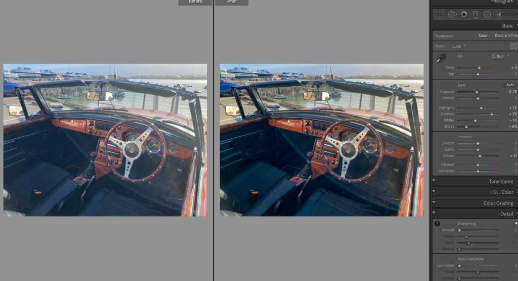
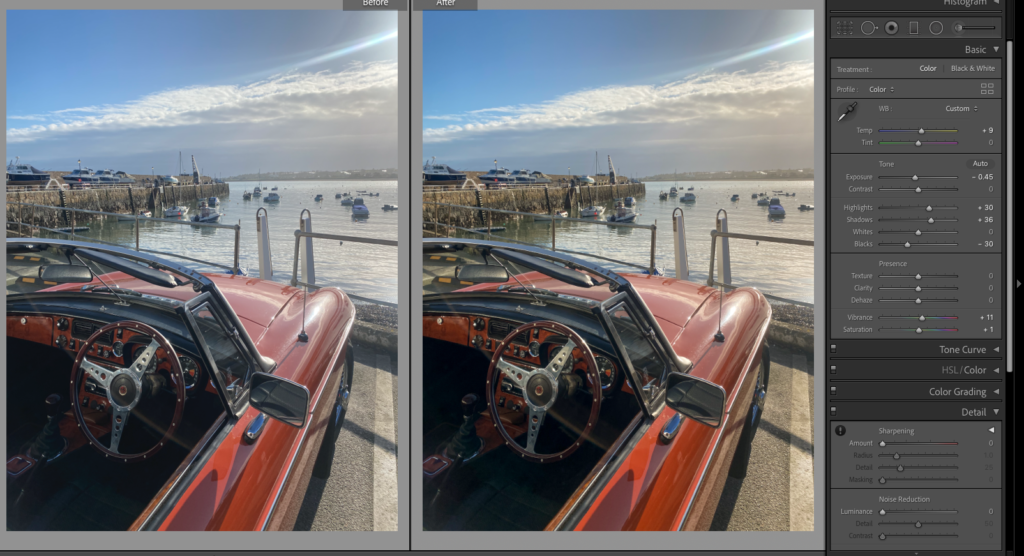
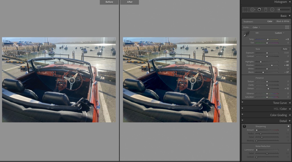
i brought the highlights up and lowered the whites, similar with the shadows and blacks. I then added dehaze to add more strength and depth to the image. After then adding temperature I felt like the images looked retro but are obviously new.
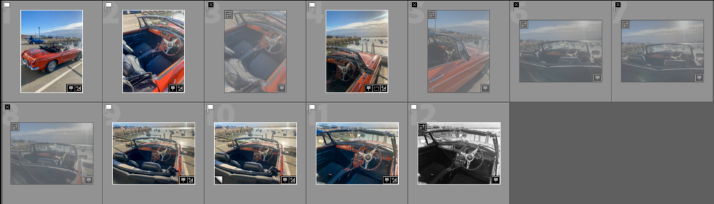
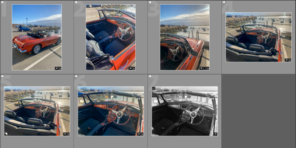
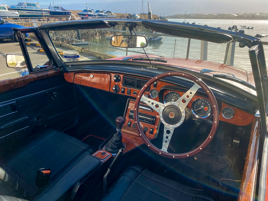
I have done this to link with these archived photos, that include a similar looking car.
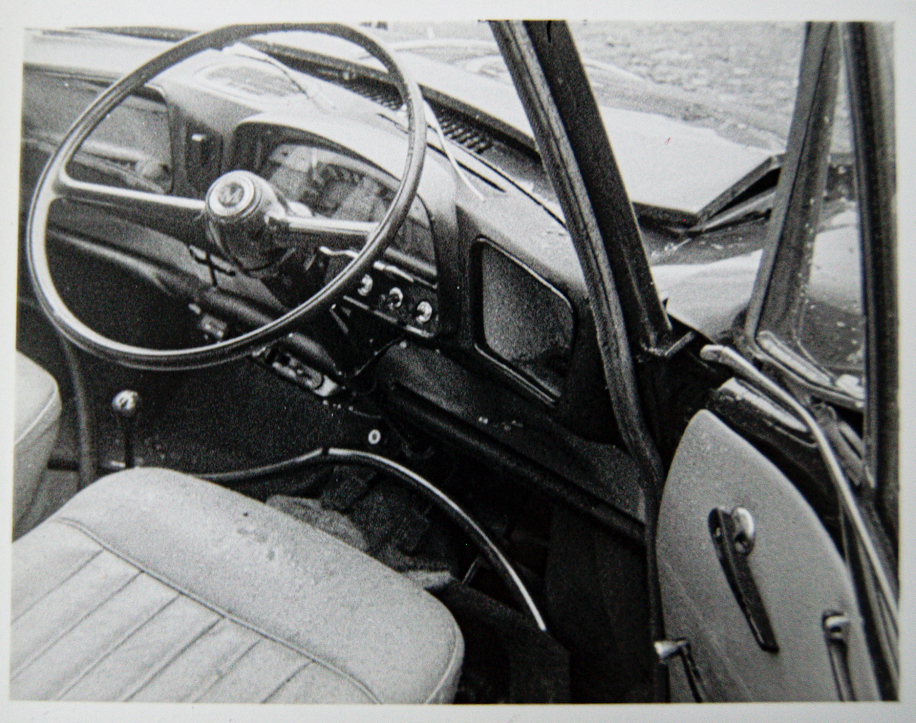
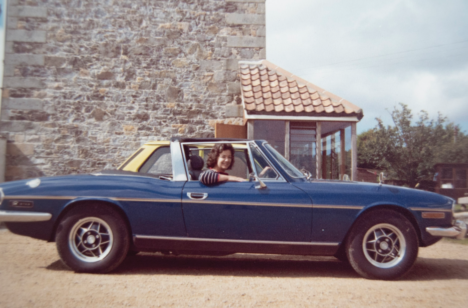
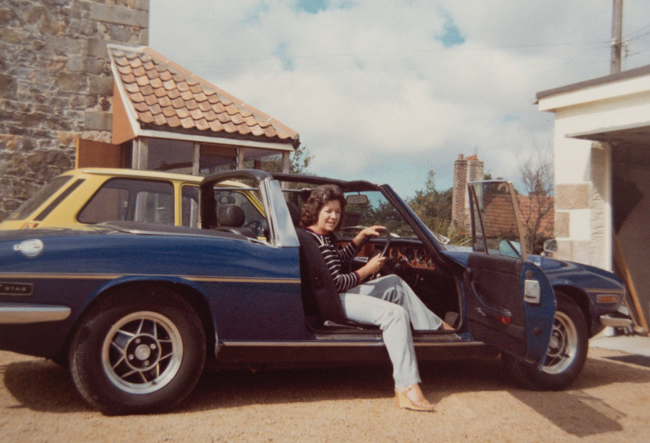
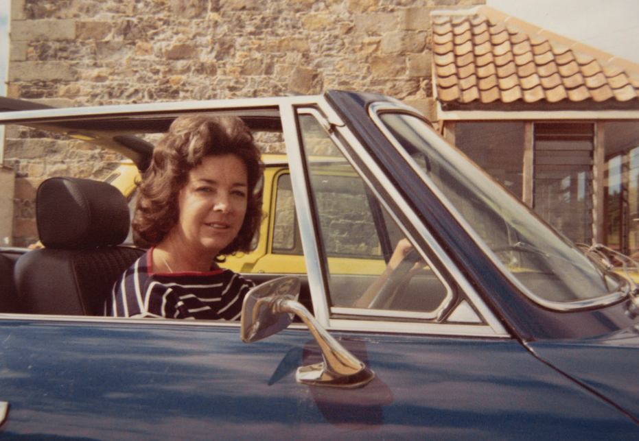
I want to choose the best composition that includes the boats (because my grandfather owned boats and I can make this comparison too) and the car. I also need to decide which of the archived images I will compare them with.
The best two
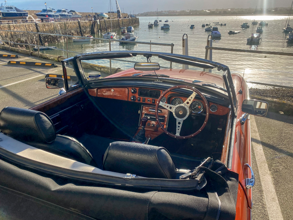
COMPARISON
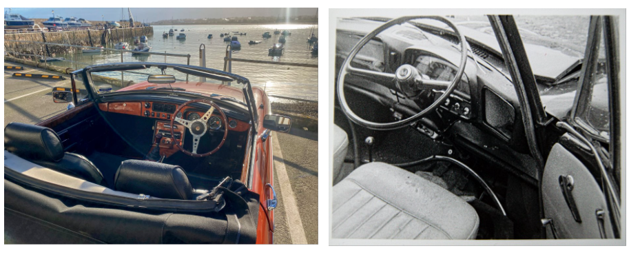
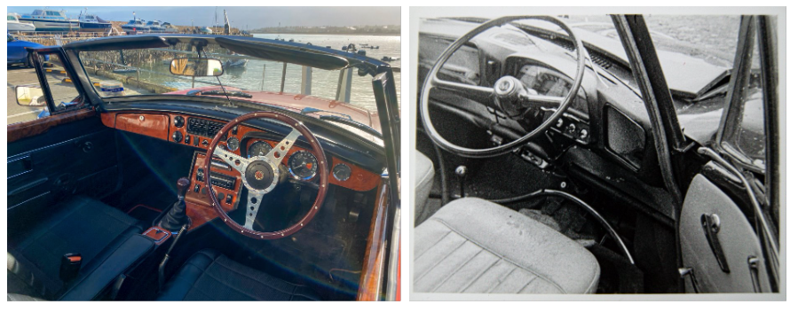
After comparing the images I am still unsure of which to choose, so I will decide when putting my photobook together.